Favourite architecture studio websites of 2021 and 2022
Here are my favourite architecture studio websites that I encountered in 2021 and 2022.
(I didn’t get around to documenting this last year, so this note covers my notes from the last two years. Here’s the list from 2020.)
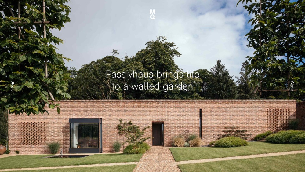
McLean Quinlan
Website: mcleanquinlan.com
There are several thoughtful touches that make navigating this site a delight.
When you arrive on an individual project page, the page’s title isn’t the name of the home, but a short sentence that captures something lovely about the project.
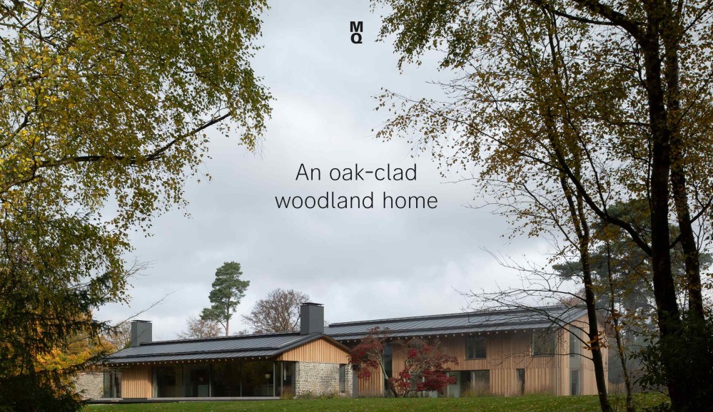
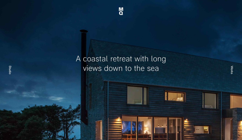
The full-page architecture photography, bracketed by navigation elements on the sides, and the firm’s logo at the top, gives project pages an almost cinematic quality, as if you’ve suddenly been transported into an immersive, high production-value documentary about the home.
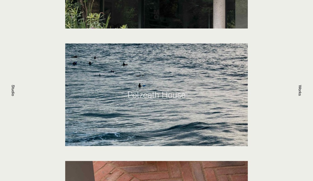
That idea of capturing what makes the project special is also at play on the Projects landing page with its moody, atmospheric photos of some notable element of the site. Sometimes, the photography doesn’t even show the house at all, and yet even these snapshots of landscape succeeds in saying something about the mood of the project.
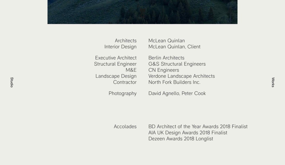
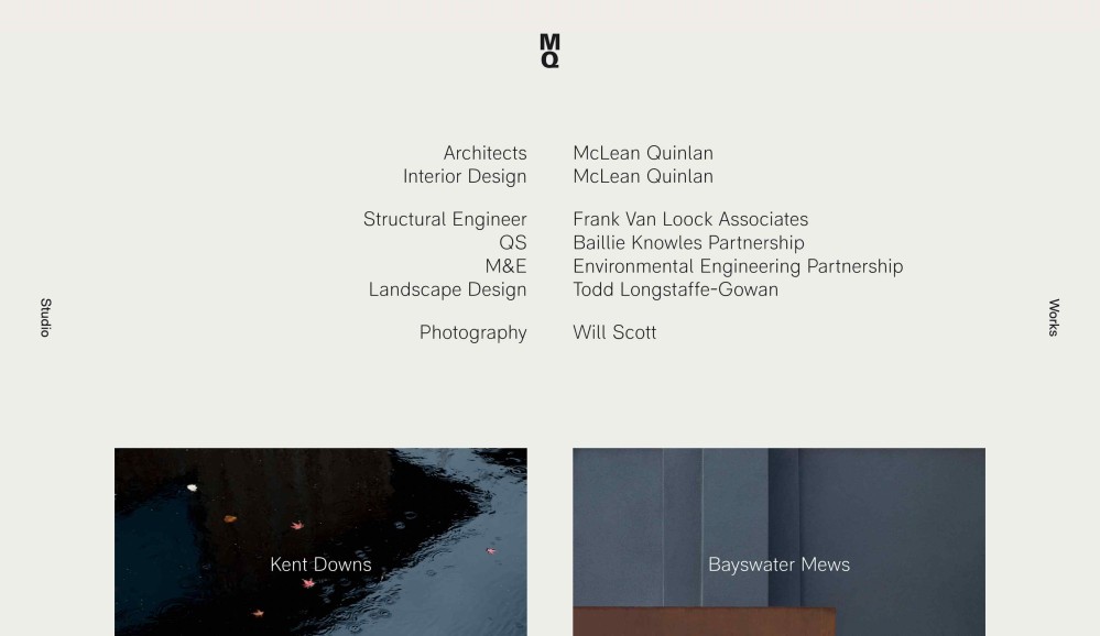
Finally, I enjoy how every project page ends with a roll call of the different subcontractors who contributed to realising the project. Every building is a team sport, and it’s nice to see that celebrated in this way. Separately, I enjoy how this footer puts you in mind of the rolling credits at the end of a firm, further reinforcing that cinematic feeling.
Ben Pentreath Ltd
Website: benpentreath.com
I love this website because it takes typography seriously.
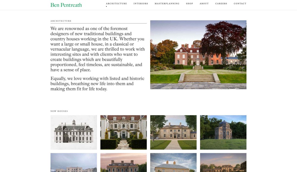
Where most studio websites are content to default to a standard, inoffensive sans serif typeface, the Ben Pentreath website charms with a serif that brings to mind fine, intentional things, like a letter of invitation to dinner, whose debossed letterforms are printed on heavyweight paper stock.
One might say that a serif is the obvious choice for a studio known for their traditional / classical design, but the choice of this specific serif - Adobe Caslon - saves the page from the easy danger of simply looking out of date.
Overall, I love this website because it feels like it’s the rare studio website that understands that the words matter just as much as the photos. It gives words room to breathe, which creates a relaxed, conversational tone.
Olson Kundig Architects
Website: olsonkundig.com
Olson Kundig’s Culture page is a remarkable document.
What it communicate is that this is a studio that cares about creating a culturally rich, intellectually stimulating environment. The sense you get is that if you’re someone who cares deeply about ideas, and about learning, your tribe work here.
While I have no way to prove it, I suspect that this page has contributed to driving several highly talented people to seek a role at Olson Kundig.
MATT Architecture
Website: mattarchitecture.com
MATT Architecture has some of the best copy I’ve ever read on an architecture studio website, hands-down.
First of all, it’s laugh-out-loud funny. Not in a slapstick kind of way, but there’s a disarming, wry sense of humour threaded throughout their project pages that keeps you reading, and before you know it, you’ve read almost every page on their site.
But beyond the humour, what I enjoy most about their copy is what they choose to emphasise on their project pages: they write plainly and compellingly about the problems they solved with architecture.
I wrote more on a separate note about how MATT Architecture embodies the ideal of “architects as problem solvers.”
GRT Architects
Website: grtarchitects.com
This website feels like the equivalent of walking into a buzzing warehouse workshop, the air thick with the sound of electric saws, and the smell of fresh-lacquered wood and smoking leather, while a plume of sawdust rises up to the high rafters.
You get a strong sense of not only finished artefacts, but the many ingredients that went into them. In the best possible way, it feels like a writhing compost heap of references thinking itself towards interesting objects.
The GRT Architects Process page is a supercharged, more networked version of my Index page.
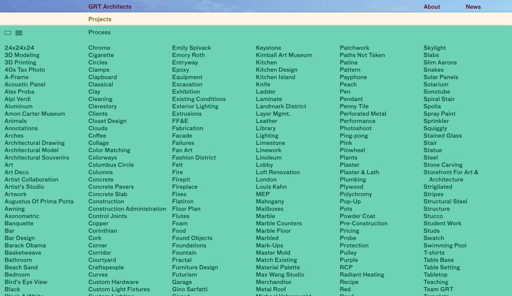
It’s a little difficult to parse what determines the items that show up on this page, but from what I can tell, the main types of things listed here include:
- projects they’ve completed
- reference images that inspired their projects (eg. inspiration)
- architectural elements and details (eg. ceiling)
- materials they’ve used in different projects (eg. brass)
I like how both the Process and Project pages let you choose to display the information either as a list or a grid. Many other websites let you do this of course, but for some reason, on this site, the fact that content can transmute in this way makes the information feel alive.
I’m struggling to articulate this, but the ability for information to change shape turns a page from a beautiful magazine spread, into a machine. Information becomes atom-sized building blocks that can be put together in several different ways, like the blood cells inside a humming database. The Herzog & de Meuron website shares this quality of “database-feel.”
Anderson Architecture
Website: andersonarchitecture.com.au
The general design of the website is basic, but I really like how they explicitly list the key features of each project.
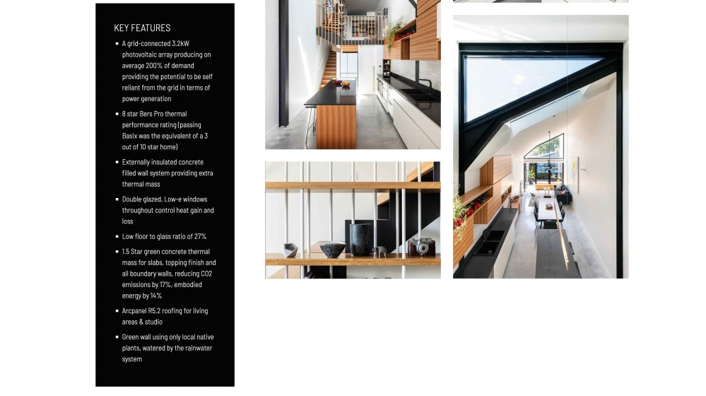
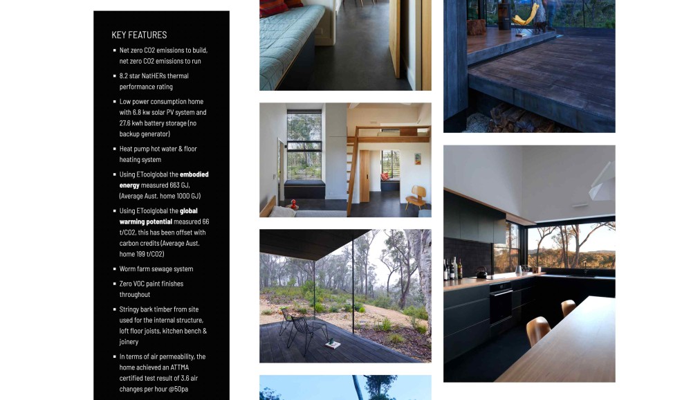
I suspect that a homeowner receiving a list like that would feel like they got value for money.
GROUPWORK
Website: groupwork.uk.com
Candidly, there are several things that this website could do better (I get the sense that it hasn’t been maintained in a while - Google Chrome prominently displays a “Not Secure” sign next to the address bar when you navigate to the page).
But the one move I love is how on load, the projects are presented as a grid of simple single-weight line drawings that reveal the finished project on hover.
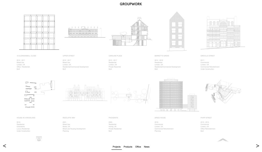
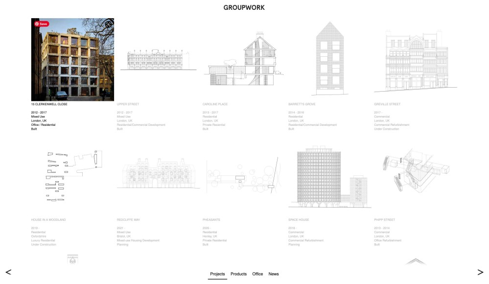
It’s a very small thing, but I like how it reinforces the idea that all architecture begins as an idea / a line on paper.
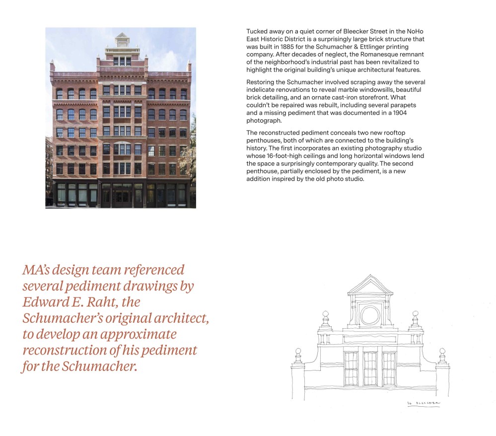
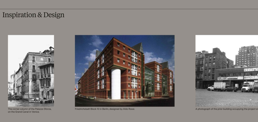
Morris Adjmi Architects
Website: ma.com
I intend to write a lot more about this firm when I do my favourite studios of 2022 list. The important thing to know is that Morris Adjmi Architects excels at designing buildings that feel timeless in the way they sensitively marry traditional and contemporary details.
This is a studio that loves made things. Objects that have authorship and story.
One way this comes through on the website is that they’ll often show photos of the construction process, equally as excited about the making process as the final reveal.
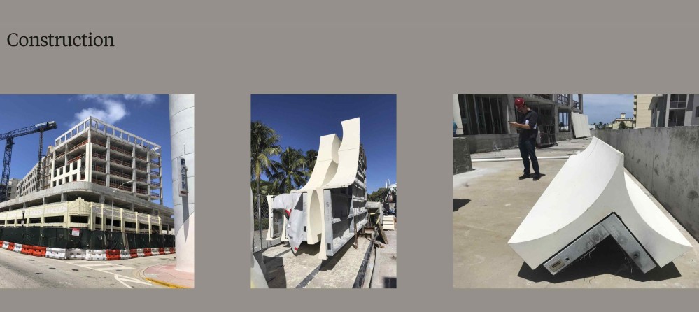
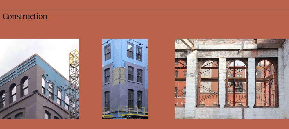
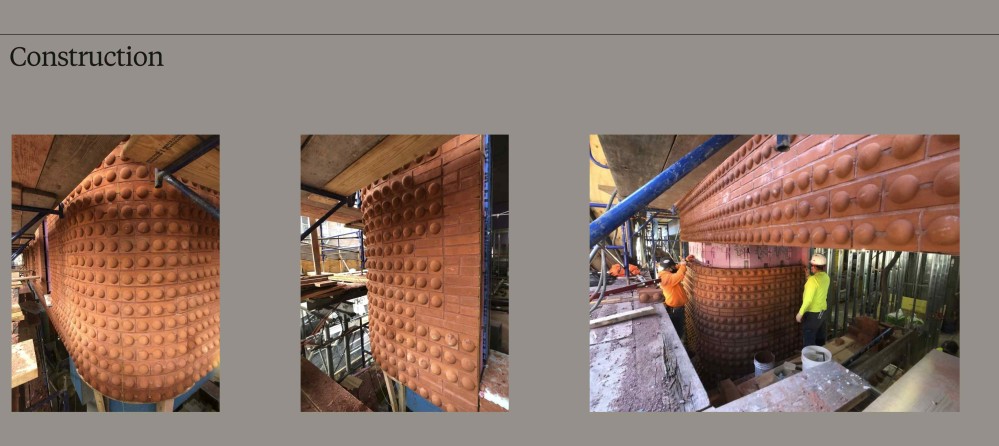
I also love that they’ll sometimes discuss the historical references and precedents that informed their design.
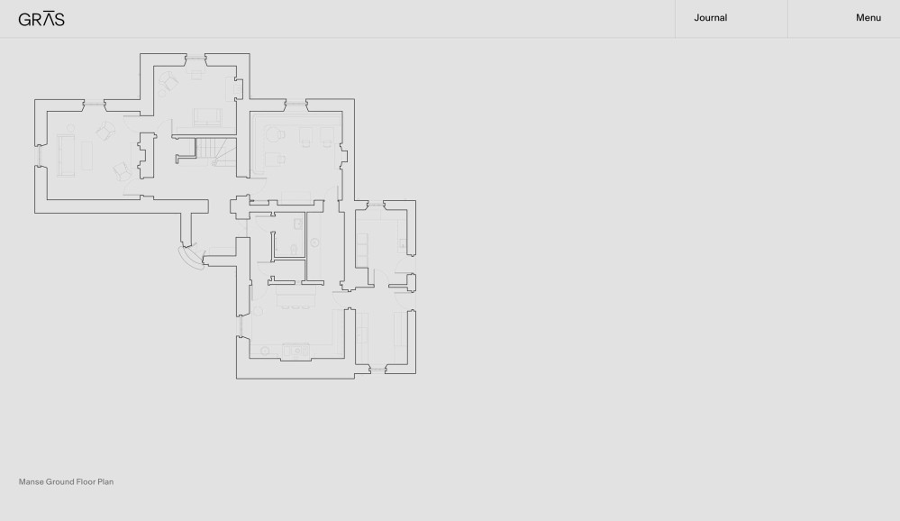
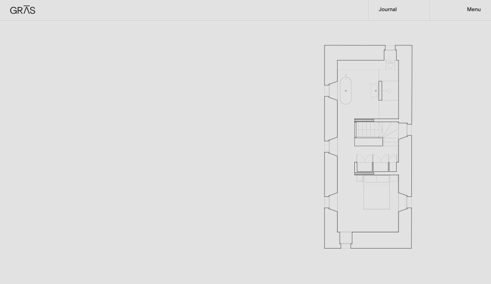
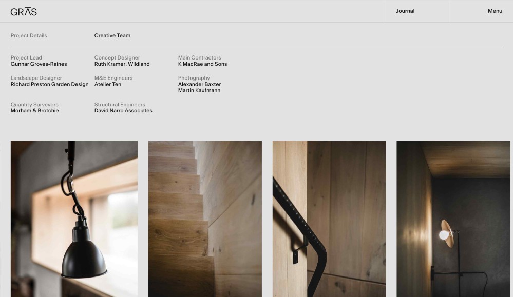
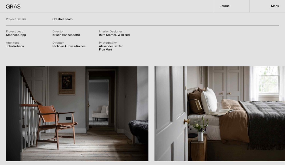
GRAS
Website: gras.co
I really like that every project page ends with a section called Material Focus.
What a studio chooses to put on their site says a lot about what they value: there’s something comforting about how GRAS takes a moment to call out the material palette. It feels like a gesture of deep respect.
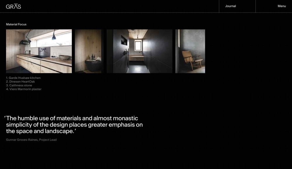
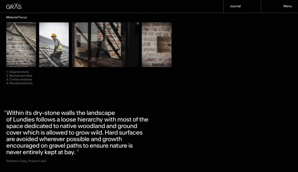
I also really love the fact that each project page has a section that lists the creative team, and that this includes quantity surveyors, landscape designers, and structural engineers.
It takes a village to bring a project together, and the work that these professionals do are creative decisions, and I love that GRAS celebrates them as such.
Finally, I love that GRAS shows floor plans. I wish all studios did this.