Favourite architecture studios of 2021
Several months into active construction of our family home, I have a heightened level of appreciation and respect for anyone who makes it their business to shape the physical world. At the risk of stating the obvious: this shit is hard.
This shit is really hard oh my goodness! It’s a miracle that anything gets built in the world at all! I mean this sincerely!
It’s an everyday, boring miracle that when we fall asleep, we do so with the easy confidence that the entire structure within which we lay our head will not come tumbling down on top of us. This happy outcome is the result of thousands of decisions by thousands of people. Again: a miracle.
Here is a list of my favourite architecture design studios of 2021. I recognise that I’m publishing this in 2023, an entire year later than intended, but as this website acts as a kind of archive, I decided it was still worth publishing, even if only for myself.
How did I decide which studios made this list? The two requirements were that:
- I learned something from them about how to shape space
- I encountered their work for the first time in 2021
Here is the 2020 list.
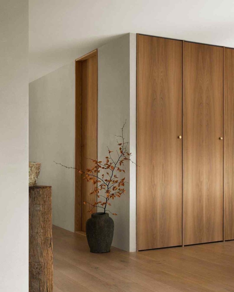
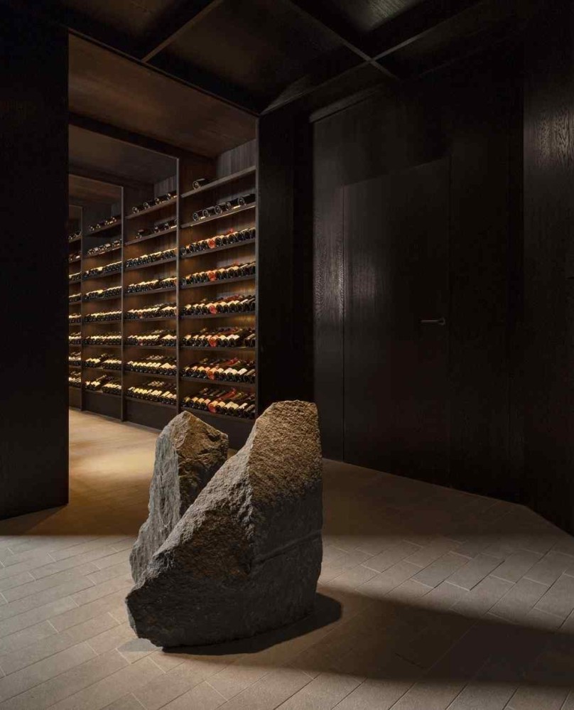
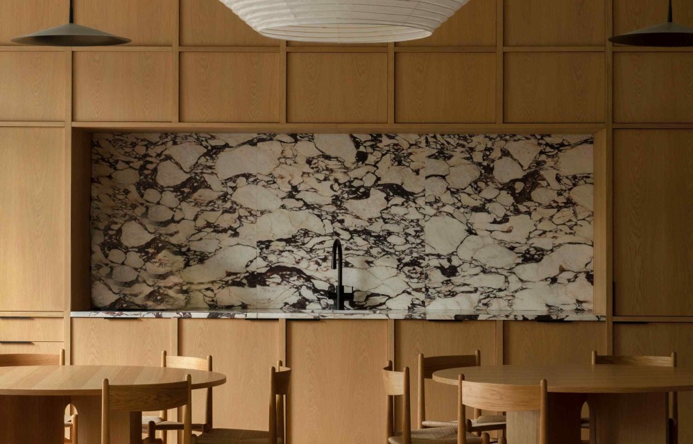
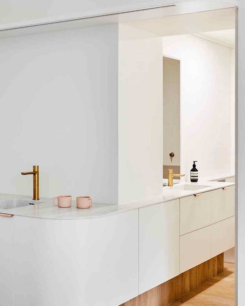
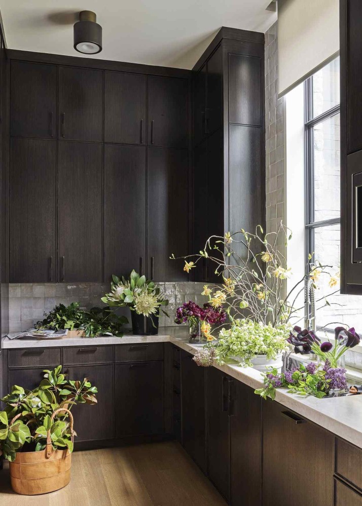
Keiji Ashizawa Design
Website: keijidesign.com
HQ: Bunkyo City, Tokyo, Japan
There’s a certain grammar of contemporary architecture that explores how to apply principles of traditional Japanese architecture to modern contexts.
Keiji Ashizawa Design is fluent in this vocabulary.
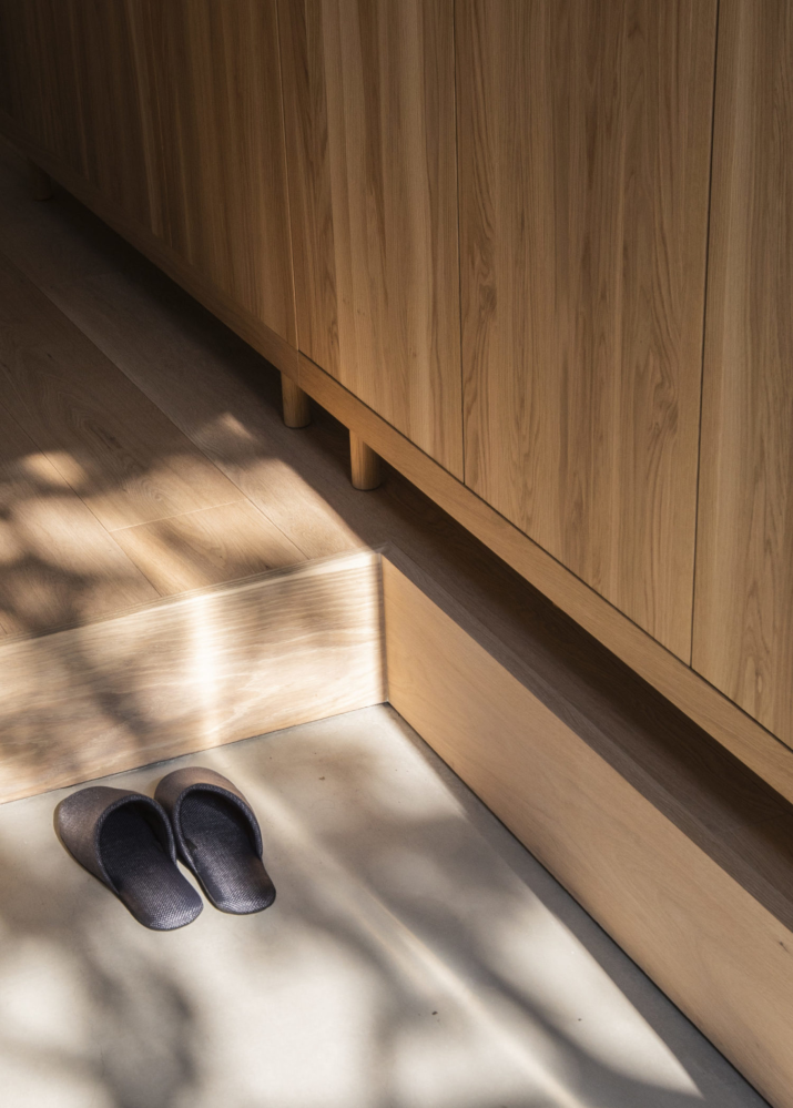
If I had to attempt to summarise KAD’s approach, I’d say firstly that they have a strong appreciation for the work that shapes (can) do. KAD appears to take seriously the power of a silhouette / shape / line to embody a bouquet of emotional associations.
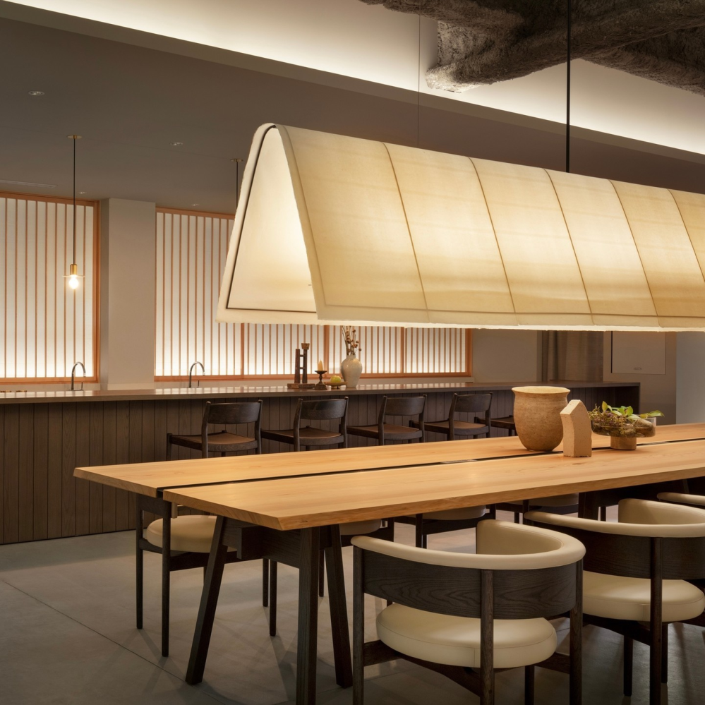
In the image above, for example, the simple shape of the focal pendant light brings to mind the pitched roof that every child scribbles when asked to draw a house, with its related associations of enclosure, hearth, and shelter.
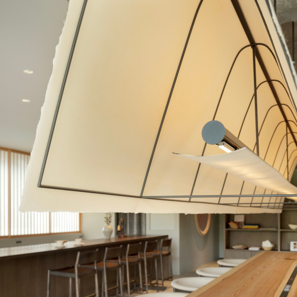
Similarly, the construction of the pendant light - uda washi paper over a thin, metal skeleton - brings to mind paper lanterns, shoji screens, and other associations of Japanese craft.
Another thing I’ve come to believe to be characteristic of KAD is that they appear to focus a lot of attention on joints. They sweat the details, especially, where different materials meet / come into conversation with each other.
The image above shows where wood planks run up against the metal tracks of sliding doors. They could simply have let the horizontal planks run up against the tracks, but they chose instead to “hem” the planks, first with a plank running along the tracks that’s about half the width of the floorboards, and then an additional, second hem on every other board. It’s a small detail, but one that speaks of care.
Such attention to detail is probably not surprising from a studio that also does a lot of furniture design.
Norm Architects
Website: normcph.com
HQ: Copenhagen, Denmark
I admit that I usually associate the word “Modernist” with “bloodless.” Norm Architects woke me to the idea that Modernist principles might instead mean “restraint” and “refinement,” and that these principles can live comfortably with a care for materials and tactility.
I’d go as far as saying that their work sometimes tips over into something downright sensual. Their compositions always have this feeling of just enoughness - just the right amount of lushness without excess. There is just the right amount of wildness, pruned back hard by a disciplined hand.
With Norm Architects, I find that my eye becomes a hand, running again and again against textures. It’s no surprise that they collaborated with Kinfolk on a book called The Touch, about designing spaces for all the senses.
Let me be explicit: Norm Architects designs spaces that want to be fondled, and puts them in contexts where it would be highly inappropriate to do so, creating a delicious tension.
…or is it just me?! Maybe it’s just me! 🙃
If you find yourself thinking that there’s something Japanese about this Danish firm’s work, that’s not an accident. They collaborate frequently with Keiji Ashizawa Design.
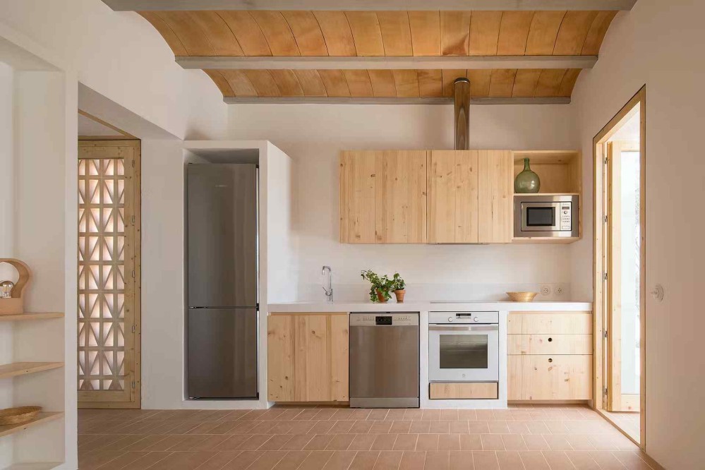
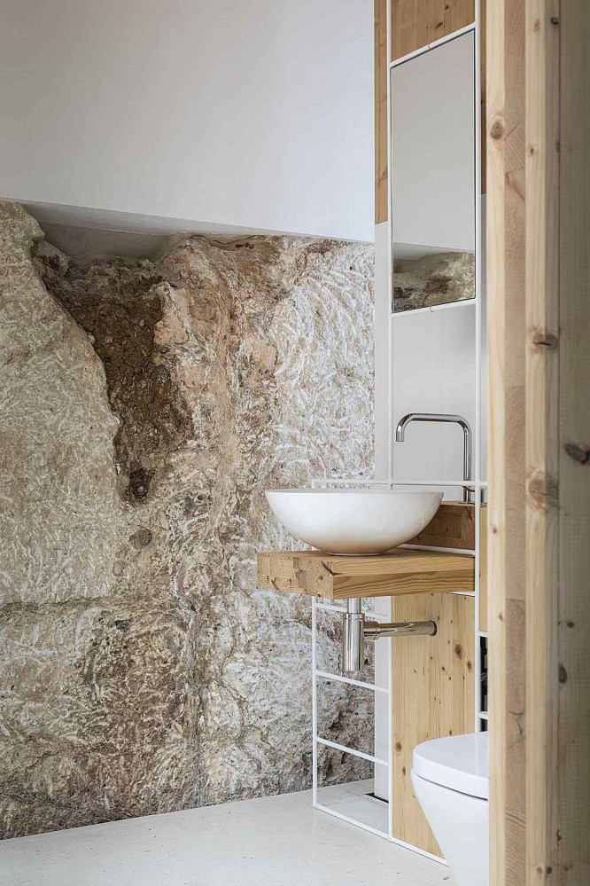
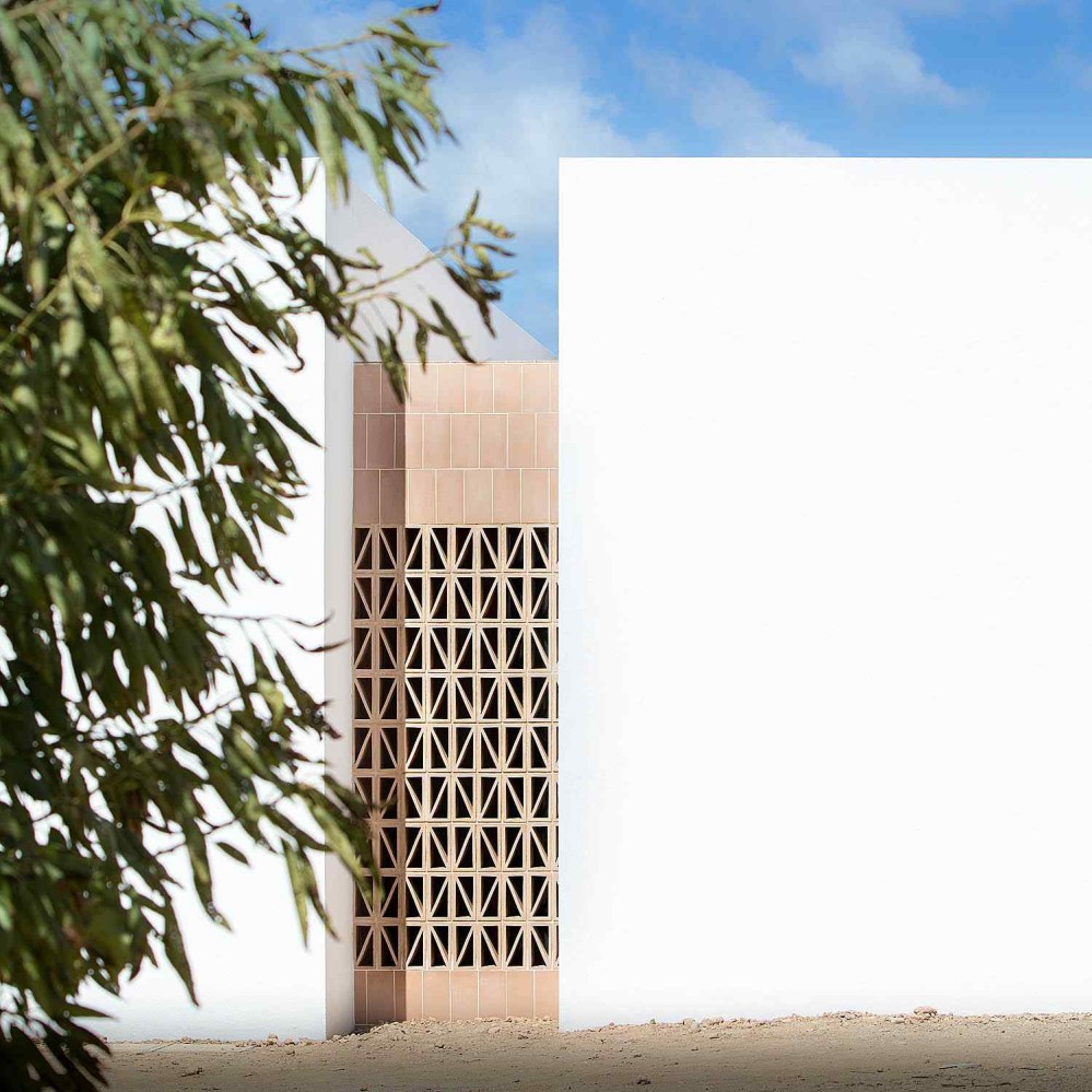
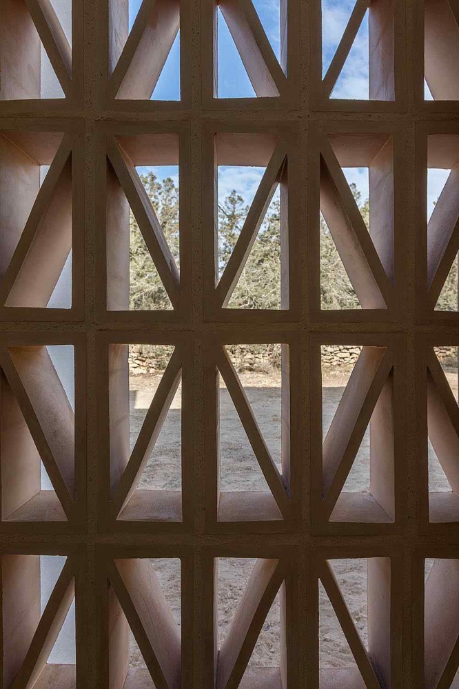
Marià Castelló Architecture
Website: m-ar.net
HQ: Formentera, Spain
Consider a giant paintbrush, hovering in the sky.
See this plane-sized brush gently disturb a family of clouds as it floats down, down, down, dipping bristles into the earth to pick up bits of terra cotta soil and weathered wood. Imagine that the brush begins to paint a structure in three dimensions.
When I see a building by Marià Castelló Architecture, this is how I imagine it was made.
Their projects have this quality where it feels as if the buildings embody something of the physical landscape in which they’re rooted, as well as the cultural landscape that surrounds them.
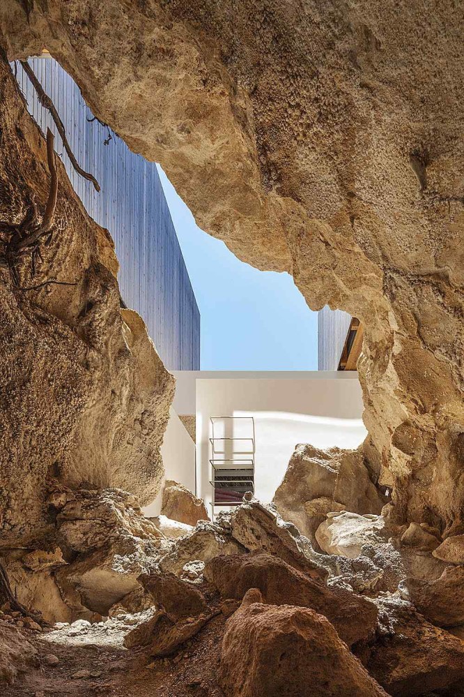
Part of how they achieve this, I think, is by designing the buildings with materials that are plentiful on the building site. I also suspect that they’re intentional about mirroring the colour of the natural landscape around the project.
I think these two things - reflecting the material and colour palette back into the landscape - aid that sense of familiarity, that feeling of “of course a building in this exact place would look like this - what else could it be?”
Several years ago, when I was much younger, a question I returned to often was “What is Ghanaian architecture?” Today, I suspect that much of what we describe as regional architectural style is often mostly a function of weather and climate, but at the time, my fledgling attempts to answer this question were focused on very surface-level treatments.
This is why I admire Marià Castelló Architecture, because it feels like they’ve cracked the code on how to make a building feel honest to its local context. Their buildings feel part of a living tradition.
This description of their Es Pou project featured in Dwell does a great job of bringing across how their projects feel like an extension of the landscape.
The warm colors of the surrounding oat and wheat fields have been brought inside by way of pressed terra-cotta tiles on the floors and Catalan boveda ceiling arches. In keeping with the hyperlocal intent, the firm sourced simple rattan and wood furniture from Formentera artisans. The lighting and more contemporary pieces of decor and furniture were designed, and in some cases handmade, in Castelló’s studio. Like the architecture itself, they were conceived to honor the unique balance of Formentera and its delicate historical memory.
Marià Castelló projects feel inevitable, and rooted in their place.
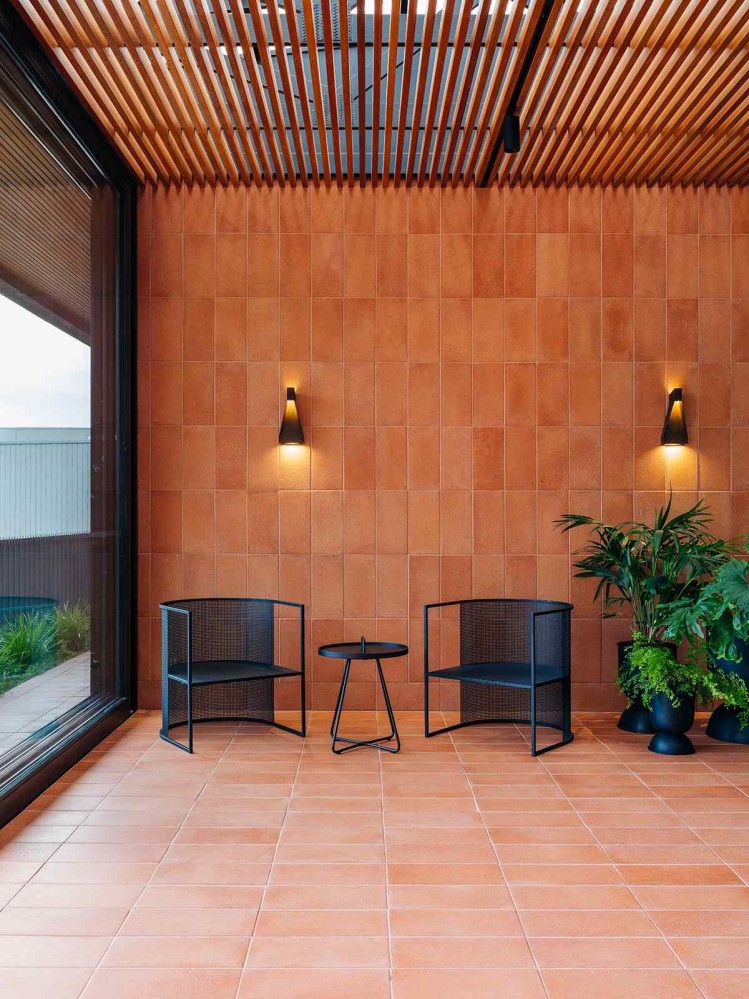
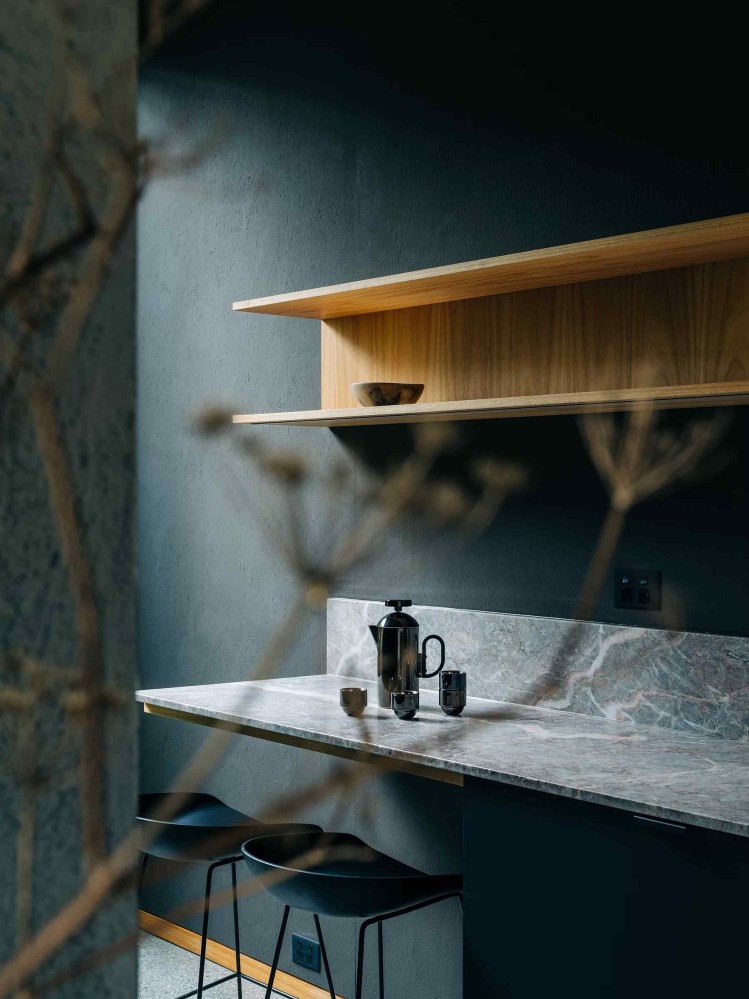
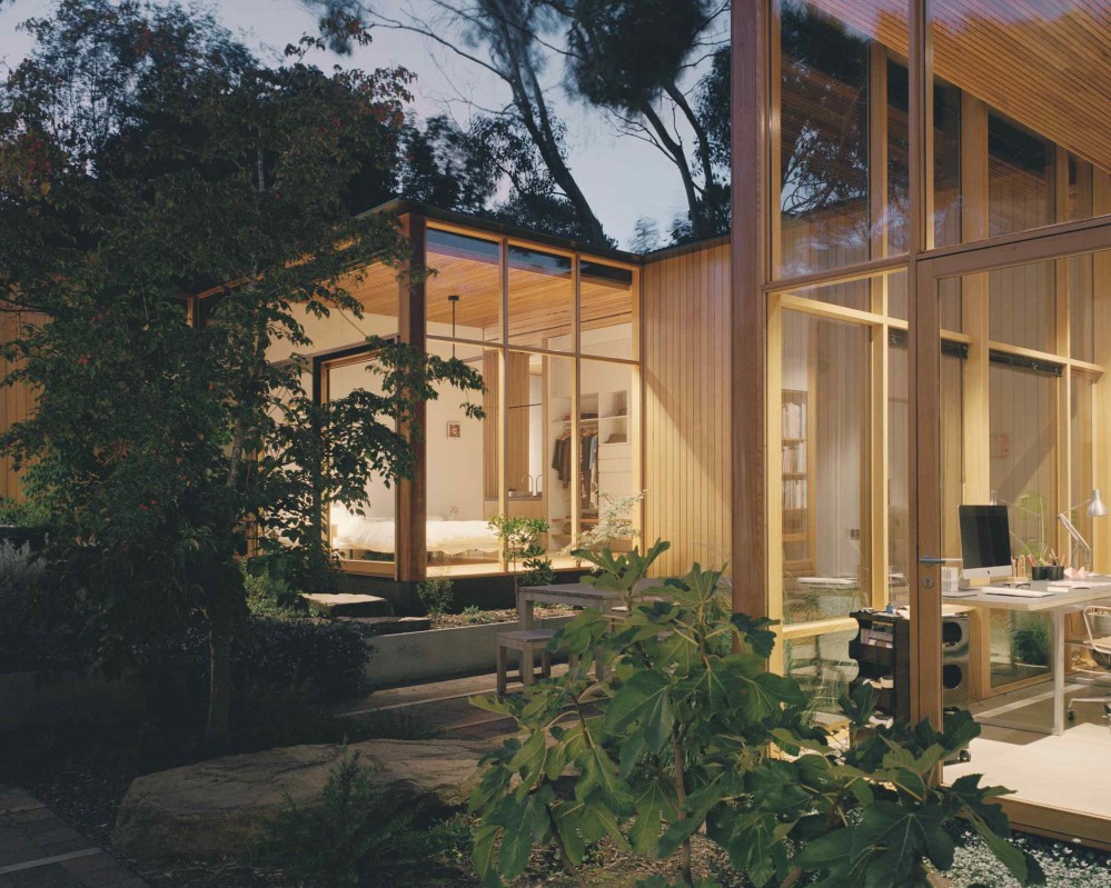
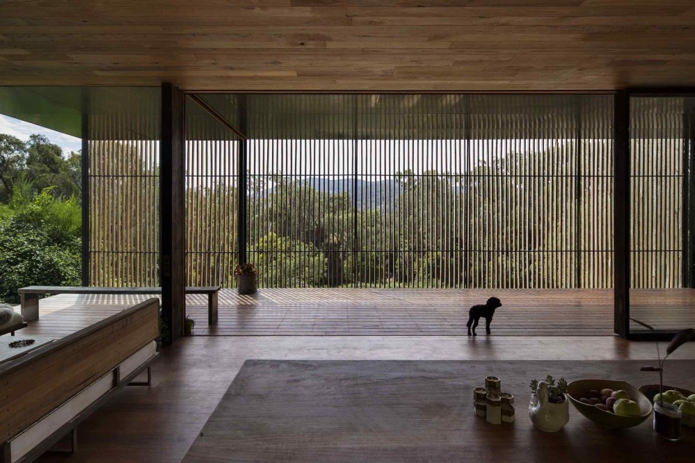
Archier
Website: archier.com.au
HQ: Fitzroy, Australia
The words I’ve found myself using when describing Archier’s work include lush and supple.
My favourite Archier projects involve elevation changes. Sometimes it’s a level change within a house, sometimes it’s them taking advantage of a cliff to create a dramatic view. They don’t do this on every project, so I can’t claim that elevation changes are a quintessential Archier move. But when they do do it, I love their choreography of soft rises and falls.
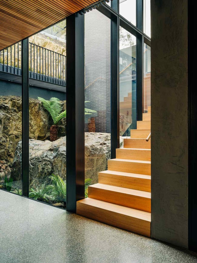
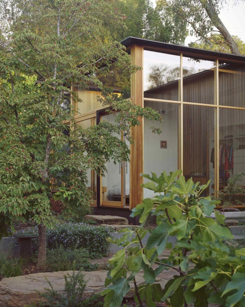
The only way I can describe it is that it feels like their buildings always embody a conversation between matter and void.
Sebastian Treese Architects
Website: sebastiantreese.de
HQ: Berlin, Germany
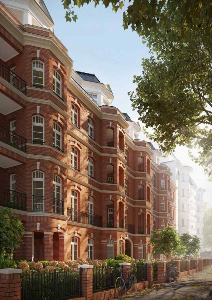
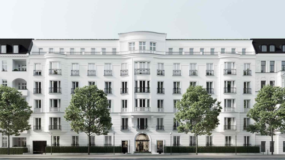
Sebastian Treese Architects works in a confident, classical language, unafraid to lean into ornament, urban fabric-level scale, and all the vernacular references that come with European heritage.
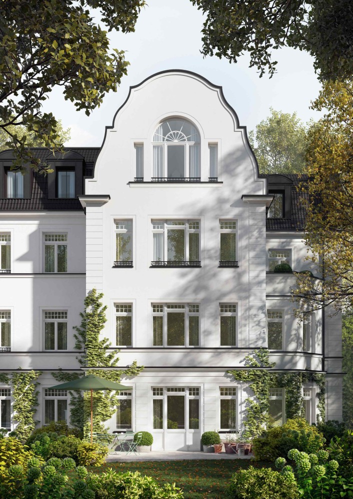
One of the reasons this studio is so interesting to me is because they represent an example of a European studio wrestling with the types of questions that I associate more with African studios. Specifically, questions around how to reconnect with a living tradition of the built environment.
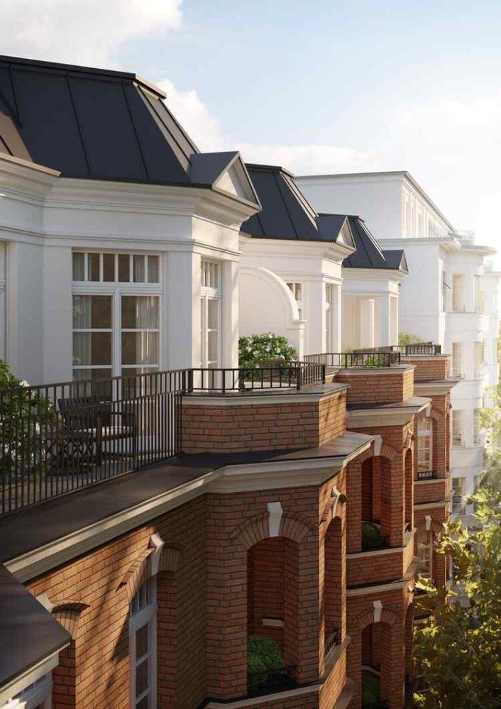
In Africa, we’re trying to piece together a design vocabulary in the long shadow of the colonial period. Sebastian Treese Architects is coming at wrestling with history from a different point of departure - the STA website points out matter-of-factly that “In Germany, it is impossible to have a quaint relationship with the past” - but it’s fascinating to see how deftly they make this language work for the modern world.
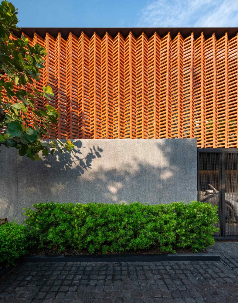
WARchitect
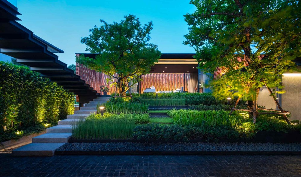
Website: warchitect.me
HQ: Bangkok, Thailand
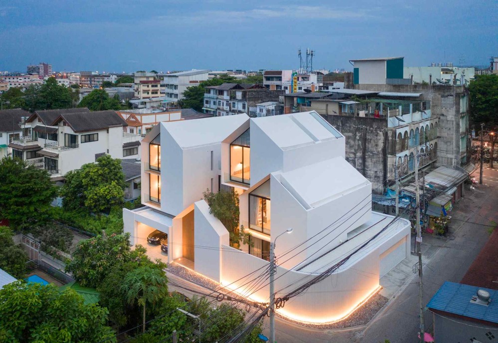
WARchitect designed my favourite building of 2021, Sleepless Residence. I’m obsessed with this building. I can earnestly say that it profoundly deepened my understanding of what it means for a building to mediate the threshold between indoor and outdoor.
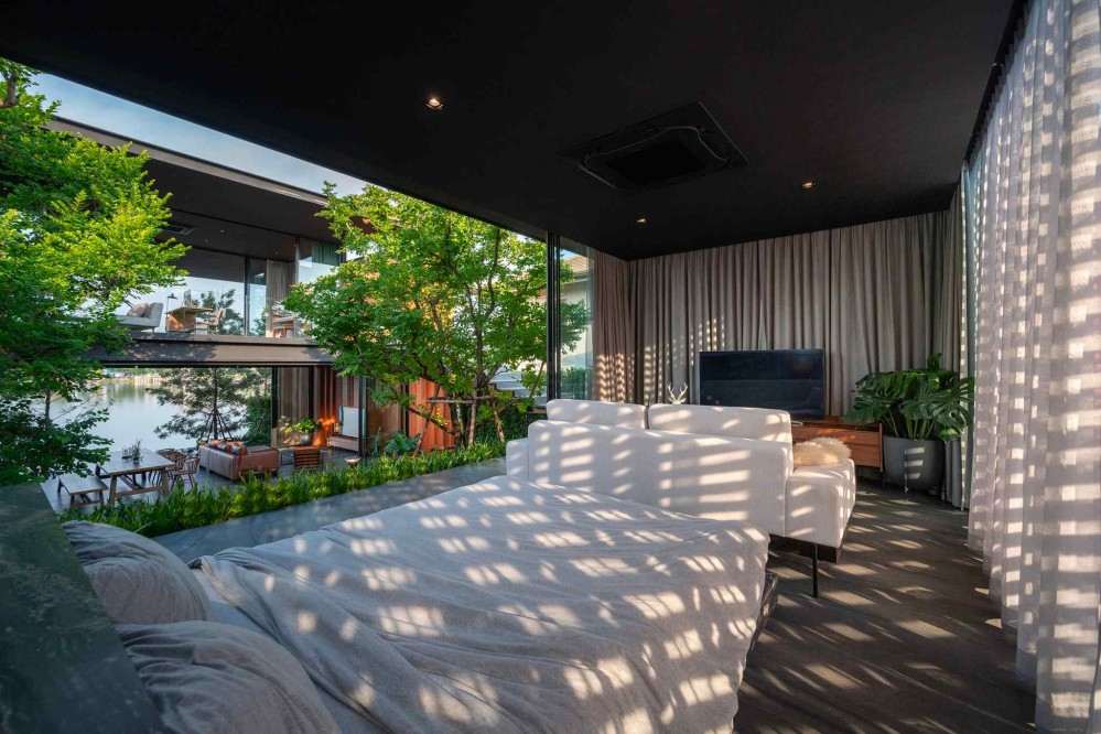
Photos simply don’t do it justice - please watch this video tour to get a more embodied sense of the space.
Based in Thailand, WARchitect takes full advantage of the tropical climate. Maybe related to this, I find that they’re always doing lovely things with screened facades.
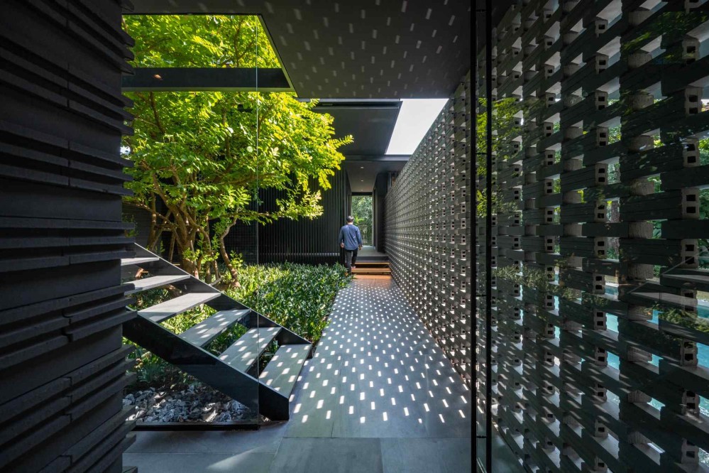
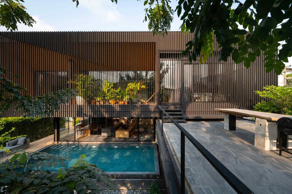
Another theme that they return to is thinness, and this pairs with an obsessive attention to detail. WARchitect will obsess over the visual perspective created by fractions of an inch in order to achieve the illusion of a plywood-thin ceiling, like they did in HACHI Skyscape.
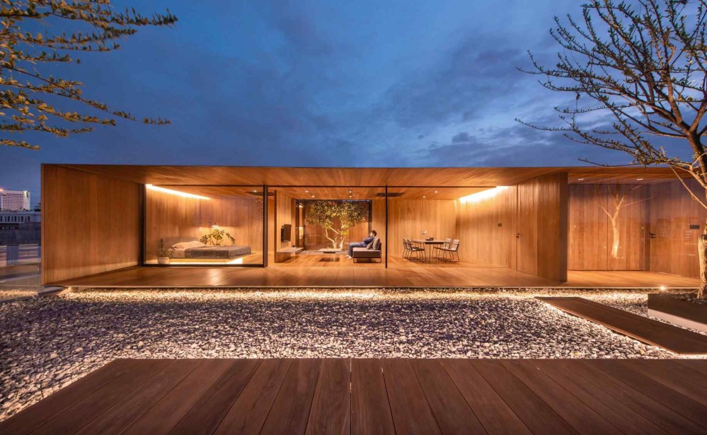
Thinness is not a fascination I share, but I can’t help but admire the lengths they’ll go to make a building feel paper-thin. It results in buildings that feel less like sculpture and more like origami.
While I personally believe that the human animal craves the tectonic assurance that a building is “solid,” and that a thick envelope provides this, I earnestly admire the feats of engineering WARchitect pulls off in pursuit of an idea of architecture as elegant planes, folded in space.
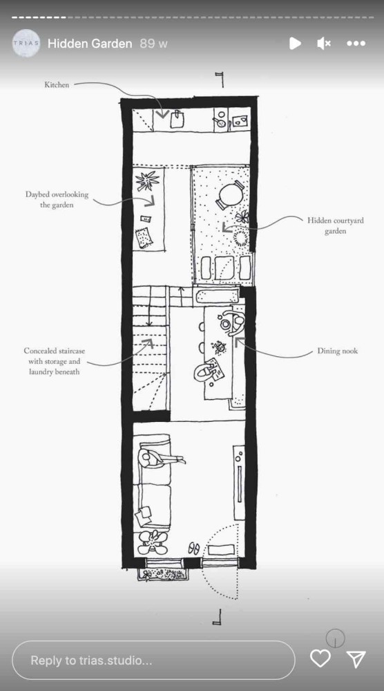
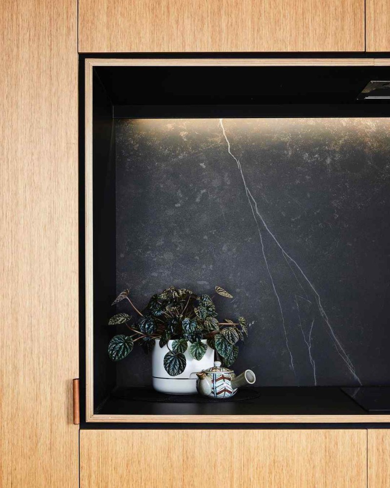
TRIAS
Website: trias.com.au
HQ: Sydney, Australia
TRIAS spaces feel like thoughtful, surgical interventions. They take a scalpel to space, making sure there is a reason for each line, each pause.
As designers, we advocate for less but better in all that we do.
…We see buildings as small acts, but significant ones. Accordingly, we design places that quietly provoke change in our cities, suburbs and landscapes — TRIAS
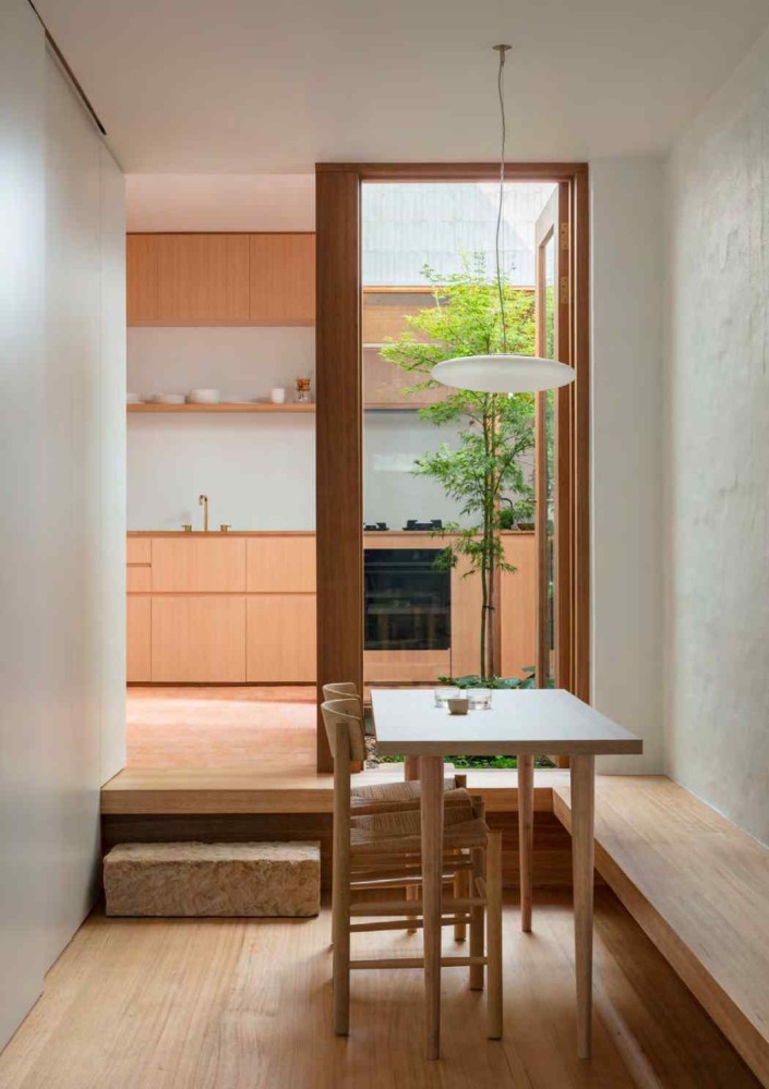
If beauty is embodied care, TRIAS spaces feel dense with care and meaning.
I love the plain-faced clarity of their hand drawings.
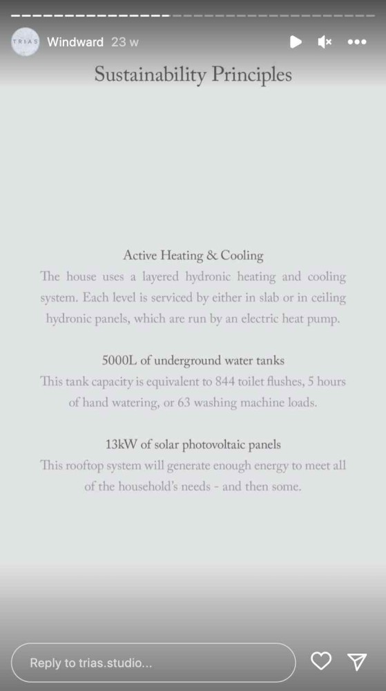
I love that they clearly state the sustainability tactics they employ for each project.
And I love that they appear to approach each project as a material composition, or a choreography of haptic experiences.
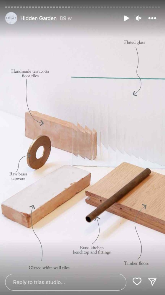
I encourage you to watch this tour of their Hidden Garden project to get a better sense of how a TRIAS home feels.
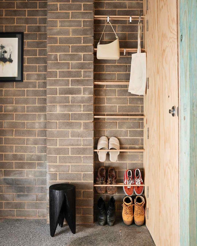
Tsai Design
Website: tsaidesign.com.au
HQ: Geelong, Australia
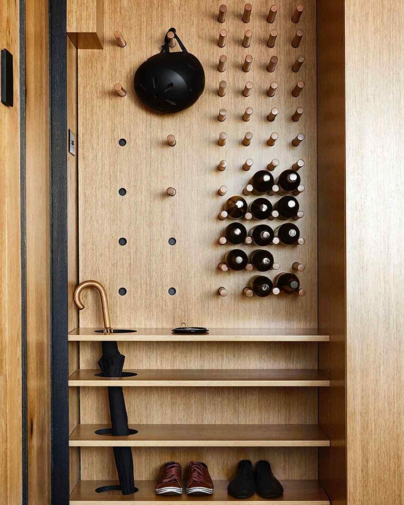
My favourite studios have a gift for folding a mind-bending amount of utility into space, and Tsai Design excels at this.
In the example below, a small closet-width wall becomes a wine rack, shoe rack, an umbrella stand, coat hangers, a console table for small items like keys, and a door stopper (that’s the block of wood at the top left).
Too many buildings fail us with unrealised potential.
Dimly-lit terraces. Busy shops with underutilised first floor residences. Family homes that do little to support a life with kids. Tsai Design challenges these buildings to step up: to work harder; to make better use of the spaces they occupy, and to contribute more meaningfully to their neighbourhoods. — Tsai Design
My favourite example of this skill in action is their Small Grand Apartment project, where the kitchen countertop loops around a corner, past a hidden door, to become the countertop of the bathroom. I gasped when they revealed this move in this apartment tour.
I love this principle of interrogating every inch, every square meter of a space, to unveil how it can do more.
McLean Quinlan
Website: mcleanquinlan.com
HQ: London, United Kingdom
McLean Quinlan taught me that there is such a thing as a contemporary approach to proportion and composition, and that when applied to a palette of traditional materials, it creates an object that feels timeless.
Said differently, you can use roughly the same materials as a building made a long time ago, but if you tweak something about the dimensions of walls, doors, windows, and how materials connect to each other, it creates an emergent property in the building where it becomes unmoored from time, and feels oddly contemporary, regardless of when it is situated.
I can’t put my finger on why, but I enjoy how they describe themselves. They call themselves “housemakers.”
We are housemakers creating distinct, beautifully crafted, architecture in the town, the countryside, in the UK and overseas.
We love what we do; delighting in the detail, the use of light and materials, the sensory, the tactile, and the making of spaces that age with grace. — McLean Quinlan
Maybe “housemaker” has something about it that puts you in mind of other carefully crafted objects, like a fine coat, or a mechanical watch.
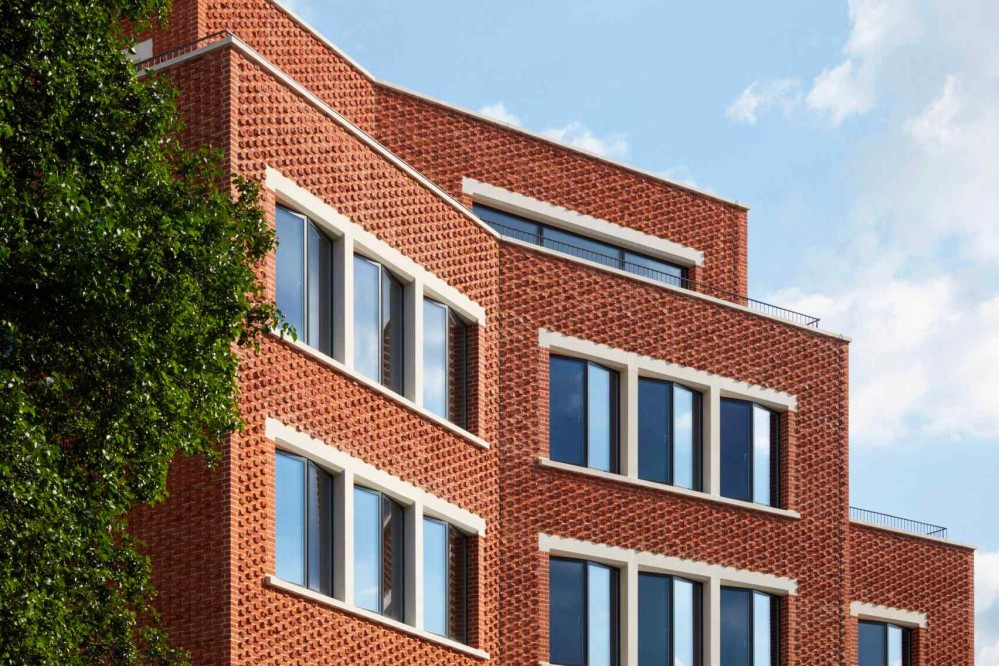
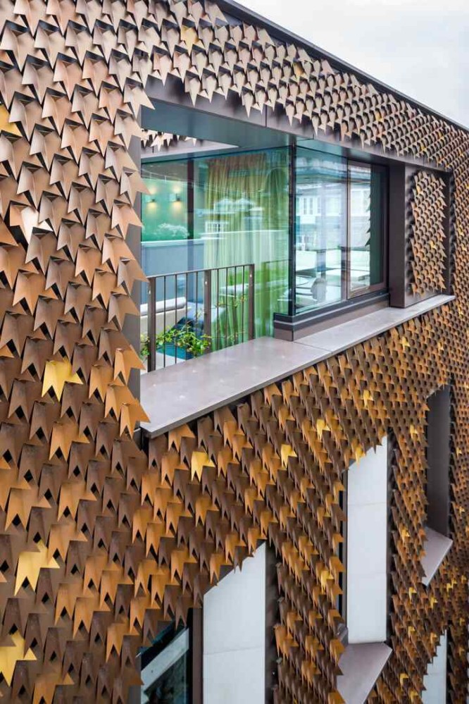
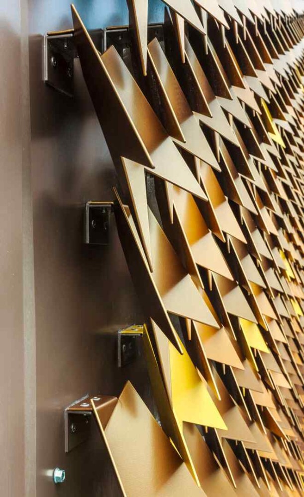
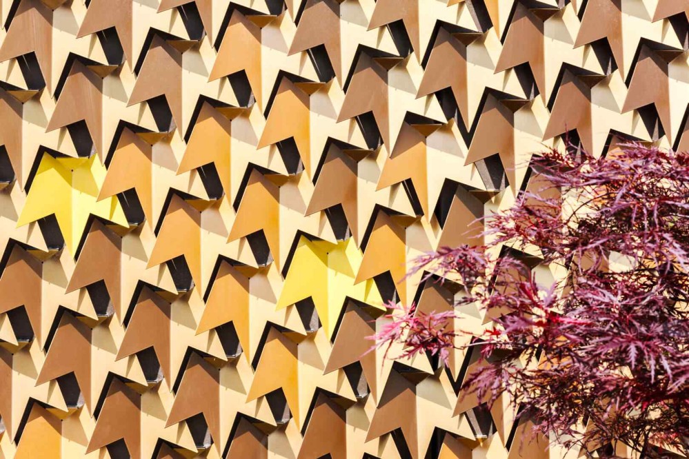
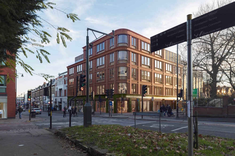
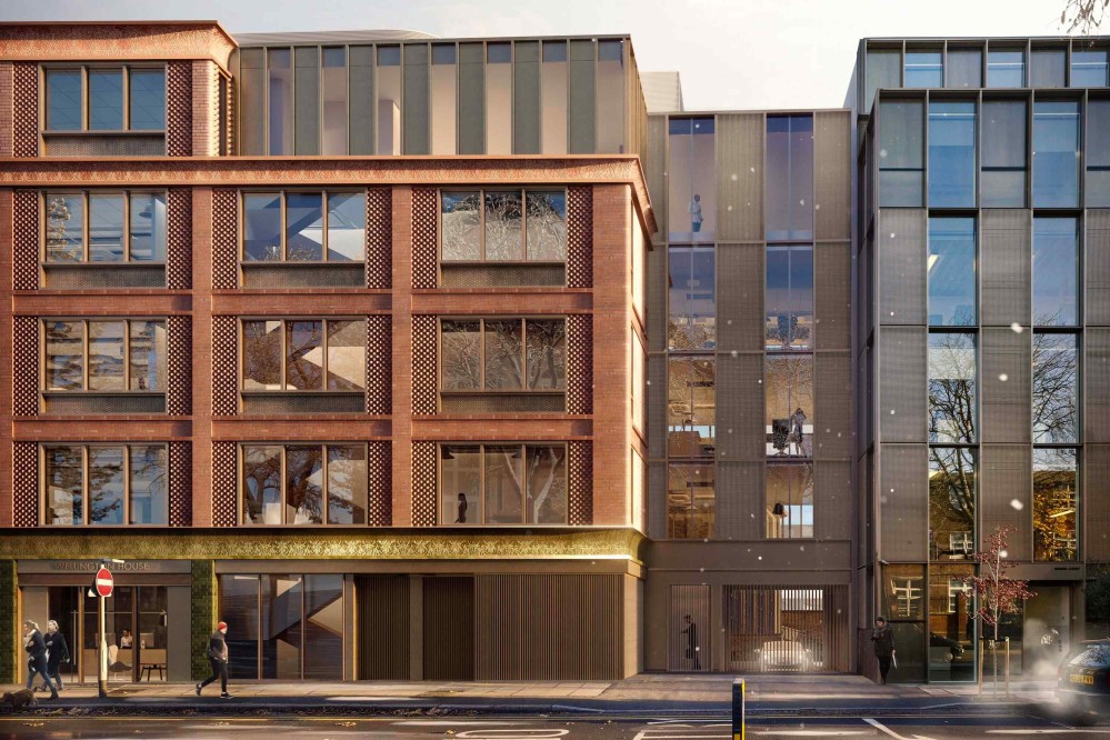
Squire & Partners
Website: squireandpartners.com
HQ: London, United Kingdom
Squire & Partners taught me that ornament is not dead, and that if architecture embodies values, then the skin of a building, too, performs work, and one must choose the story that skin tells.
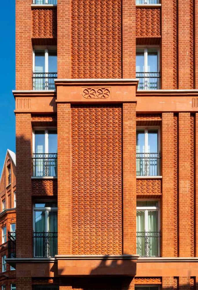
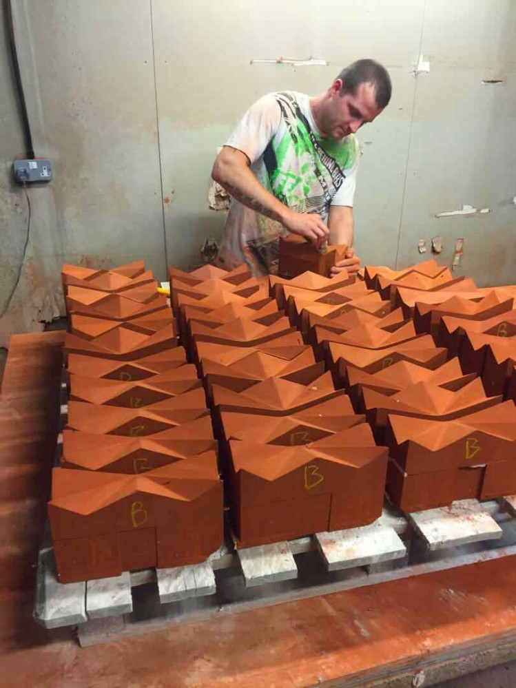
When Squire & Partners designs, it feels like that skin-story was an intentional choice.
Bevan & Liberatos
Website: bandlarchitects.com
HQ: Charleston, South Carolina, USA
Bevan & Liberatos taught me that:
…there is a place for traditional architecture in our time, that there is wisdom in traditional architecture that contributes not only to the longevity of a building - pitched roofs, projecting eaves, drips, moldings and ornament that redirect water, sills, etc. - but also, of course, to the beauty of a building. — Bevan & Liberatos
I enjoy how they’re making traditional building typologies of the American South work for contemporary living, and I’m curious what space-shapers in Africa can learn from their approach to providing shelter in somewhat similar climates.
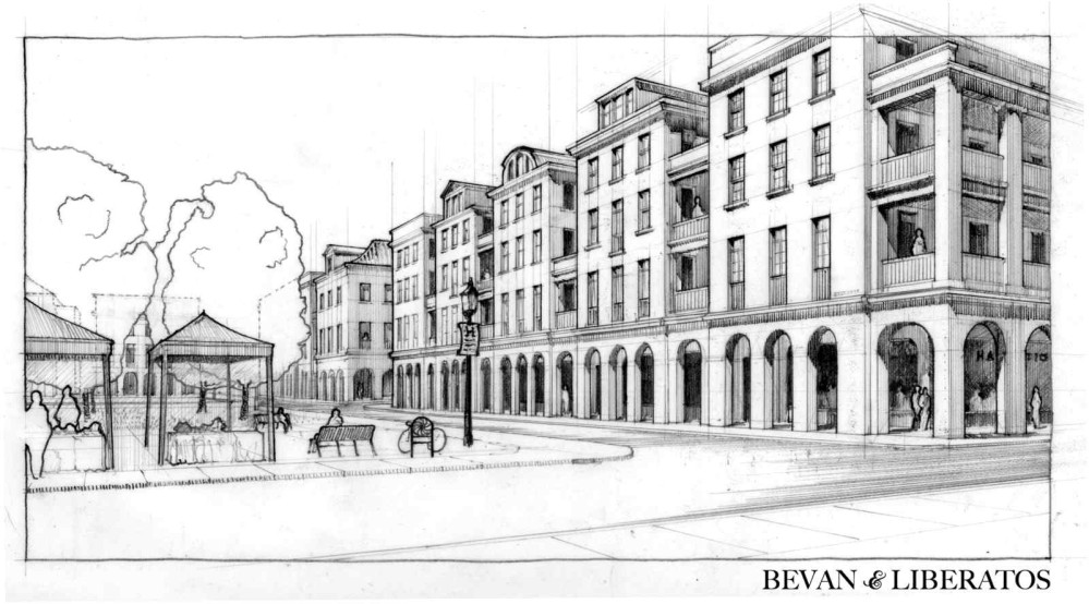
Here is a small, very random thing I enjoy when I see their work: their designs always seem to assume the existence of public life.
Granted, the prevailing urban condition does a lot of this heavy lifting - if your city’s rules don’t allow you to build right up to the lot line, you won’t be able to build right up to the lot line - but regardless, this is a quality I notice in their work: that embedded within the design is the easy assumption that a civic life exists one step outside the door, and that the buildings are active participants in it.
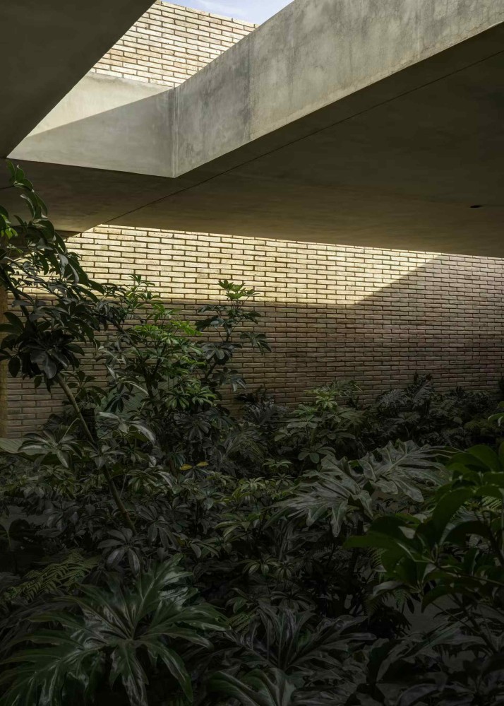
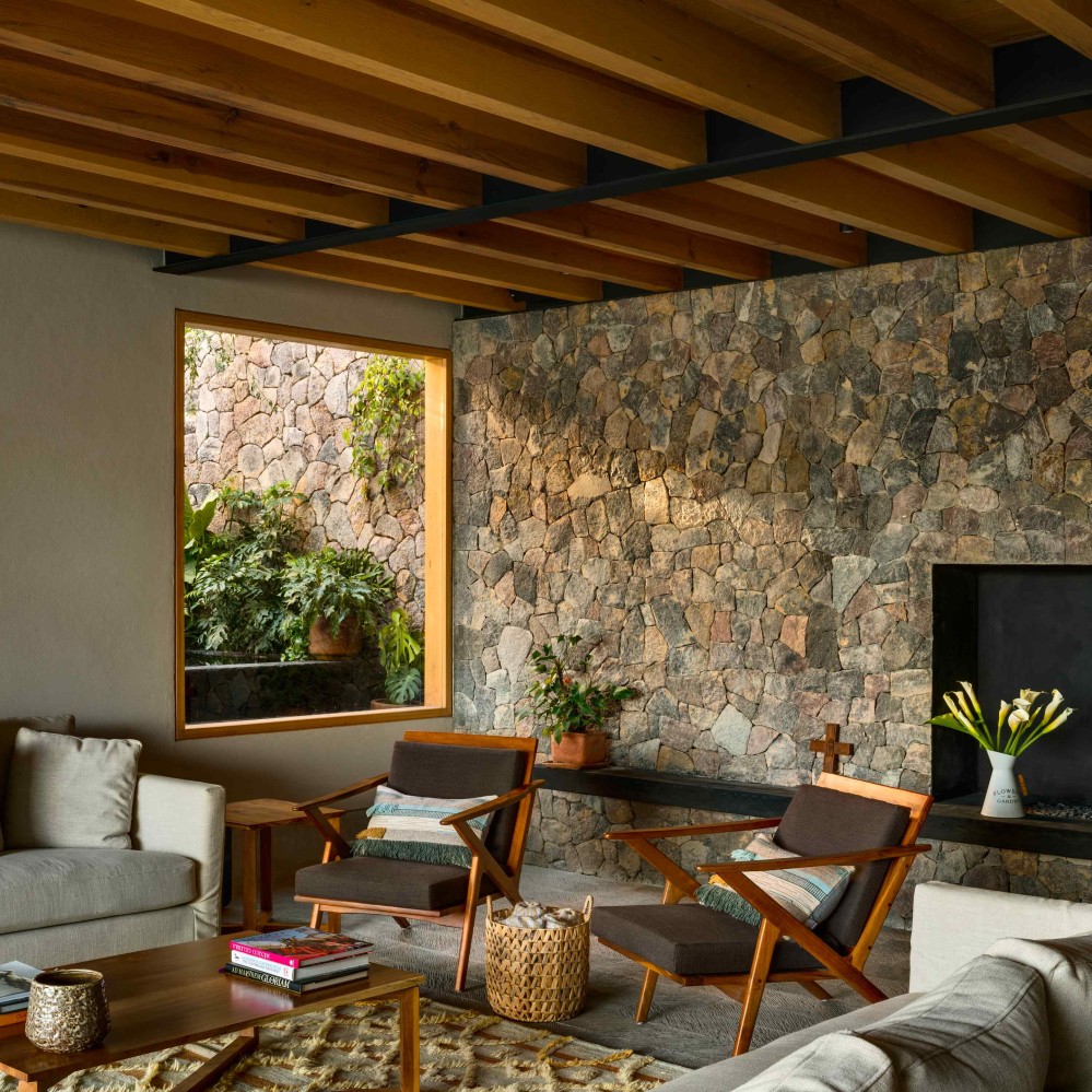
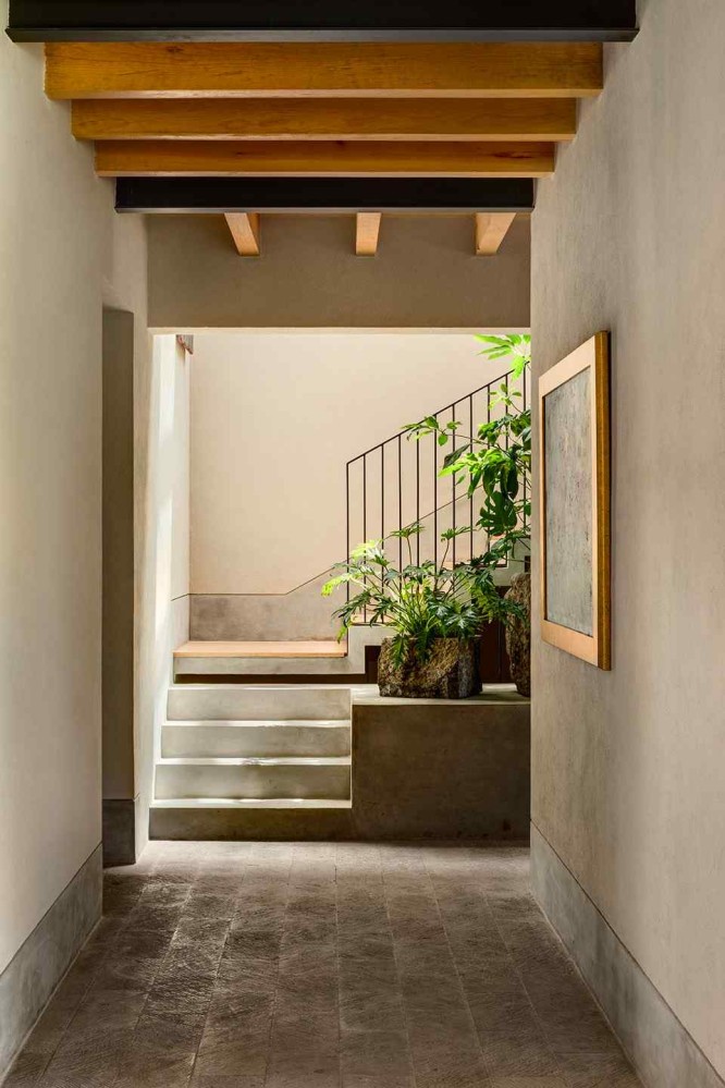
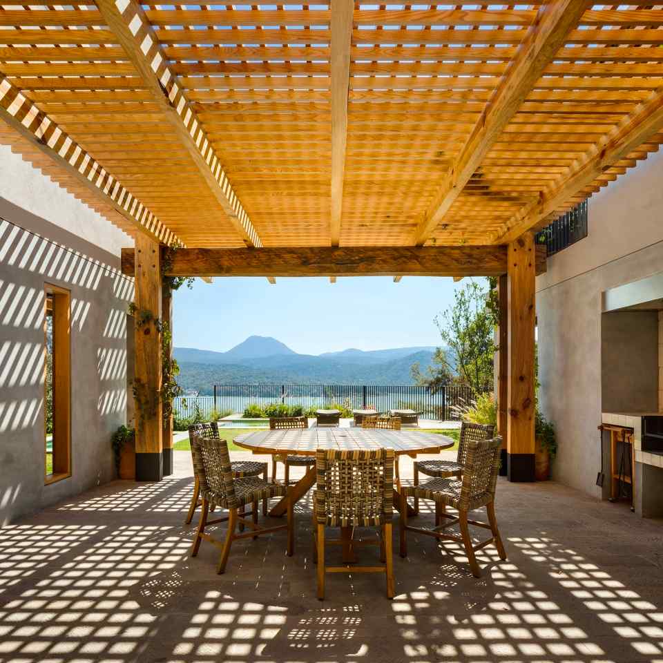
Arquitectura Sergio Portillo
Website: asp.mx
HQ: Mexico City, Mexico
Often, I get the mad idea that if I stare long enough at a building by Arquitectura Sergio Portillo, I will come into some profound insight into how to design and build for the kinds of environments we have in West Africa.
In their work, I see them wrestle with the reality of harsh sunlight, like we do here, and I love them for it. Their solutions include deep eaves, deep balconies, and a constant pursuit of shade.
Other moves I’ve come to consider characteristic of their work include a very strong sense of enclosure due to high masonry walls, and playful level changes, especially the visual illusion where a two or three storey building appears to be a low one-storey bungalow from the street.
Let me talk again about light: ASP work always feels like a careful mediation of light.
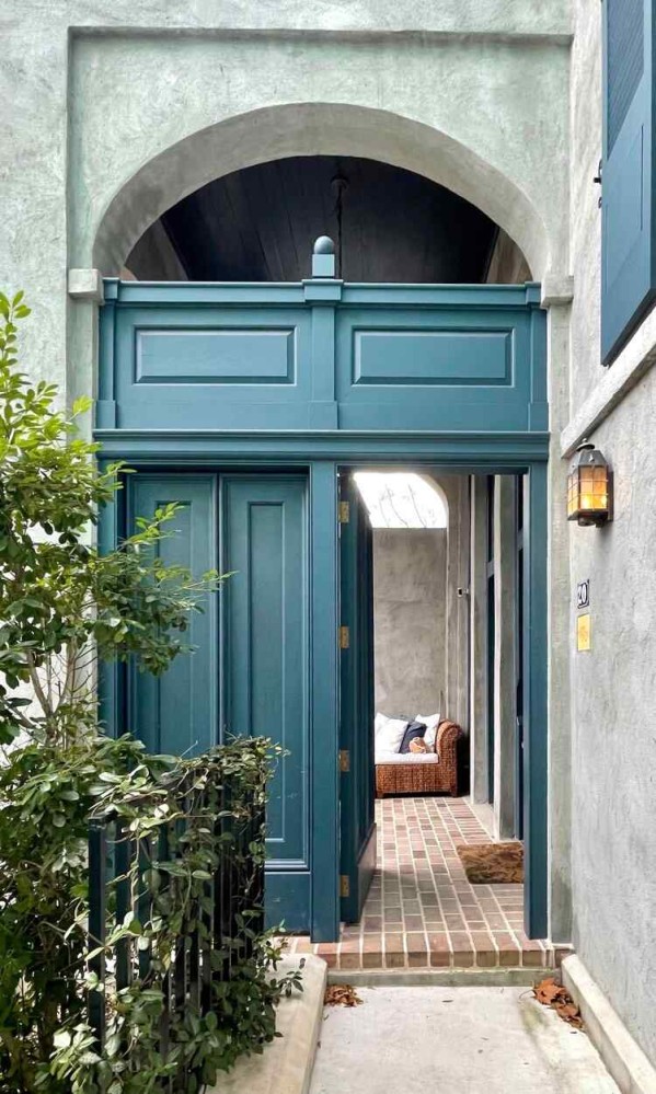
Ryan Street Architects
Website: ryanstreet.com
HQ: Austin, Texas, USA
The word “luxury” is overused in residential construction, but there is something about RSA work that makes you think that it’s deserved.
These are simply generous, well-appointed homes. There’s just an easy confidence in the richness of the colour and texture of spaces.
You get the distinct sense that, unburdened by the concern of making a move that would be a financial burden to fix, the makers have allowed themselves luxuriate in tiny details that would otherwise have been value-engineered away. In the photo below, for example, look closely at the detailing around this arched door.
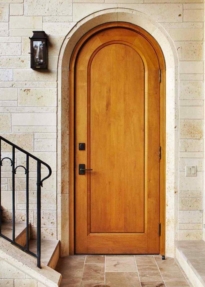
There’s a thin scoring around the stone, then an angled plane in the stone towards the door proper, and then several lines, each stepping deeper into the doorway, that both creates a satisfyingly thick edge, and reinforces the sense of an arch. And then note also how the very top of the arch in the wooden door is called out by a different stain of wood. This single doorway reads like a flurry of butterfly kisses against one’s face - innocent, playful, and delightful, with no need to justify its loveliness.
It’s very easy for these sprawling mansions to read as overly large, but RSA succeeds in making every square meter feel considered.
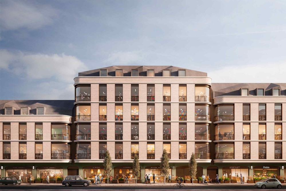
MATT Architecture
Website: mattarchitecture.com
HQ: London, UK
Architects do far more than just make buildings pretty. They’re problem solvers who happen to use the built environment as their medium, and MATT Architecture perfectly exemplifies this.
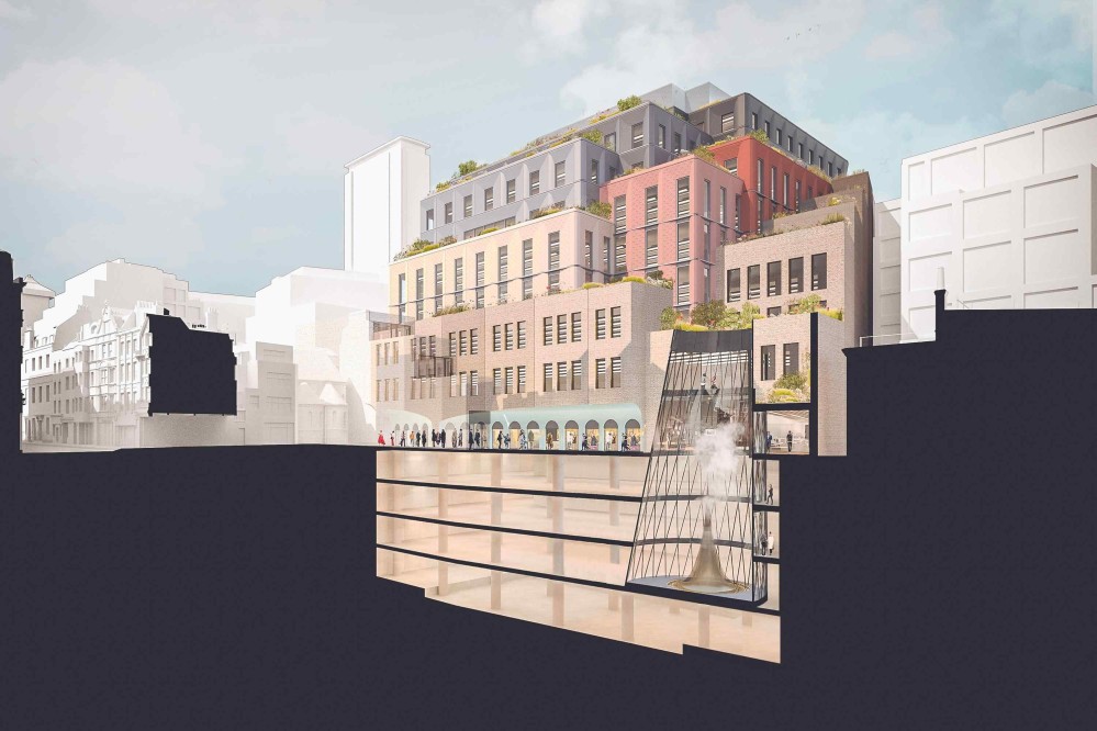
I love how, when they write about their projects, they take care to explain how their intervention solves a problem. For their Wilton Road project, for example, they explain how:
- it triples the area on site, resulting in being able to rent to more businesses, and new employment in the area
- in response to a concern that the existing road already gets blocked by busses and bin lorries, they created a new space for vehicles, to keep traffic flowing
- the “hybrid steel/cross laminated timber structural system means that instead of pumping 1500 tons of CO2 into the atmosphere during the building’s construction we’ll be taking 1500 tons of CO2 out.”
This is an example of what it means to use architecture as a tool to solve all kinds of problems - even economic, traffic, and environmental problems.
Another reason this studio was one of my favourites of 2021 is that the style they appear to return to feels like a conversation between the present, and London’s architectural heritage. Brick cladding, rounded corners, and ornament go a long way to make a building feel both contemporary but part of a living tradition. It feels like a respectful refinement of what has come before.
One final important thing to mention about MATT Architecture: the copy on their website is hilarious. It’s rare to find a studio that can communicate clearly about what they do, and even more rare to find one that does so with so much good humour. Reading the project pages on the MATT Architecture website is a pure delight.
GROUPWORK
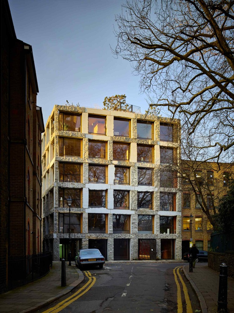
Website: groupwork.uk.com
HQ: London, UK
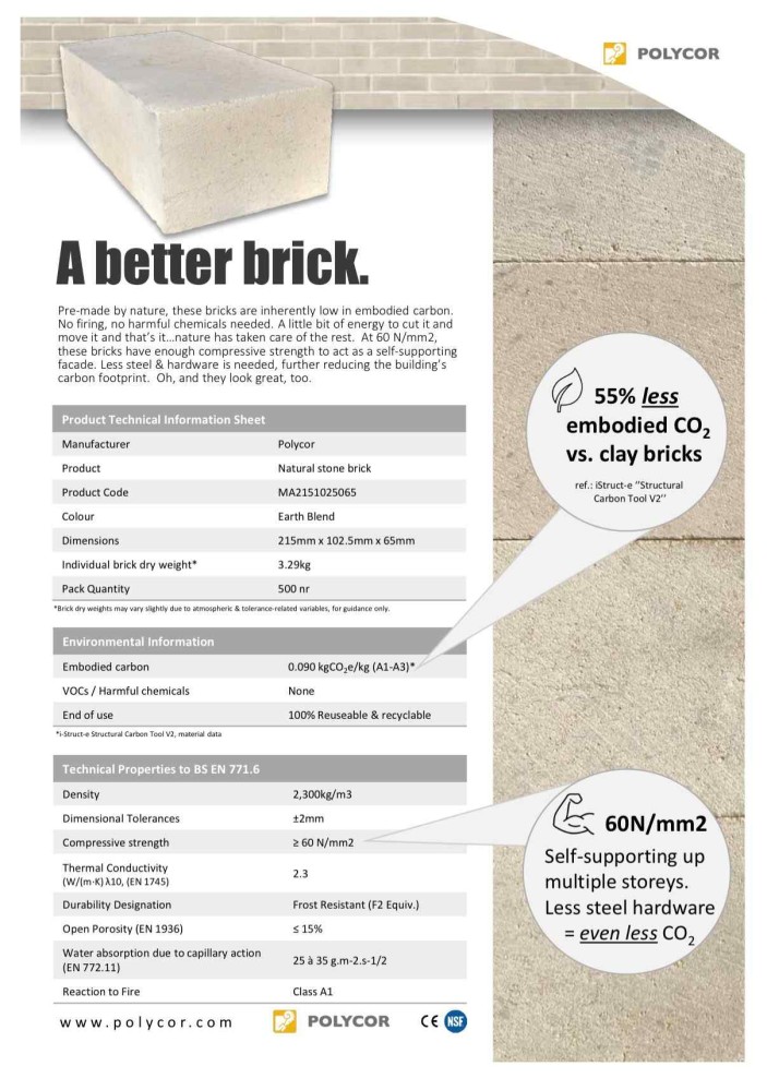
This studio sparked in me an obsession with stone as a building material. I had no idea how versatile and superior stone is on various sustainability metrics when compared to other materials.
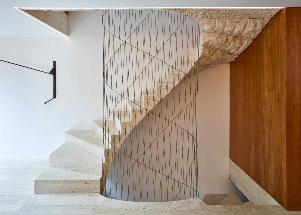
The studio is on a campaign to get other architects and contractors to come awake to stone as a structural material, as opposed to the dominant practice of using steel as the structure and stone only as the cladding. This Twitter thread is a great introduction to the benefits of stone over concrete or fired clay brick.
If you’re at all curious about this topic, I strongly recommend following the GROUPWORK Twitter account - it’s a goldmine of information on structural stone.
Fouad Samara Architects
Website: fouadsamaraarchitects.com
HQ: Beirut, Lebanon
I’ve spent a long time attempting to articulate why I’m so intrigued by this studio, and I think it comes down to being fascinated by their forms.
The forms themselves are often simple compositions of rectangles, but there’s almost always this move where they’ll have very heavy mass act as a frame for a heartbreakingly delicate, light-filled volume.
The lighter volume feels like it’s “cradled” within or between the heavy masonry - like a large soap bubble held between the fingers of a giant. There’s something really beautiful about that sense of being held securely, that sense of gentle enclosure.
What were the recurring themes across these 16 studios?
The first was ornament. In architecture school, I got the sense that ornament was something to be vaguely embarrassed about, but there is something happening within me right now that’s nudging me to take seriously the idea that there is real work that ornament does.
Another theme was buildings as part of a living tradition. There was a period of time where the formal architecture establishment felt the need to reject the past completely. It feels like we’re moving away from that dogmatism, towards acknowledging that knowledge compounds, and that the past can provide strong foundations upon which to build.
It makes sense that 2021 was also when I became more aware of structure, because the family home project was the first time I properly appreciated how the facade of a building is frequently a byproduct of its skeleton. It feels very obvious to say this, but: how a thing is built will have profound implications of everything from cost, to longevity.
Finally, the idea that matter is embodied feeling. Even now, I feel almost sheepish admitting that I believe that matter can embody associations, moods, politics, values. Why does it feel slightly dangerous to vocalize this, when it feels so obvious?
If you’re curious to see my list of favourite studios from the year before, here is the 2020 list.
(If you enjoy my writing and want to support my personal research projects, the best way is to buy me a book!)
-
Better Places
-
Better Places
-
Better Places