Favourite architecture studios of 2022
“Some places feel better than others. Why?” This is a question I keep returning to, and I’m grateful to the architects who broaden my understanding of how to tune space.
This is the third edition of an annual list of my favourite architecture studios. The selection criteria were that:
- I learned something from them about how to shape space
- I encountered their work for the first time in 2022
Here are the lists from previous years: 2021, 2020.
Roman and Williams
Website: romanandwilliams.com
HQ: New York, USA
The first lesson that Roman and Williams taught me is that different creative lived experiences can colour how people approach shaping space. That, if space is a language we read with our skin, and if creative practice is on some level, embodied knowledge, then when we approach the task of space shaping, our ideas and decisions are influenced by our other creative lives.
Would a classically trained musician make different architecture design decisions, coloured by their refined acoustic sense? Might a sculptor who works primarily in stone think differently about form? Could a poet who plays with meter have different assumptions about how different proportions generative different moods?
After Roman and Williams, I believe the answer to these questions is “very likely.”
The design sensibility of founders Stephen Alesch and Robin Standefer were shaped by their background in set design - they actually met on a Hollywood film set - and the lessons learned designing spaces never left them. The studio’s work embraces the idea of architecture as stage, both itself a performance, as well as a backdrop to the dramas of our lives.
This sense of “architecture as stage” comes through in their beautiful presentation drawings, still drawn by hand by co-founder Alesch. Architecture drawings can do important work in communicating feeling, and the way Roman and Williams chooses to represent their drawings reads almost like drafts from an old-school Disney animation. There’s a vitality and active energy to them, inviting you project yourself as a character into the space.
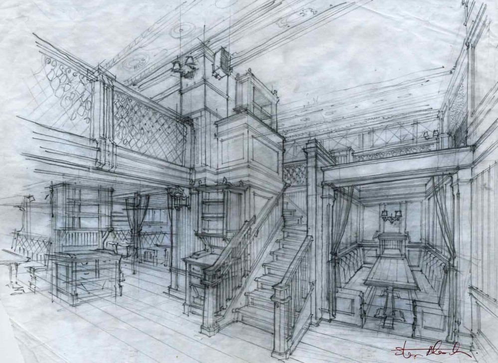
This studio reminded me that architecture drawings are not passive acts of documentation - they can be infused with narrative meaning.
You would assume that since their origins were rooted in film set design, their interest in space design might only be facade-deep, but the reality appears to the opposite. Roman and Williams cares a lot about materials and the physical feeling of inhabiting their spaces. It’s not enough that their spaces excite the eye; when someone is transported there, the journey must be rewarded with a dense mix of textures, smells, and sounds that don’t come through in an image.
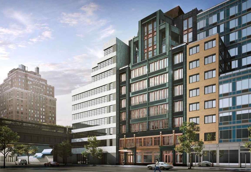
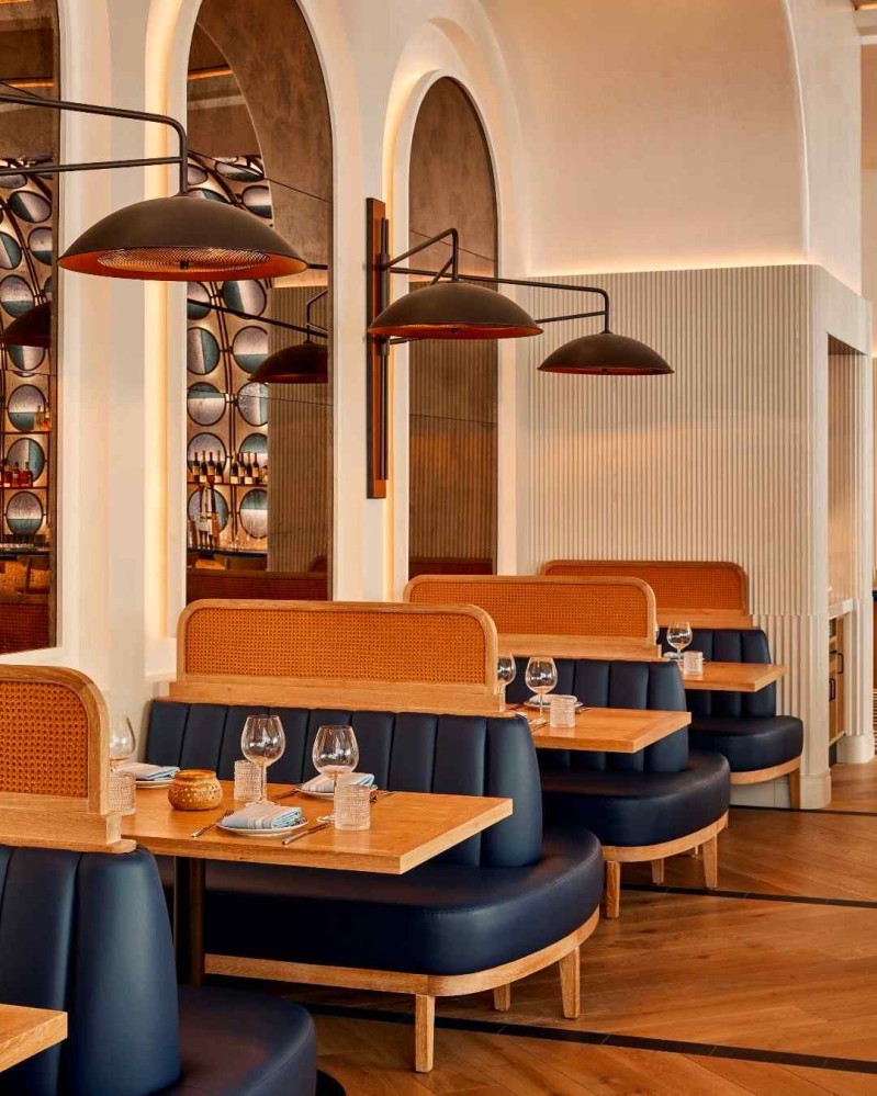
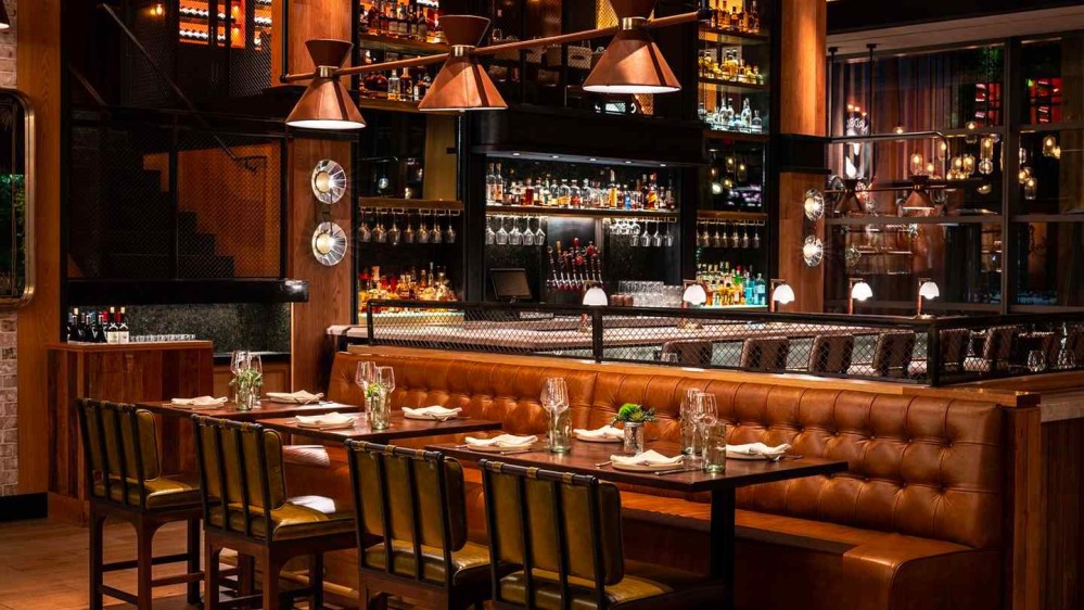
Here is how they describe the material palette in their Tin Building project, which contains over fifteen different restaurants and bars.
Each restaurant–with its own design identity and own atmosphere–punctuates the space to create a journey of discovery while remaining of a piece with the overall market.
On the ground floor, T. Brasserie riffs on classic French brasserie decor with antique mirrors, Art Nouveau–style tilework, and marble tabletops and counters. In the building’s opposite corner, the team opted for a dark, sexy palette in the sushi bar, Shikku, with black concrete floors, charred shou sugi ban millwork, and dusky marble counters.
Across the way, the Spoiled Parrot candy shop offers an over-the-top fantasy with exuberant pinks, rose mirrored ceiling and walls, and a swirl of globe lights.
Tucked away, speakeasy style, House of the Red Pearl features luxurious velvet-upholstered banquettes and horseshoe-style armchairs, gold-on-red Chinoiserie wallpaper, and glowing lanterns.
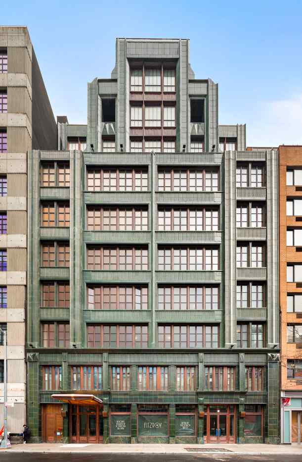
That care for tactility comes through powerfully in The Fitzroy, my favourite of their building projects. That green terra cotta facade with wood and brass accents is unapologetically lush.
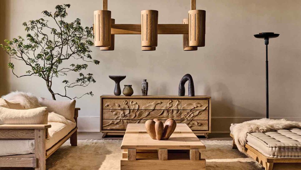
It also comes through once again when they design home goods. They have a clear preference for heavy, sturdy items that promise to become heirlooms.
Take their Lab Desk Lamp: “The Lab lamp is our archetypal version of a library light, and a physical realization of our appetite for weight and gravity. At 16 pounds, it is the most substantial of our lighting offerings, hand-crafted from solid brass that is painstakingly melted, cast and folded to achieve a striking, confident silhouette.”
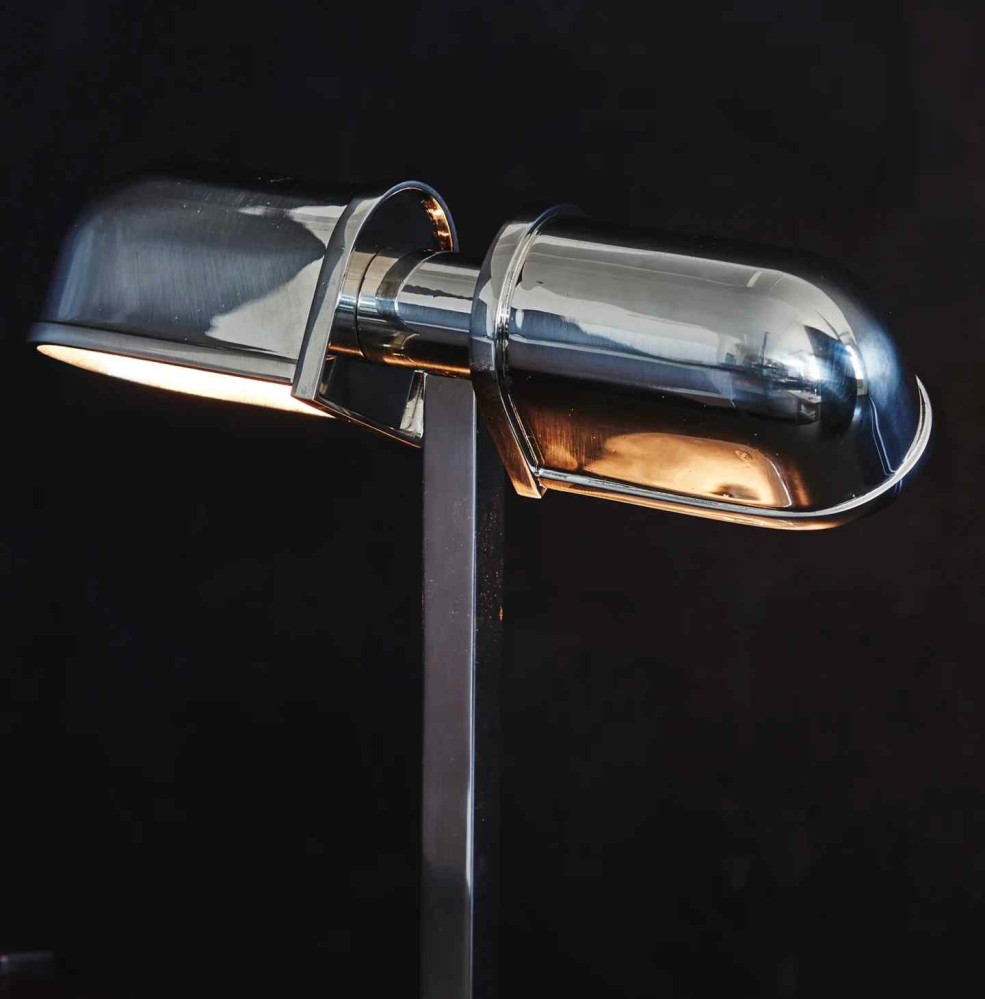
These objects aren’t made heavy merely to take up space. Roman and William objects assert themselves so that they can cultivate and absorb attention, so that they become dense with meaning.
At whatever scale Roman and Williams designs - from object to building - they do so with the intention to make something that will be woven into the tapestry of someone’s story, and by doing so, make that story more interesting, and more memorable. Their creations are background characters that amplify what’s happening around them.
Overall, Roman and Williams pushed my understanding of what an architecture studio can be.
We create buildings, spaces, and objects that collapse past, present, and future. We have a reverence for the history, materials, and techniques of the past with an ever-present focus on the now.
We animate spaces by unearthing stories, amplifying traditions, and reinterpreting symbols. Everything we design, from an object to a building, is underpinned by narrative.
We design things that are meant to be well-used and long-lasting, embracing the beauty of time and wear and rejecting the preciousness of the untouchable. We hope that our buildings and objects will live well beyond us.
Stories + histories + legacies. Their primary product appears to not be architecture, but culture, which happens to be embodied in different kinds of culture-object vessels.
No wonder that in addition to the architecture and interior design studio, they also own an art gallery, a French restaurant, and a physical and online store through which they sell beautiful furniture and lighting.
Roman and Williams present such a hopeful vision of the future for architecture studios, one that isn’t bogged down by a sterile, hermetically sealed ivory tower of abstractions and manifestoes, but instead gets busy with the joyful creative work of making and living. More stories - more shapes of them, more colours and textures of them that become histories, and on a long enough timescale, legacies that precipitate their own stories.
Roman and Williams reminds us of the power of space shaping to do this. I am thankful for their example.
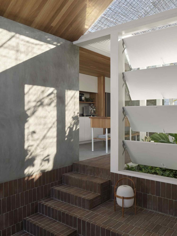
John Ellway
Website: jellway.com
HQ: Brisbane, Australia
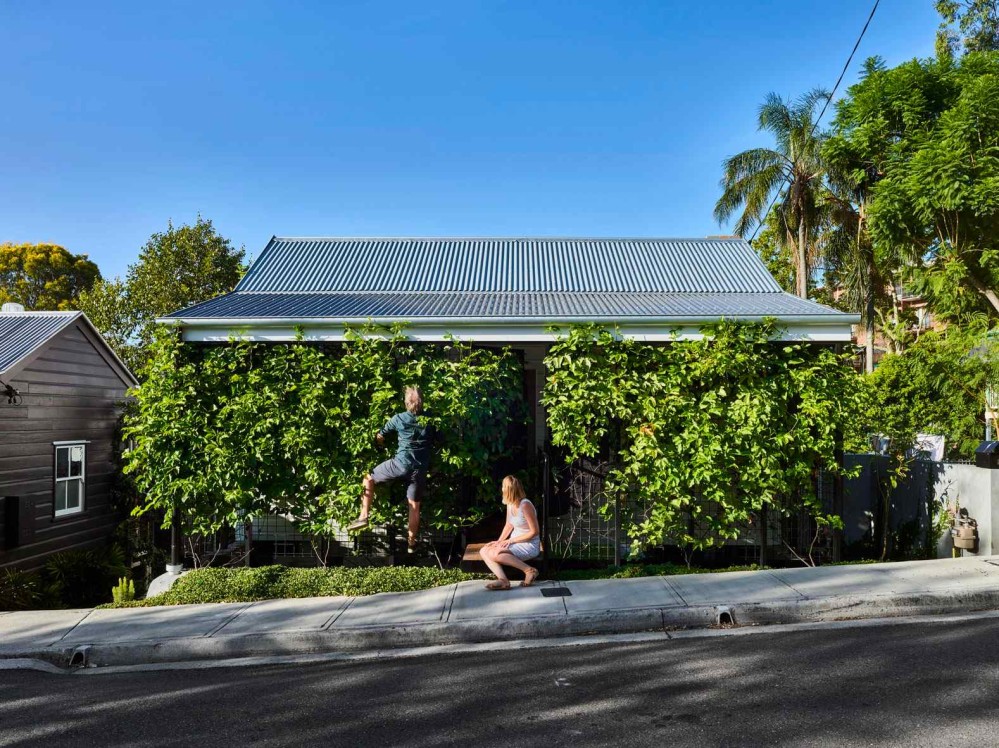
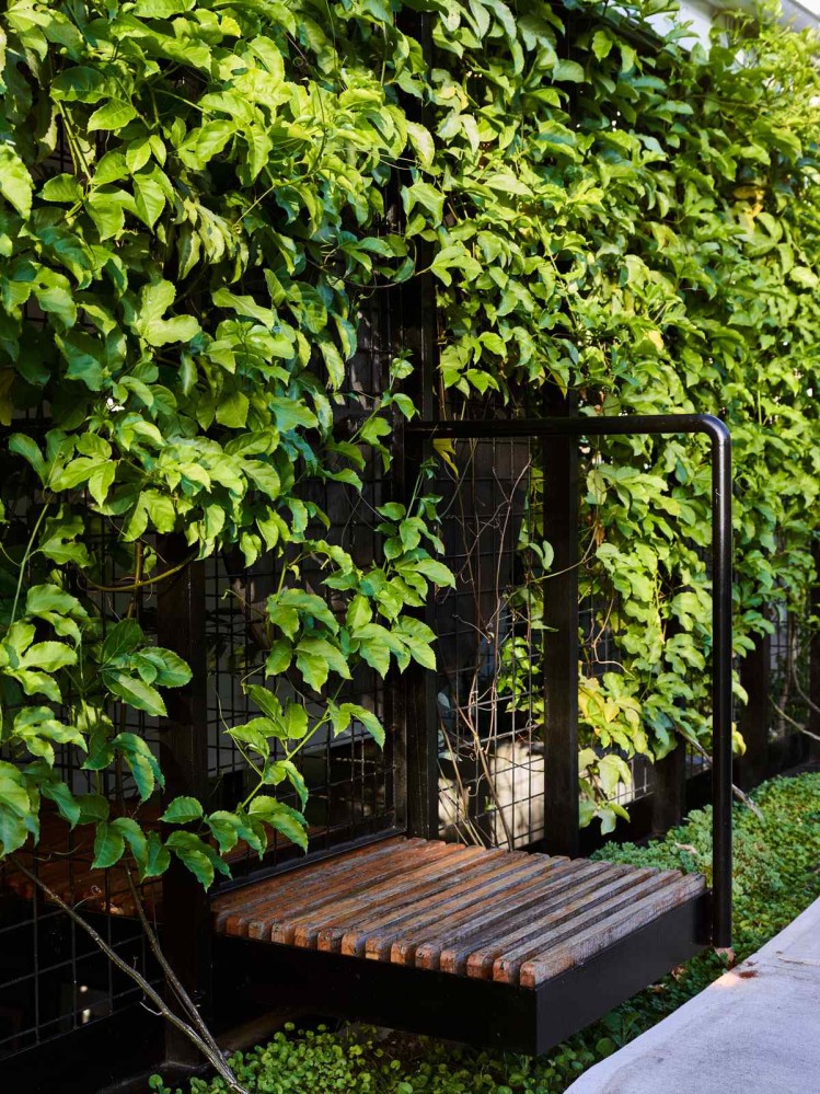
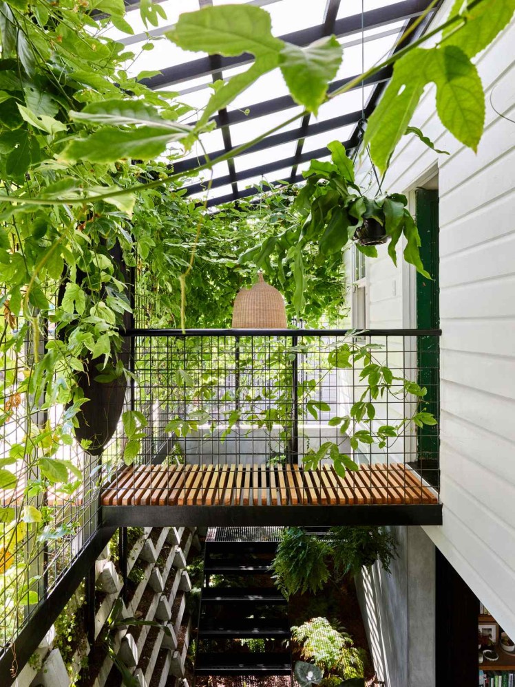
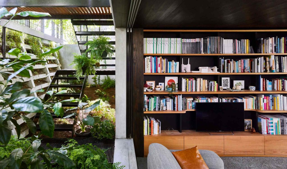
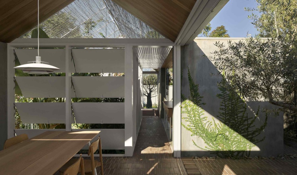
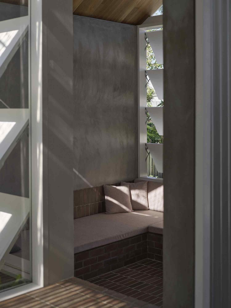
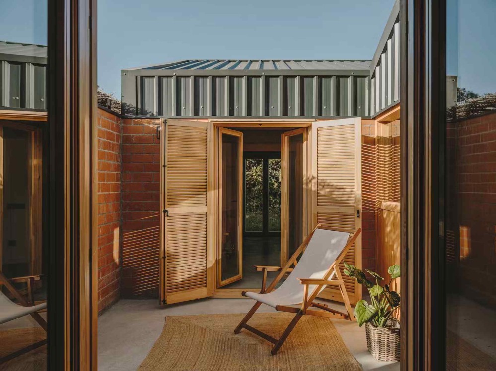
I’ve come to believe that one of the things that makes a home come to be loved is when the building has at least one uncommon architectural element that creates a different embodied or physical experience than one is used to.
This uncommon architectural element needn’t be something expensive or excessively strange. It merely needs to be unexpected - a round window where one expects rectangles, skylights over an indoor shower, an enclosed “room” open to the elements, etc. Simply a moment that creates wonder and delighted surprise - the kind of thing which would linger in a guest’s mind after they left, because it’s not everyday you get to experience something like that.
John Ellway is great at these small, beautiful moments.
In his Terranium House (which also happens to be his own home), the entire front facade of the home is obscured by a dense hedge wall, as if the home had been overrun by the plants, and the front door actually opens up onto a floating bridge.
In his Hopscotch House project, entire walls fall away to reveal themselves to be massive wooden louvers, creating a wonderfully strange physical experience that feels simultaneously sheltered and nicely intimate, but also exposed to nature.
In his Cascade House project, which pushes the limits of spaces that blur the boundary between inside and outside, clever placement creates the illusion of the kitchen as a bobbing island, surrounded by the pool.
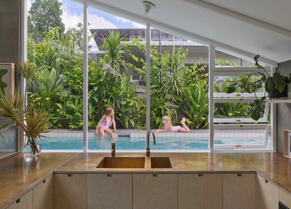
None of these moves are especially strange, but by carefully folding space, he’s able to create memorable physical experiences for those lucky to call this home.
Woods + Dangaran
Website: woodsdangaran.com
HQ: Los Angeles, California, USA
Joseph Eichler was a real estate developer who built over 11,000 homes across California in the mid-90s. He championed the idea of bringing modernist architecture principles to mass audiences, and decades later, a small but passionate community still marvels at the ineffable beauty of Eichler Homes.
My initiation to the Eichler Home fandom came through this video tour of a lovely 1960s property, and it triggered a full blown obsession that spanned several weeks of 2022, where I tried to learn as much as I could about Eichler Homes, as well as the broader movement to bring modernist principles to tract homes.
As a result, when I encountered Woods + Dangaran’s later in the year, I could sense the ways in which the studio continues to raise a torch for the modernist sense of space.
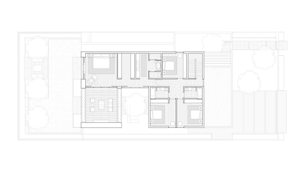
One of the defining qualities of a Woods + Dangaran project: the floorplans feel really, really good.
When you study a Woods + Dangaran floor plan, you feel an overwhelming sense of precision and care. Every line and pause - where a wall gives way to a window, door, or to nature - feels surgical. This is the primary lesson that Woods + Dangaran taught me: that floor plans aren’t merely documentation made after the fact; they are a technology that can be actively edited to achieve a specific outcome.
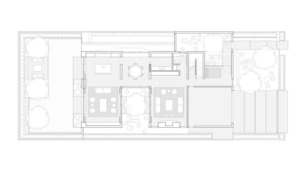
Woods + Dangaran floor plans remind me a lot of the promotional brochures made by Eichler and other developers to introduce the modernist style to a new mass audience. The example below is from The House that HOME Built promotional brochure from 1955.
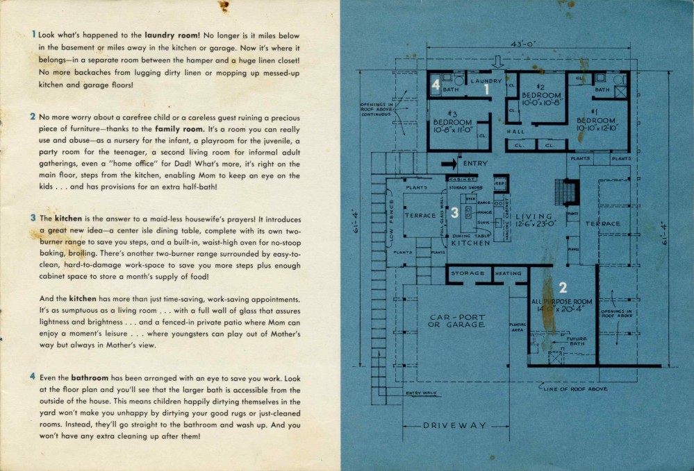
HOME was popular NBC television show with an audience of over 2 million viewers. In 1955, the show partnered with architects and contractors to encourage Americans to purchase modernist-style buildings, and this brochure was made by NBC to aid the participating builders in marketing the buildings.
With clear, compelling prose and illustrations, the designers make it easy for a general audience to appreciate the attention to detail behind every line on the floor plan. While Woods + Dangaran doesn’t make promotional brochures explaining their design decisions, their floor plans telegraph a similar level of intentionality. It’s like a kind of braille - when you run you eyes across the floor plans, you can trace the intentions in your mind.
And the three-dimensional spaces that rise out of those floor plans feel crisp. All the lines meet exactly correctly.
A pristine ceiling will lie down without complaint, to softly kiss a delicate glass wall.
Rifle-sharp lines of sight terminate into beautiful views.
Woods + Dangaran conducts a symphony of lines draped lightly across space to create pure volume, and then deepens that composition with a rich palette of materials.
Max von Werz Architects
Website: maxvonwerz.com
HQ: Mexico City, Mexico
When I look at projects by Max von Werz, I sense a shared curiosity about enclosure, thickness, depth.
To be clear, I have not read anything where he explicitly states this. I’m very certainly projecting my own narratives onto an unsuspecting maker. But again and again, it feels like he returns to similar themes.
In the Casa Cieneguita project, this sunken level, this open air room, succeeds in feeling both protected, and yet open to the world.
The exaggerated massing of the wood-faced columns of the Baja Club Hotel helps create a thick aura of a dense habitable zone between the building and the world.
In his Brechstube project, here again, wide eaves create a comforting depth right before the building. There is something kind about this deepness. It’s possible that what I’m responding to is simply my body recognising that a big roof protects again sun, rain, and other elements. This is possible, but…there is something here about the comfort of the thick “skin” that mediates the building from everything beyond.
This investigation of enclosure is probably most pronounced in his Casa del Lago proposal, my favourite of his projects. It’s an inverse monument, something that creates architecture not by inserting a figure in a field, but by extraction.
Who would have thought that a built environment whose primary palette is negative mass, could feel so sheltered?
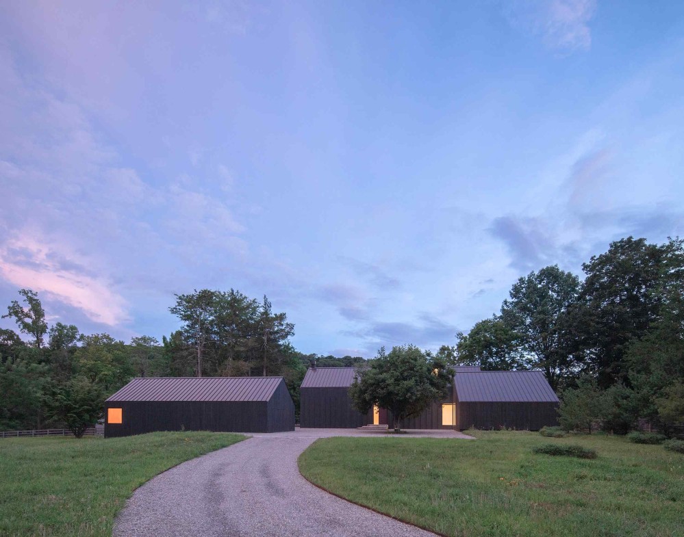
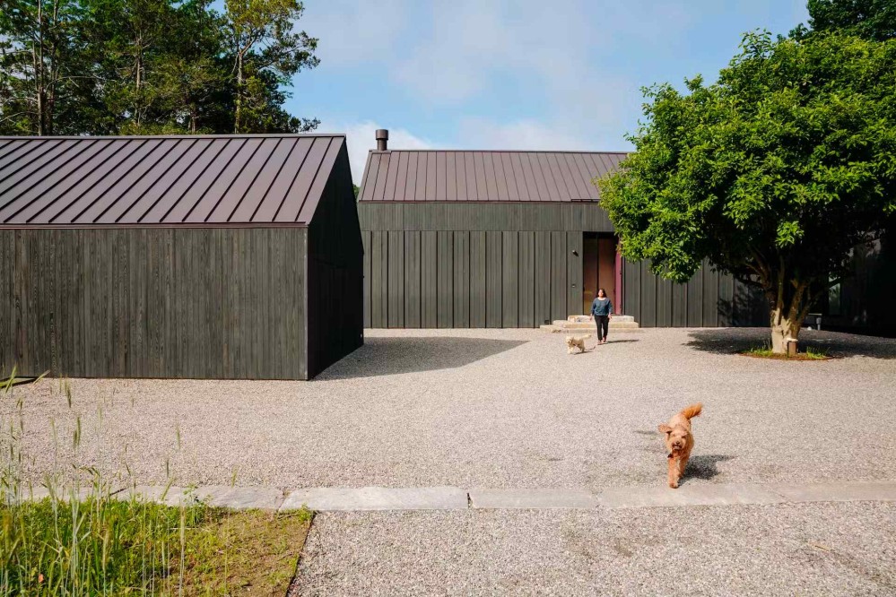
Worrell Yeung
Website: worrellyeung.com
HQ: New York City, New York, USA
Worrel Yeung’s signature move is a building that recedes into its landscape.

It’s like they turn down the dial on the envelope of the building. But to say this, does not mean that their buildings are only about the insides.
By turning the building into a silhouette (that is, by de-emphasizing elements of the facade) from a distance, the overall external form becomes more legible, not less.
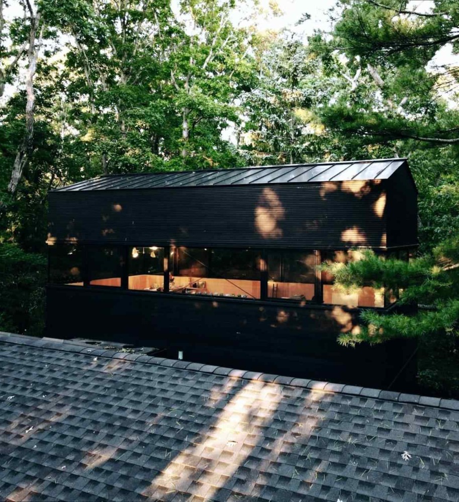
And while the facade reads as a uniform black from a distance, when you get up close, you realise that the wood siding is carefully choreographed, creating a kind of ornamental pattern on the facade, made intimate by how close you need to get to the building to see it.
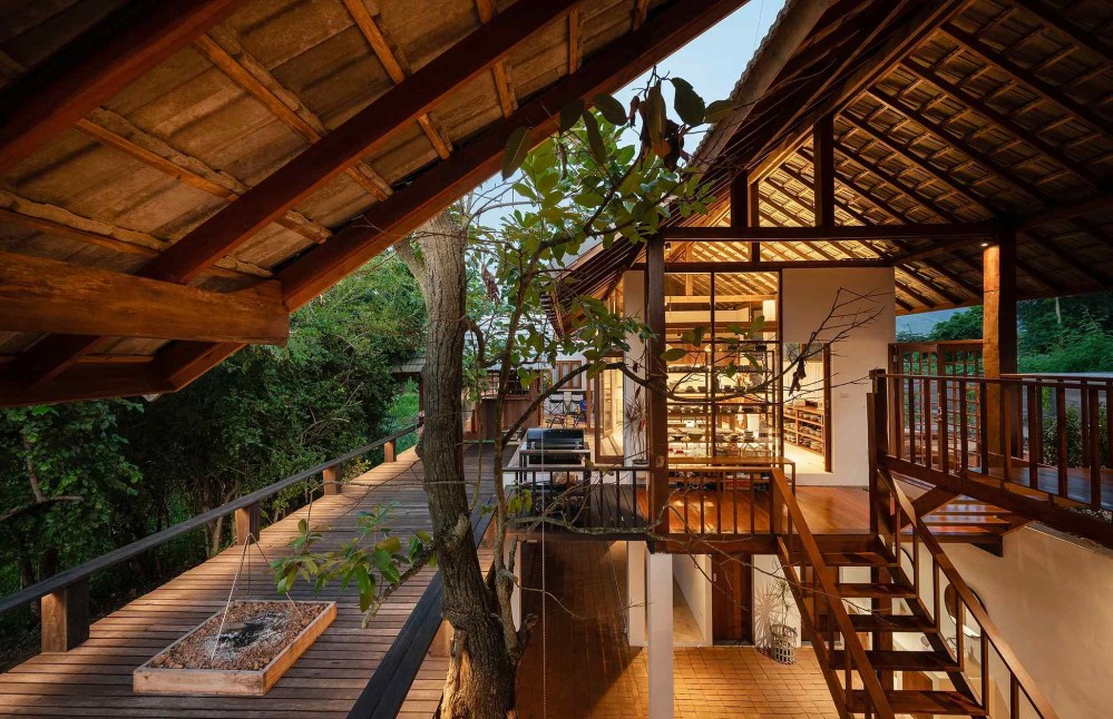
Sher Maker
Website: shermaker.com
HQ: Chiang Mai, Thailand
The spaces that Sher Maker designs feel like they’re in response to a line of inquiry about materials. It feels like they go into the world with questions, read physical answers in wood, ceramics, or plastic, like a kinds of braille, and then produce a building as a consequence of that exploration. As a result, both the external forms and the interior feel of their buildings appear like something new.
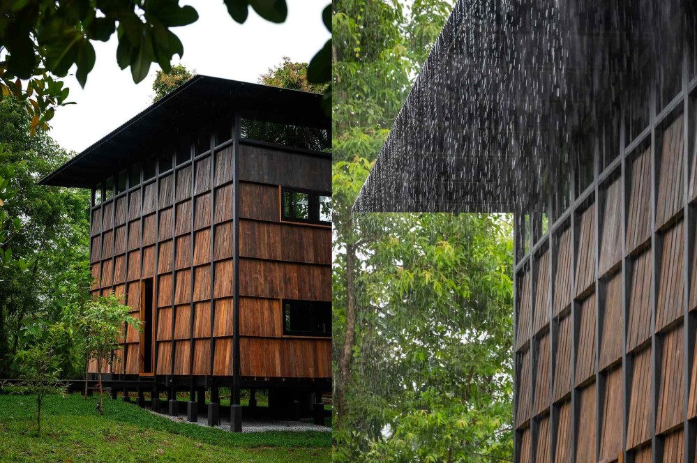
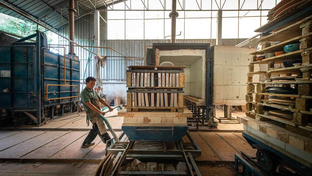
Something that comes through very clearly is that this team is earnestly curious about construction in all it’s forms. It’s no surprise that half of the structure that houses the Sher Maker team is very literally a large workshop, where they experiment with woodwork, metalwork, and other materials.
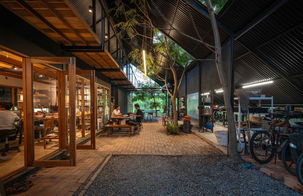
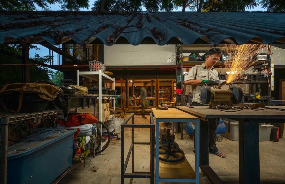
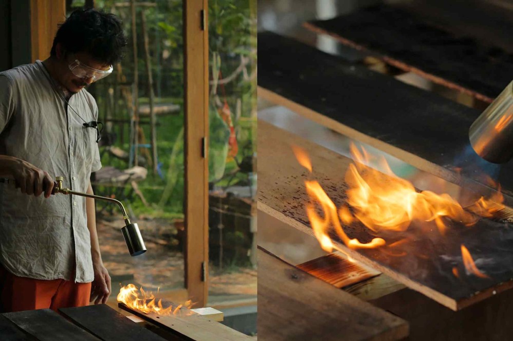
That energy flows right into their projects. Long experiments with wood burning helped them achieve the lovely wood gradient on the Wood and Mountain Cabin project.
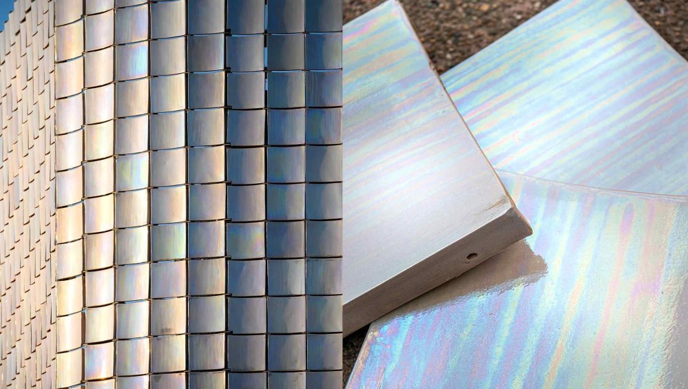
And to achieve the heartbreakingly beautiful pearlescent tiles for the PTT Saraphi gas station (!) they collaborated with three ceramic studios in their home city of Chiang Mai, which is apparently well known to be a home of several craftspeople.
Sher Maker taught me that we have not finished learning the mysteries embodied in materials, and that with disciplined play, we can seduce new lessons from these mute teachers.
Slow Studio
Website: slowstudio.es
HQ: Spain
Slow Studio has a list of qualities they aspire to in the spaces they design. The one I keep returning to is “comfortable and durable.”
These are not words you often find a contemporary studio using in public. But they feel correct when you look at this team’s portfolio. There’s a certain unfussy, clean-faced honesty about their work. Each building achieves the enviable balance of feeling “just enough.”
I also love this team’s commitment to documentation and sharing.
The case study write-ups for each project are highly detailed, and their blog is styled as a Research page where they share what they’re learning in pursuit of homes that are sustainable, healthy, energy efficient, and of course, comfortable and durable.
On their research page, you’ll find a guide to ecological paints, an intro to building with cross-laminated timber, and more.
Slow Studio reminded me that architecture studios can be laboratories for learning, and that ideas like comfort, durability, and efficiency can be explicit goals to work towards in a project.
Ackee Workshop
Website: ackeeworkshop.com
HQ: Trinidad & Tobago
Ackee Workshop is a studio based in Trinidad & Tobago with a very interesting positioning: they position themselves as a team that’s very good at designing hilltop homes.
They carry this positioning through every customer touchpoint. The first large text on their website speaks about “Responsible hillside living,” and on Instagram they educate their audience about various aspects of hillshide construction.

I find the clarity of their positioning so interesting because it’s so rare. Some studios might focus on residential projects only, or some might specialize in a typology (eg. hospitality projects, hospitals, etc). I’m so curious about how this explicit positioning influences the number and quality of inbounds that come their way.
Rockwell Group
Website: rockwellgroup.com
HQ: New York City, New York, USA
The theatre was a major formative experience for Rockwell Group founder David Rockwell. His mother was a vaudeville dancer and choreographer, and he himself performed in several theatre productions. It’s easy to see that this experience profoundly shaped how he thinks about spaces, and that this sensibility extends into the work by the multi-disciplinary studio he founded.
You see it in the names of Rockwell’s books, with titles like Spectacle, Pleasure, and Drama.
You see it in the fact that the studio has carved out a celebrated niche designing memorable spaces for the hospitality industry - hotels, restaurants, theatres, and more.
And you see it, of course, in the work.
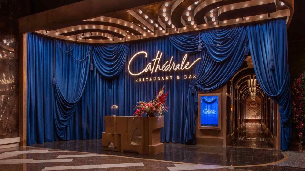
No matter the project, there’s a certain element of theatricality at play. Above, blue velour drapery welcomes guests into the welcome area of the Las Vegas outpost of the Cathédrale Restaurant & Bar. A curtain is pulled away to tease a candle-lit tunnel, promising mysterious delights beyond. It’s difficult to tell where the architecture ends, and outright set design begins. The space is tuned to put guests not in mind of a mere restaurant experience, but of a show.
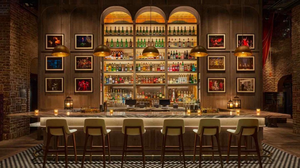
Even when the spaces are relatively straight-forward, one still gets the sense of a set calibrated for performance. The bar at the CIVILIAN Hotel reads like a set piece - a stage for one to pose against, and to become a member of the cast.
Given this, it’s no surprise that the studio’s actual set designs go all out.
My favourite example is Rockwell Group’s work for the 2016 Broadway revival of the musical She Loves Me, for which David Rockwell received the 2016 Tony Award for Best Scenic Design.
Set in 1934 Budapest, the scene begins in front of a parfumerie. The building is soon revealed to be a “jewel-box” that dramatically unfurls to show its gorgeous interior, made up of four giant, modular, interlocking set pieces. The set “mirrors the emotions of the narrative as it opens, closes, and pivots, dancing to the score.”
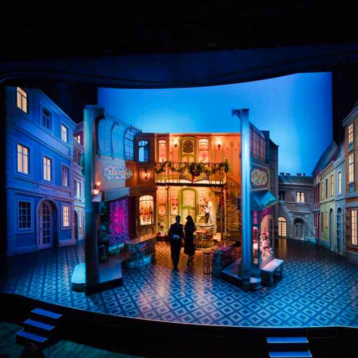
You have to see the set in actual to understand why people say it gives them goosebumps. Here’s a YouTube video showing what the reveal would have looked like to audiences, and the video embed below is a great behind-the-scenes walkthrough showing even more closely how wonderful this set was.
Rockwell spaces are sensory delights. You find yourself reaching for superlatives to describe them: lush, sumptuous, dense in flavour. Each feels like a portal into a fantasy of supple leathers, fragrant woods, mirrored brass, jewelled lights.
The theme is clear: public spaces are both frame and stage, for the human dramas that play out within and around them. In this, Rockwell Group feels like kindred spirits to Roman and Williams.
Morris Adjmi Architects
Website: ma.com
HQ: New York City, New York, USA
At about the time when I encountered Morris Adjmi Architects, I was growing frustrated with the weekly battles on Twitter between two groups. On one side, advocates of Modernist architecture, who claimed that there was no such thing as beauty. On the other side, advocates of classical architecture whose definition of beauty seemed overly narrow.
MAA taught me that there is a lot to learn from traditional architecture forms…and that it is possible to compound on those ideas to build something new. I love how they summarise this philosophy on their website:
We create buildings that stand out by fitting in.
I also learned that there is so much yet to be explored and discovered when it comes to ornament.
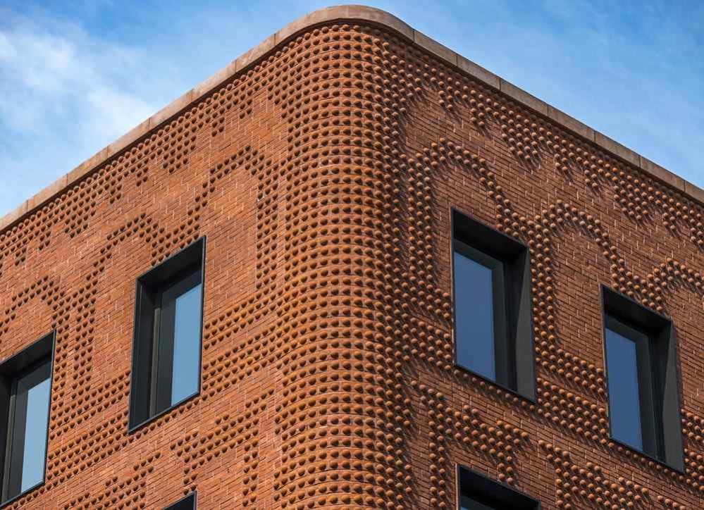
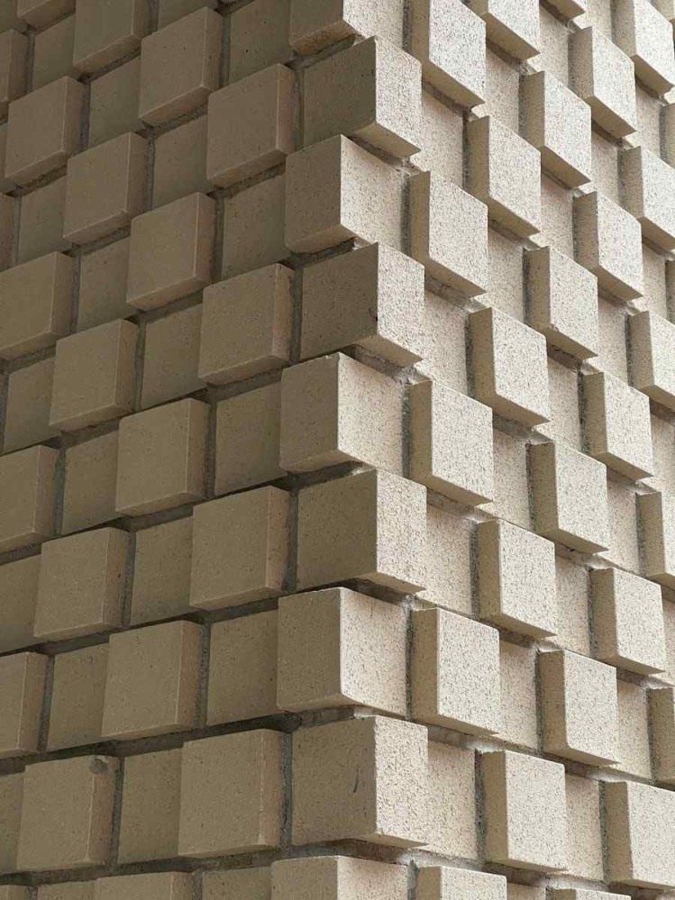
Some of their work is very clearly an investigation into ornament. For example, the “stippling” pattern on The Grand Mulberry is instantly iconic.
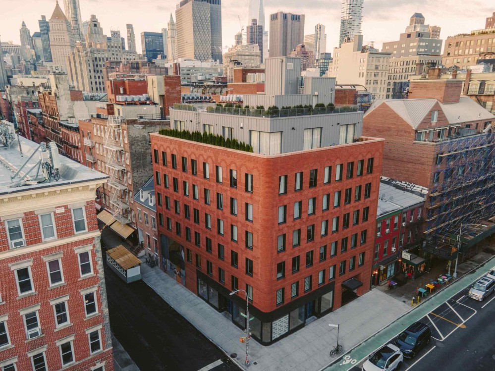
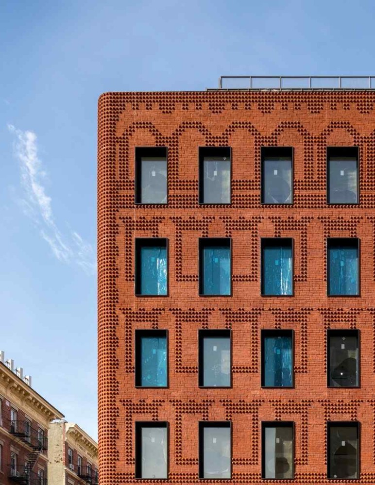
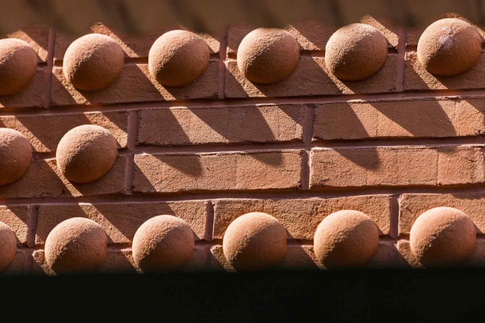
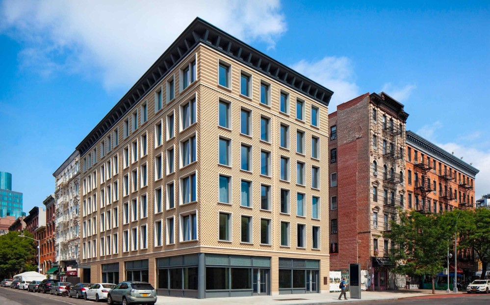
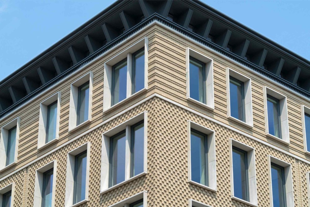
Similarly, the middle portion of the 45 East 7th project is a study in facade as ornament. Light plays against the L shaped brick surface, casting changing shadows that follow the sun’s path across the sky, bringing the facade alive. From afar, the facades reads like a kind of textured leather.
Yet another lesson that MAA taught me was the value in deeply studying context.
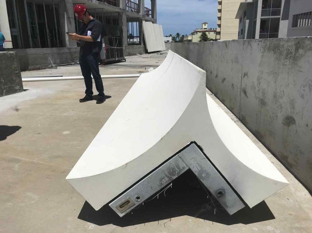
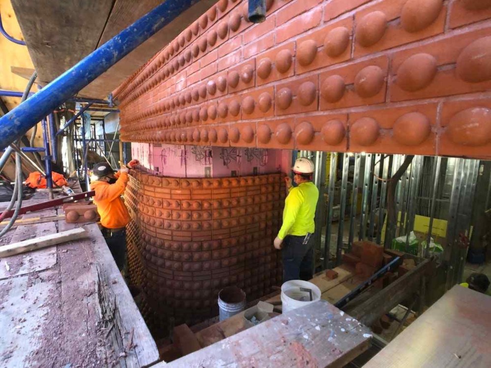
Their buildings are never shy about proposing something new, but they also feel responsive to their environment. There is a sense of a call and response between a Morris Adjmi Architects building and its context. It engages with location, memory, time. When they describe their design process, they clearly delight into reaching deep into the past to learn the history of the neighbourhoods in which they build. When they’re adapting an existing building, they also attempt to understand the original architect’s intent.
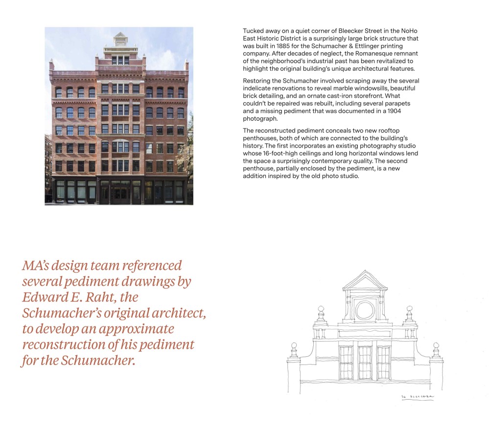
And I love that their project case study pages linger on photos of the construction process. It’s a kind of deep somatic appreciation for the building that feels all too rare today.
I am thankful that a studio like Morris Adjmi Architects exists that appears serious about investigating contemporary articulations of traditional forms.
See also: I previously wrote about how much I love the decisions MMA made around their website.
(If you enjoy my writing and want to support my personal research projects, the best way is to buy me a book!)
-
Better Places
-
Better Places
-
Better Places