Designing a 100-year home in Accra
Floor plans, material choices, and other design decisions we made in pursuit of a beautiful, adaptable home.
Four years ago, I shared an intention to document my family’s house building journey. At the time, I wrote:
As a complete newbie to the house-building process, I have a lot of questions, and I’m finding almost no useful resources online. So I’m going to write the guide I wish I had right now.
While it took longer than expected, I’m thankful to share that we’re about to break ground on construction, and I wanted to take a moment to share what I’ve learned leading up to this point.
It’s a long piece. I considered breaking it up over several posts (or eliminating some details entirely), but ultimately decided to write the kind of resource that I personally would have found helpful four years ago: dense, very heavy on the small details, and with lots of links that send you down several rabbit holes.
Please feel free to work through it at whichever pace feels right. I really do hope that at least some of the things I’ve learned the last few years can be useful to you if you’re embarking on a similar project.
(Heads-up: I reference several books in this post, and I might earn a small commission from Amazon if you purchase them through my links)
01. About our home
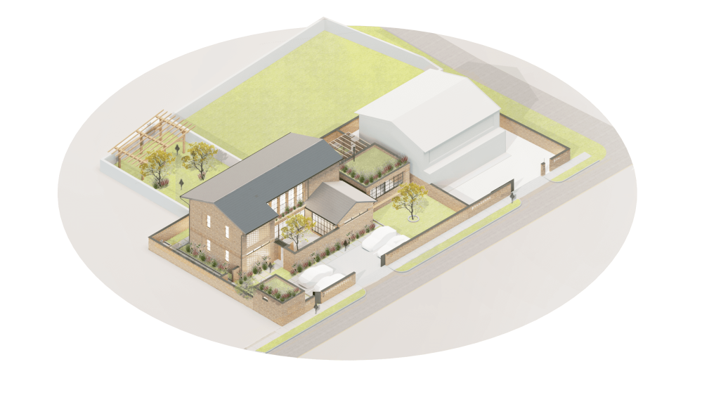
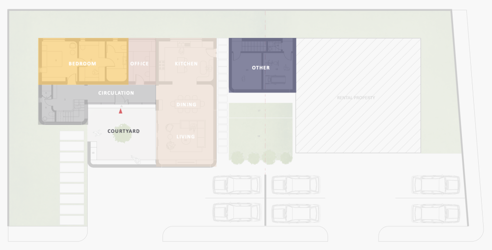
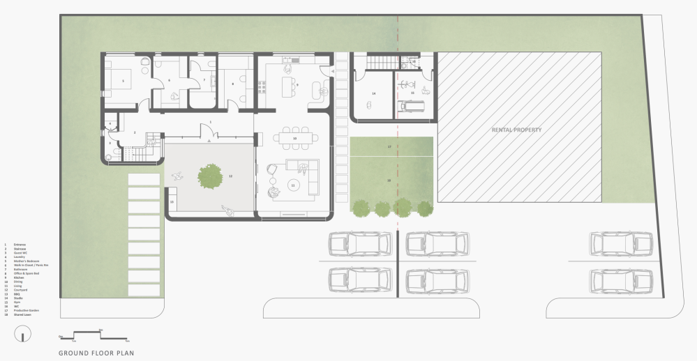
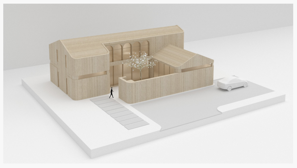
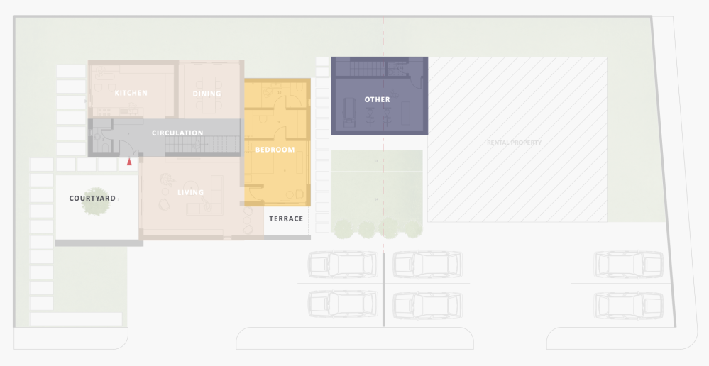
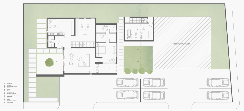
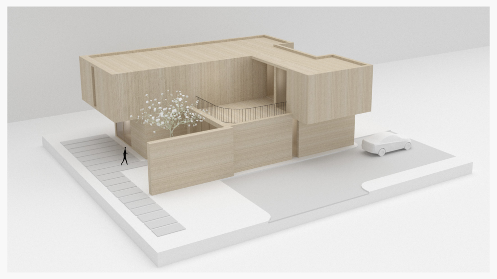
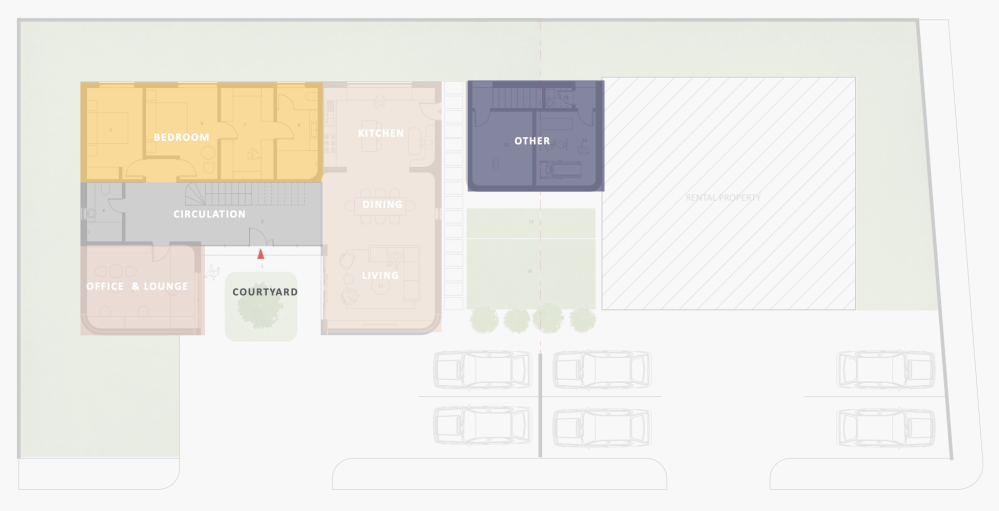
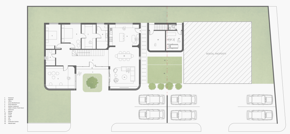
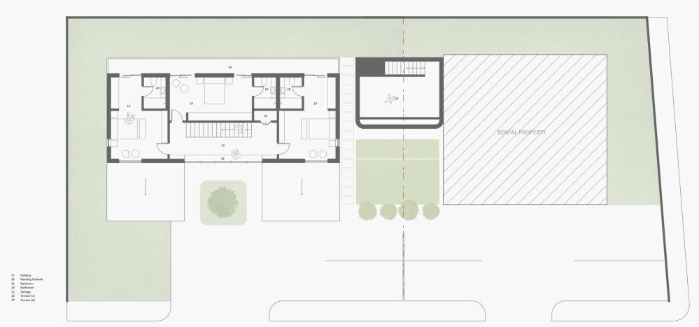
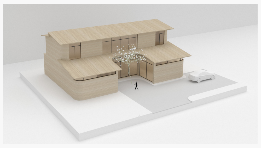
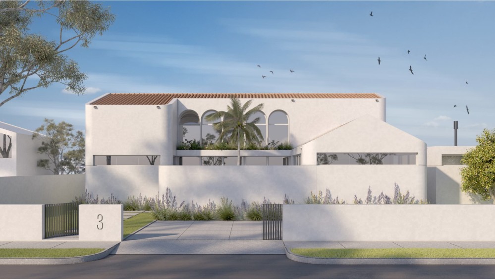
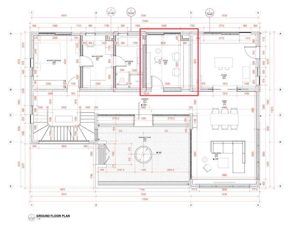
Our home will be a two storey dwelling plus basement, located at Appolonia City, an ambitious satellite city about 30 mins from Accra. It was designed by the incredible team at Studio Contra, and it’s a double wythe, fired clay brick, load bearing structure with 339 square meters / 3,648 square feet of interior space. It has 5 en-suite bedrooms, a study, and a small gym and creative workshop.
Here’s what it’ll look like once it’s completed.
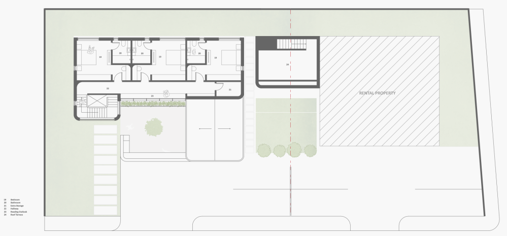
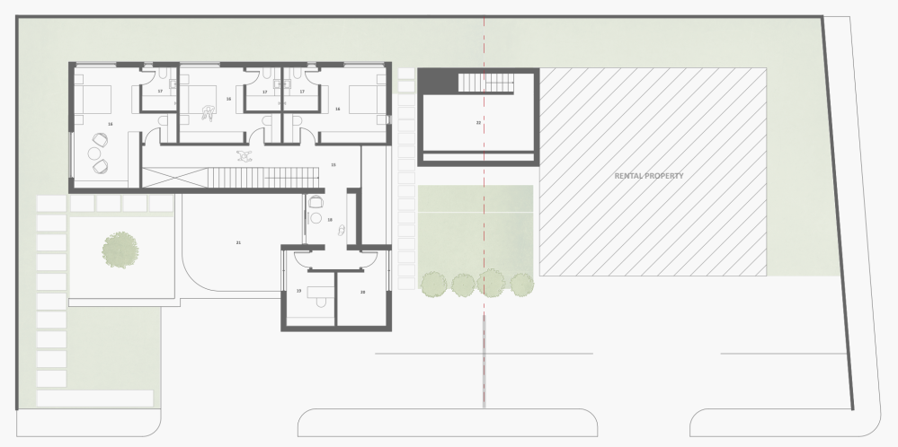
(You’ll see the floor plans later in the detailed walkthrough section of the essay.)
Featuring a 40,000 litre rainwater recycling system, solar power, and pursuing IFC EDGE green building certification, we intend for this to be among the most sustainable projects in Appolonia City upon its completion.
02. Design brief
Here is the design brief I shared with Studio Contra to kickstart the process.
While you don’t strictly need to read the brief to understand the rest of this piece, I would recommend doing so. It’ll give you a sense of the headspace we were in as we went into the process. It’s also pretty cool to see how Studio Contra took my hazy ideas and gave them form.
To recap: the goal was to create a beautiful, adaptable, care-minded home for my family which could evolve and grow gracefully with us over many generations. You’ve likely seen photos of old, stately homes, which are clearly the product of many lifetimes of care. How might be build something like that today?
These were my parting words at the end of the brief:
I care a lot about intimacy. It matters a lot to me that every space in our home creates intimate, special moments between members of our family. I don’t know when next we’re all going to be together. I want to make the time we have left worthwhile. The most important words that matter to me: Intimacy, Solace, Softness, Care.
And here is the Pinterest board of references I shared with the team (it’s literally the same inspiration/photo references board one we’ve been using the last few years).
What follows is an account of the design decisions we made in pursuit of a home we hope to shelter over 100 years of memories.
03. Early concepts
The first step was to determine the broad strokes of the building’s spatial programme (architects use the word “programme” to broadly describe the internal layout of a building).
Studio Contra returned with three directions, each with its own advantages. (I just looked up my notes and remembered that we had the first review one day after my 31st birthday).
House 1
Text from the presentation: From the street the house is guarded and discreet revealing only high level windows showing glimpses of activity within. A large tree indicates the presence of a courtyard just beyond the facing wall. Deep arched window reveals are a reference to the classical motifs of Spanish revivalist architecture. The house terminates with a recessed terracotta clay tile roof with concealed drainage. Overall the intention is to produce a contemporary interpretation of a traditional typology.
House 2
Text from the presentation: While being very transparent within, the house reveals almost nothing of its interior life from the street with the only concession to transparency being a narrow window. The house is contemporary in its form and expression, making use of straight lines, a dramatic cantilever and simple shapes. Nevertheless there is an attempt to use warm materials and landscape the give an inviting quality to the house.
House 3
Text from the presentation: There is an attempt to evoke the classical through balance and symmetry while also signalling to the contemporary with the high level windows which make the roof appear to float. Japanese architecture is referenced here through the shape of the roof, the subdivided glazing and layering of the gently pitched roof profiles. Unlike the other options this house presents an entrance that is visible to the street although the courtyard greenery may partially obscure access.
Discussion
House 1, which was organised around a courtyard, was the unanimous favourite with both the architects and my family. We enjoyed its strong sense of enclosure paired with teasing glimpses of life within, which allowed us have a sense of privacy, while still being kind to the street.
The design brief and Pinterest board featured several references to Spanish architecture, and I was pleased to see these motifs echoed in the form of the courtyard and arched windows.
Regarding layout, we liked that there was a gradient of privacy, creating two “wings” of the house. On the right-hand side we had the more public spaces like living room and kitchen accessible to guests, while the left side (and top floor) had the more private areas like bedrooms. We also liked how the living room and kitchen area could be made into one continuous social space if desired.
And unlike the other options where the stair was in the center of the plan, we liked that the stair in House 1 was quietly tucked to one side where it wouldn’t eat up prime living space.
While we loved a lot about the programme, we weren’t as sold on the treatment of the facade and certain moves like the recessed roof, and these would evolve significantly as we continued to work on the project.
House 3 was the second favourite, and I think that in a world where my family was a bit more extroverted, we might have gone in this direction. The nods to Japanese architecture come through in the symmetry, the shape and pitch of the roof, and window treatment - and the house radiates a certain calm and balance.
We also really loved the office. It’s now clear that the present and future of work will include working from home in some capacity, and this plan delivered an elevated domestic office, which could easily double as a place to receive clients.
There was a lot we loved about this plan, but we couldn’t get over how exposed it was to the street. With the gate open, it would be possible for someone on the street to see into the center of the house (as well as parts of the living room and office, depending on their angle). That said, I still love this plan, and would love to see it exist in some capacity one day.
House 2 was the most contemporary approach, and our least favourite. This plan took the concept of privacy to an extreme, showing a ruthlessly closed face to the street. Its blocky, windowless expression made it read like a heavy mass, and we didn’t enjoy how the rooms related to each other. For example, the primary bedroom opened right into the living room, and the kitchen, dining area, and living room all felt like isolated closed-off spaces. That said, the treatment of the dining area, with its sliding window to the outside, was really nice, and it delivered a really generous terrace. This was not a bad plan. It simply didn’t reflect the way my family wanted to live.
We rallied around House 1 and proceeded to develop it further.
04. Decision-making principles
Before I walk through the design, I think it’s important to share the ideas that informed my decision-making on this project. There were three rough principles to which I repeatedly returned.
- Build something that will last for 100 years
- Be a blessing where you’re planted. Be a good steward of the land
- Design for all the senses
Whenever I had to make a tough call, these principles helped lead me to a decision I was sure I wouldn’t regret even several months later.
Build something that will last for 100 years
One of the most surprising things I’ve learned during this experience is that most modern homes are built with the intention that they last between 30 to 50 years. As in, the way they’re constructed and financed assumes that they’ll fall apart within the lifetime of the builder.
This came as a great shock to me. I mean this sincerely.
For some reason, I had just assumed that buildings are expected to last a very long time - hundreds of years. It has been humbling to discover that in a very real way, contemporary buildings are almost disposable. It was even more surprising to discover that almost everyone I spoke to seemed to not share my confusion. I genuinely believed that in the context of architecture, 50 years was a shockingly short period of time.
I have come to learn some of the reasons why this is the case. It’s cheaper in the short term to build this way, which makes housing more affordable, and to some extent, literally any building will last for a long time with proper maintenance, while even the best constructed building will suffer if it’s not actively maintained. I want to be very clear: there are very valid, non-nefarious reasons why it is that contemporary construction sometimes has relatively shorter lifespans. Every building is a negotiation between your desires and resources, and sometimes the result of that compromise impacts longevity. It’s about being cost-effective with the resources at your disposal.
But I’ve never been able to shake the shock of the revelation that, unless you intentionally design for it, your team will deliver to you a building that they assume you intend to be around for only a few decades.
So then, how do you build something that will last for 100 years? It turned out to be surprisingly difficult to get an answer to what I had naively assumed to be a simple question.
My search led me to Stewart Brand’s book How Buildings Learn. I’ve written previously about my takeaways from this phenomenal book, but the broad idea is this: the buildings that last the longest are those that come to be loved, and the buildings that come to be loved are those that are easy to repurpose (they adapt gracefully to changing needs) and are constructed to last (the materials used, and how they’re joined together, allow them to last longer).
Be a blessing where you’re planted. Be a good steward of the land.
“Why is it important to you that your building lasts 100 years?”
I’ve asked myself this question a number of times, and I still wrestle with it, to be honest. It just feels like it’s the right thing to do? If few people are able to build in this way, and if I’ve been blessed to be in a position where this is an option for me, I think I have a responsibility to do so?
Most homebuilders in Ghana will build out of modest, short-lived materials, not because they prefer to, but out of sheer necessity. If I am able to contribute a project that has the potential to be one of a handful that can endure over time, I almost feel an obligation to do it? It sounds like bullshit, I know, but I mean this sincerely.
One of my favourite principles from A Pattern Language by Christopher Alexander and his team is 104 SITE REPAIR** (I wrote a reading note on this book that explains what’s going on with the number and two asterisks).
This is the principle that invites us to approach building not as an imposition on the land, but as an act of stewardship.
We must treat every new act of building as an opportunity to mend some rent in the existing cloth; each act of building gives us the chance to make one of the ugliest and least healthy parts of the environment more healthy… This is the principle of site repair.
I was reminded of this during my re-read of The Architecture of Happiness by Alain de Botton. The closing chapter of this spirit-rousing book reminds us that all the beautiful buildings we know were the work of mere mortals like you and I. It invites us to aspire to turn our patch of earth into something special.
The idea sounds pretentious only because we are reluctant to imagine that on a patch of ordinary ground where nothing significant ever occurred (aside from the slow gestation of generations of crab-apples), one of the great urban rooms of the world – another Royal Crescent or Charlotte Square – could be summoned to rise. We are prone to falling into a series of illogical assumptions which hold us back from being more demanding of architects: we presume that man-made beauty has been preordained to exist in certain parts of the world but not in others; that urban masterpieces are the work of people fundamentally different from, and greater than, ourselves; and that superior buildings must cost inordinately more than the uglier architecture which typically takes their place.
And the text that really brought it home for me was Landmarks by Robert Macfarlane. In this book, Macfarlane introduces us to several people who spent their lives coming to know certain landscapes intimately, and how this loving density of attention on a place helped them understand something special about the world.
[Nan] Shepherd was a localist of the best kind: she came to know her chosen place closely, but that closeness served to deepen rather than to limit her vision.
…Over the past century, parochial has soured as a word. The adjectival form of parish, it has come to connote sectarianism, insularity, boundedness: a mind or a community turned inward upon itself, a pejorative finitude. It hasn’t always been this way, though. Patrick Kavanagh (1904–67), the great poet of the Irish mundane, was sure of the parish’s importance. For Kavanagh, the parish was not a perimeter but an aperture: a space through which the world could be seen.
…[The mountains] were her inland-island, her personal parish, the area of territory that she loved, walked and studied over time such that concentration within its perimeters led to knowledge cubed rather than knowledge curbed.
All together, these three books revolve around the same idea: that we must be a blessing wherever we’re planted. That land is a profound, special responsibility, and that if we’ve been so honoured, we must be diligent stewards.
Design for all the senses
Barbara Erwine’s central argument in Creating Sensory Spaces is that contemporary architecture is too often designed only for the eye, and not enough for the other senses, which is a shame because the best-loved places are often multisensory experiences.
By re-learning the techniques for manipulating somatic space, thermal space, acoustic space, olfactory space, and of course, light, designers will discover a richer, gloriously expanded palette for shaping space.
The job of a designer is to orchestrate the sequence of sensory experiences to increase the probability of delight. The designer may ask: Does the progression of sensory experience grow in intensity or lessen? Does it repeat in a rhythmic pattern? If so, is the rhythm intentional or a side effect of some other phenomenon? Is it a single “one note” in a field of silence, like the shaded tree in the grassland, or does it repeat in a random or rhythmical pattern? What is the score of these sensory rhythms?
This book introduced me to a whole other dimension of invisible but no less powerful design moves for introducing delight, and creating memorable, well-loved spaces.
These were the major principles that shaped my decision-making as we continued to iterate on the project.
05. Major changes
I requested a number of changes in line with the above principles.
Building in brick
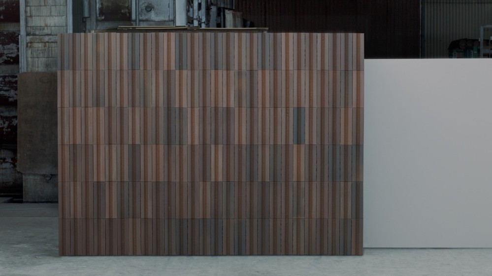
Probably the single biggest change we made was the decision to build in fired clay brick instead of concrete block. And probably one of the biggest blunders I made was in not communicating to my architects early enough that I wanted to build in brick.
First, here are some of the advantages of building in brick.
- Brick lasts for a very, very long time: Fired clay bricks are some of the longest-lasting man-made building materials. Compared to concrete blocks, they have good compressive strength and do not shrink or expand as much, which means they crack less quickly. Bricks also look better with age. In the spirit of building something that has a chance of lasting for over 100 years, brick seemed a better choice than concrete. This is a good overview of some of the long term maintenance issues with building with reinforced concrete.
- Environmental impact of concrete: The concrete industry is one of the largest producers of carbon dioxide, a greenhouse gas that accelerates global warming. In the spirit of sustainability and being a good steward, I was interested in reducing our use of concrete in our construction as much as possible. To be fair, brick is not without its own adverse environmental impact (in situations where brick makers fell trees to fire the clay bricks, this can contribute to deforestation), but on balance, building in brick is more climate friendly. More about concrete’s environmental impact.
- Fired clay brick is virtually fireproof: Fired brick is made by “baking” clay bricks at very high temperatures, which makes them extremely fire resistant. They’re classified as a non-combustible material and don’t assist the spread of fire. And even in the case of fire, brick walls don’t tend to suffer structural damage. All this is great for a building I hope to last for a very long time.
- Brick provides good thermal comfort: Because it’s a high density material, brick absorbs heat energy during the day, providing a stable, comfortable, even internal temperature at all times, which I hope will result in requiring less use of cooling mechanisms like air conditioners and fans.
- Bricks are relatively low maintenance: A brick building does not need to be plastered or painted, which saves cost over time. Brick is also termite-resistant, and thanks to its more porous structure, brickwork dries out more quickly, which means the building “breathes” properly, which reduces the likelihood of mold.
- Bricks can be reused: It’s possible to dismantle a brick wall, and after removing mortar residue, reclaim the brick and reuse it in other load-bearing structures. This means brick is super recyclable.
- Sound barrier: Brick provides very good sound insulation.
- Look and feel: Finally, I just honestly enjoy how brick both looks and feels. Brick facades have so much memorable personality. Here’s a bashful wall I met, and here’s a grumpy one. And because of the small brick sizes, it’s easier to see the evidence of the human hand in the construction. I also love how brick walls almost invite the hand to linger on them, whereas I’m always nervous about touching painted concrete walls for fear of getting them dirty. Maybe it’s all in my head, but there is something psychologically comforting about a wall you can hug without fear.
It also helped that literally every resource I consulted regarding how to build a house that would last for a long time reinforced the superiority of brick. Here is Stewart Brand in How Buildings Learn:
Brick is a superlative building material, the product of 8,000 years of experience in firing clay into modular units that can be mortared together and stacked by hand into unreinforced structures as high as sixteen stories. It is completely fireproof. London had no more Great Fires after rebuilding in brick in the 1670s, and commercial building owners in the 1990s still favor brick because they more than make up for its extra expense with saved insurance costs. As of 1989, brick was the most popular of all exterior cladding materials in the US for nonresidential construction—31 percent of the market. Maintenance is minimal. All brick walls need is to be repointed (the outer 3/4 inch of the mortar joints replaced) every sixty to one hundred years.
I ignorantly assumed that building a house out of brick vs concrete would be exactly the same process, except swapping out one material for another. This is not the case. At all! Because brick is load-bearing there are certain things you can do relatively more easily in concrete that require a different approach in brick. For example, popping in a new window or door is relatively simple in a concrete wall, whereas doing so in brick would require holding up the load-bearing wall to install a lintel.
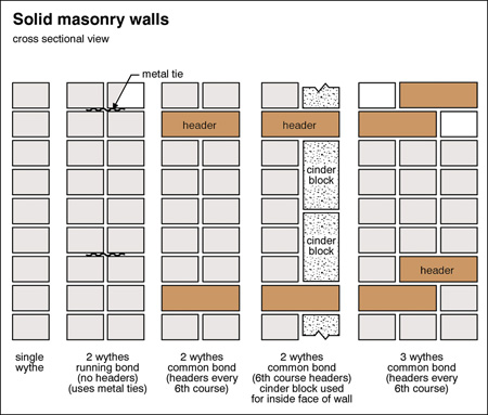
There is also a difference in how bricks are laid versus blocks. We’re using a double wythe approach, which means that the wall is made of two courses, with an airgap, and the two courses are connected with something called a tie.
All of which is to say, I thought swapping out concrete block for brick would be trivial, and I mentioned it only after we had gone through a number of design explorations assuming concrete construction.
This was one of many moments where Studio Contra’s expertise proved invaluable. As chance would have it, Jeffrey, one of the co-founders of the firm, had extensive experience working with brick while he was a practicing architect in the UK. Additionally, he made contact with the Brick and Tile Association of Ghana to help secure a brick specialist for the project.
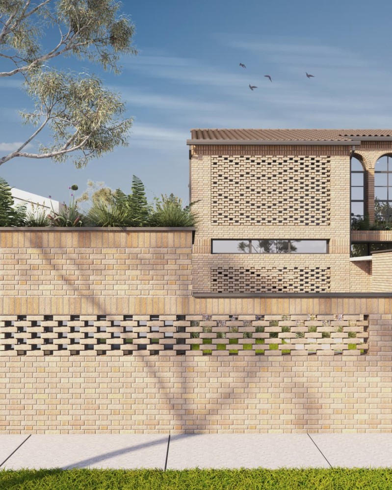
We explored two directions for brick - one white, and one multibrown (a tapestry of different variations of yellows, pinks, and browns).
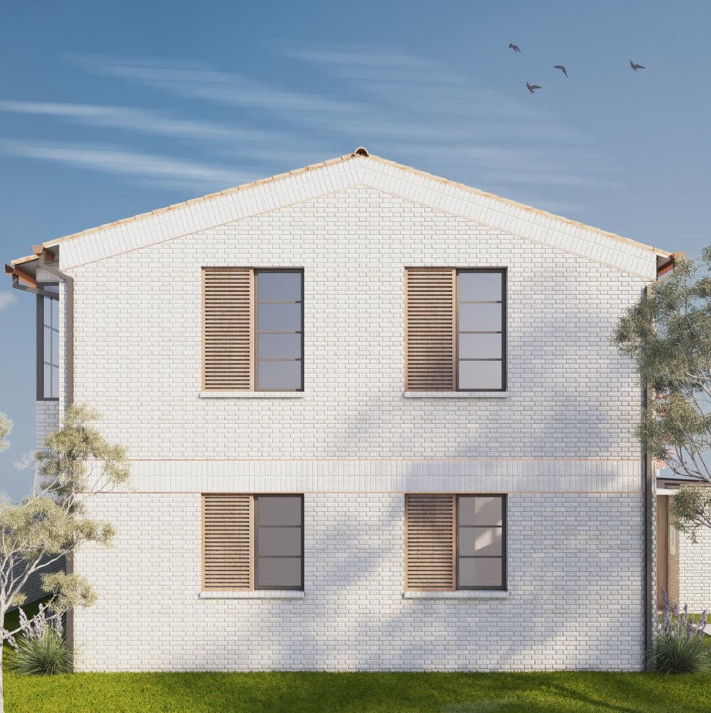
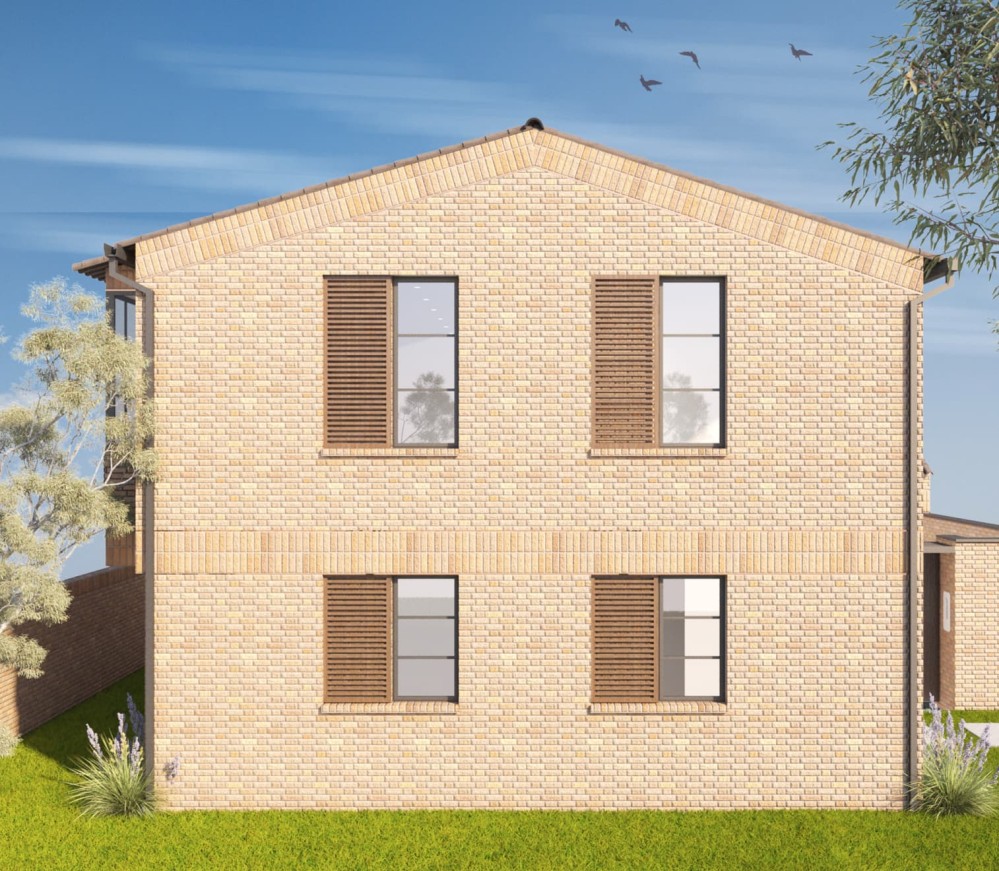
We ultimately went with the multibrown direction. It’s the one we preferred aesthetically, but also, painting the entire building white would eliminate one of the benefits of building in brick in the first place, which is that you don’t need to paint it.
There are several patterns of brick bonds possible. We went with the Double Flemish Bond because of its aesthetic appeal, cost (fewer bricks to achieve a strong bond) and reduction in waste (every off cut or half brick can be reused). Although more economical, it requires more skilled workmanship and supervision.
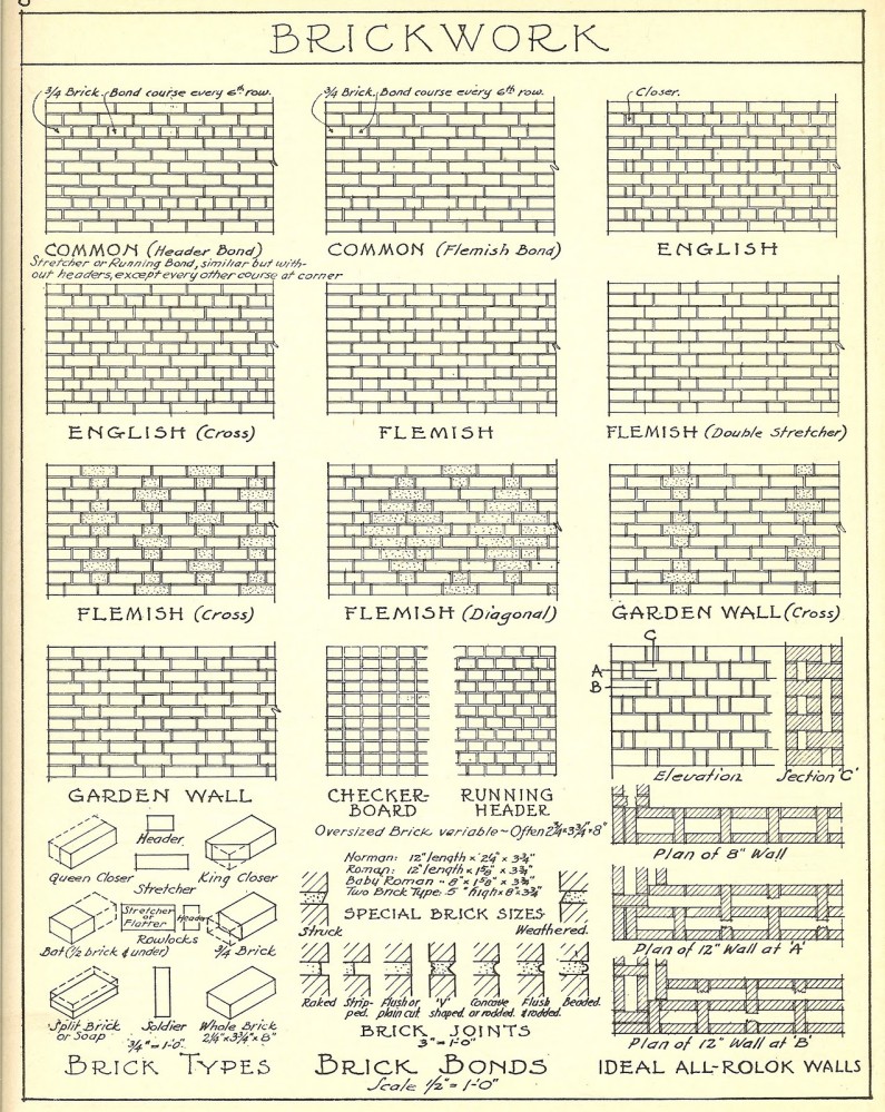
This video lecture by architecture historian Calder Loth is the single best introduction to brick bond types I’ve found.
Finally, we needed to think carefully about the ties holding the courses together. The way much of modern brick construction happens is to that you lay two courses of brick with a gap in-between, which you span with a metal strip called a tie. The very best brick construction is triple wythe: three interlinked brick courses that produce thick, sturdy walls that should ideally last forever, but this significantly increases the number of bricks used and cost, hence why the double wythe approach became popular. But the problem is that if you skimp on the quality of the tie, it can cause structural issues later. Stewart Brand explains the issue in How Buildings Learn:
The vulnerable component of this system is the metal ties that reach across the cavity to hold the two layers together. When they corrode, the walls become much weaker, with no visible indication that there is any problem until parts of the outer layer fall off or the entire wall collapses. Inspection requires hiring professionals, and correction with new ties is horrendously expensive. Having started with cavity walls in the late 19th century, Britain has more experience with the problem than the US. According to an alarming little book, Cavity Wall Tie Failure, in the some 12 million cavity-wall brick buildings in England, tie failure will be found in 70 percent of the buildings from the 1800s, 35 percent in the walls built from 1920 to 1950, and a shocking 40 percent in the ones from 1950 to 1981.
To avoid this, we’re using stainless steel ties. They’re a more expensive, but should last us a very long time.
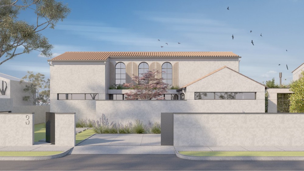
Rethinking the roof
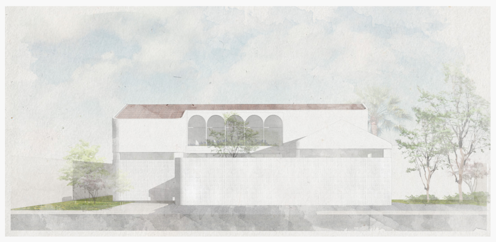
Another important change was to move away from the initially proposed tucked roof (where the external wall of the building rose as a parapet a little past the pitched roof) to a more traditional pitched roof where the eaves extended past the external wall.
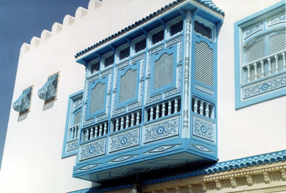
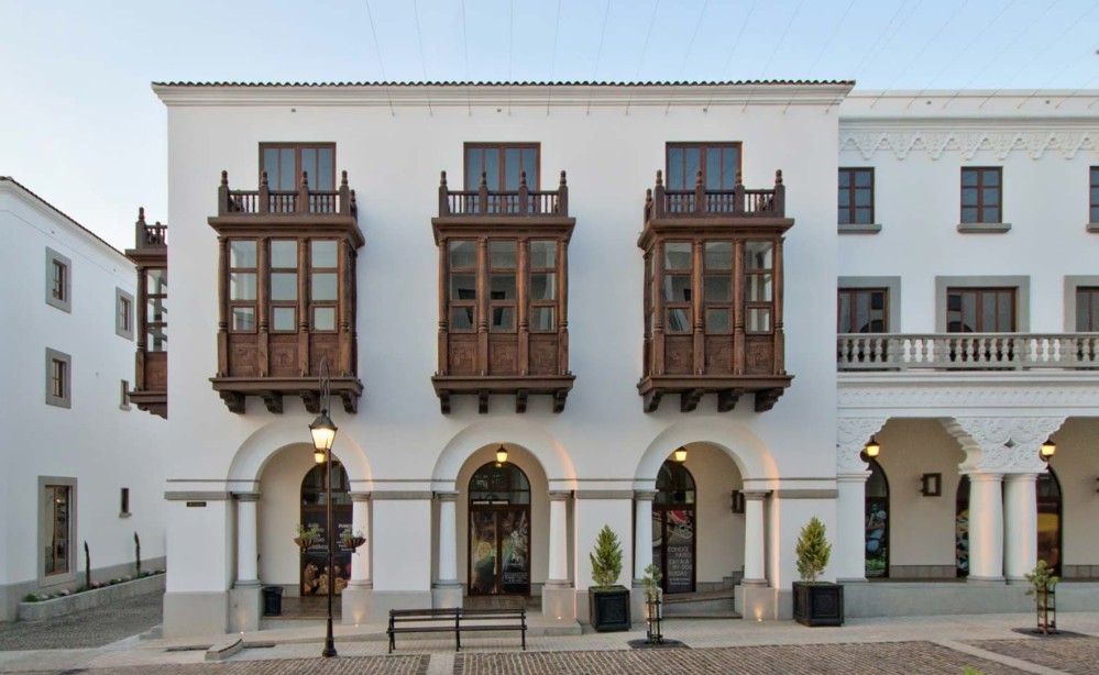
My architects were hiring the tucked roof to add a contemporary flourish, but I actively preferred the more explicit Spanish reference. I believe that eaves help create an active sense of shelter, which we were looking to evoke with the house.
A house is a roof, and so the thickness of the eaves sometimes is exaggerated to produce an illusion of greater weight and density, stimulating the sense of shelter. - A House in the Garden: Shofuso and Modernism
But most importantly, it mattered a lot to me to prevent rainwater from touching the walls as much as possible.
Many contemporary buildings have flat roofs, and as a result I’m sure we’ve seen the seemingly inevitable staining that occurs on the facade.

But my concern went beyond aesthetics. During my research, I was surprised to discover that traditional builders seem almost maniacal in the lengths they would go to keep rainwater as far away as possible from walls and foundations. From what I can tell, this simple act is part of why these buildings tend to last as long as they do.
Brand explicitly calls out built-in gutters in How Buildings Learn as features that almost always end up causing issues down the line.
The simpler the roof, the better. Chimneys, dormers, valleys, skylights, widow’s walks, and other complications all invite problems with flashing, and they make reroofing difficult. Built-in gutters look nice, but they often wind up leaking into the walls.
And he reinforces the importance of keeping water and sun off the walls.
It seems obvious, but people keep having to rediscover it: pitched roofs shed water well. Also, they provide a volume of air under the roof that absorbs radiant heat and water vapor and vents them to the outside. That space can be used for storage and for service equipment that otherwise would be outside in the weather or down in the building bothering people. And pitched roofs can have eaves that overhang enough to protect the walls from rain and sun and even keep water from collecting in the ground around the foundation.
Introducing the basement
After a lot of thought, we decided to introduce a third, basement level. On a practical level, the basement allowed us to introduce a number of elements such as a dedicated guest bedroom, guest bathroom, and laundry area.
But more importantly, on a philosophical level, I’ve come to believe that part of being a good steward of land includes maximising its potential. Even though it increased the cost of the project, it seemed unforgivably wasteful to not activate that space.
I’ll go into more detail about the basement later in the essay, and the interesting design challenges it presented.
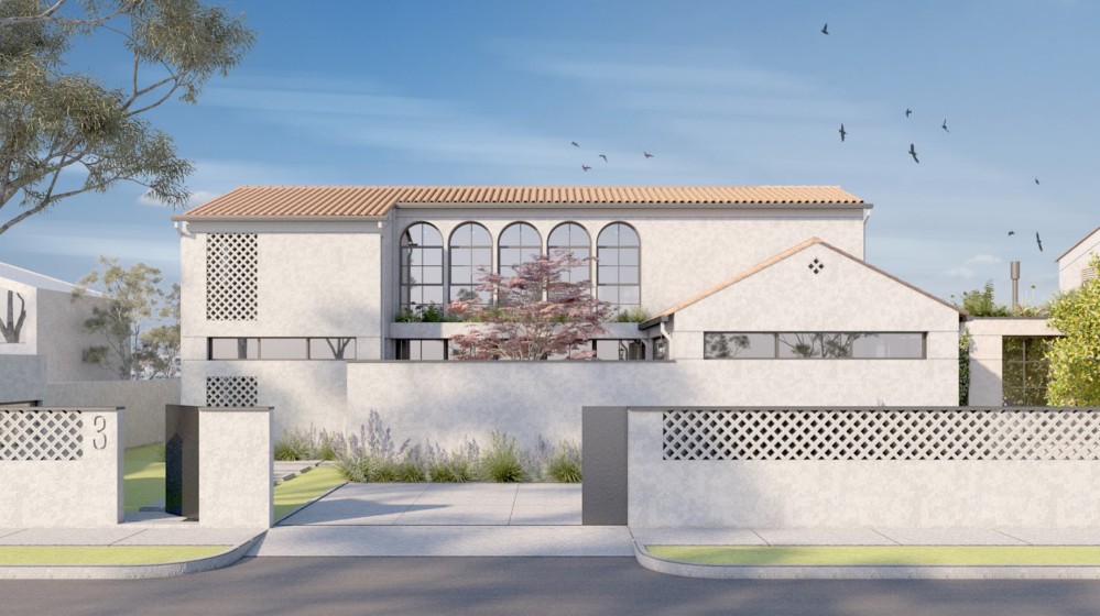
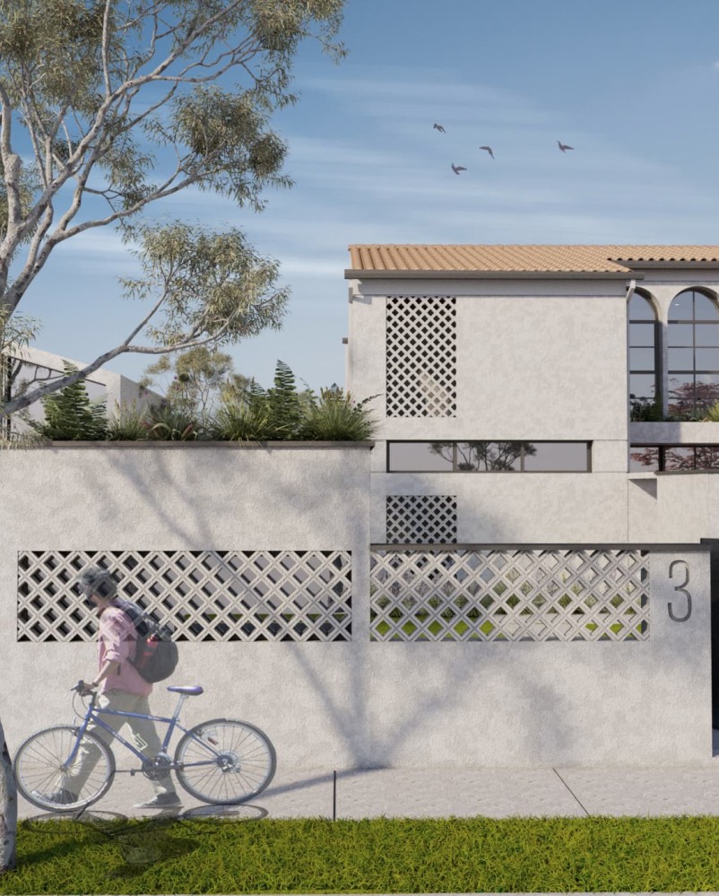
Another change we made that had a meaningful visual impact was to square off all the rounded edges. To be honest, this decision was mostly aesthetic (I’ve personally never seen a rounded corner done with a high enough level of craftsmanship in Ghana) but it was also informed by the desire to make it easy for the building to adapt over time. I agree with Stewart Brand that the quirk isn’t worth the investment.
As for shape: be square. The only configuration of space that grows well and subdivides well and is really efficient to use is the rectangle. Architects groan with boredom at the thought, but that’s tough. If you start boxy and simple, outside and in, then you can let complications develop with time, responsive to use. Prematurely convoluted surfaces are expensive to build, a nuisance to maintain, and hard to change.
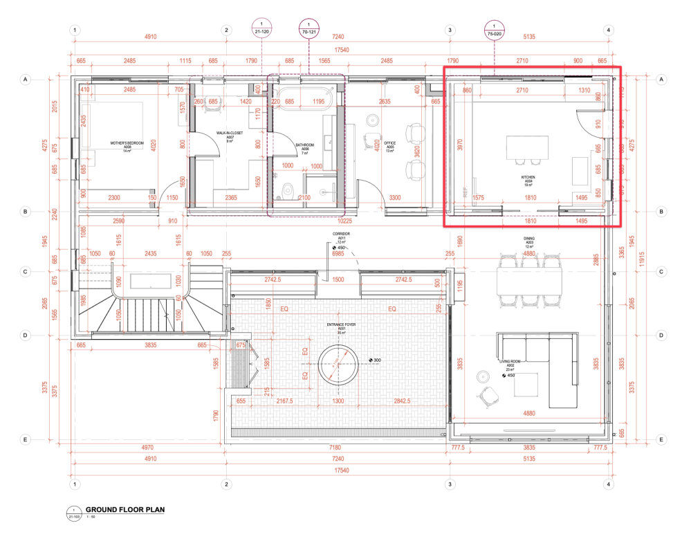
06. Walkthrough
In Atmospheric Architectures, German philosopher Gernot Böhme defines atmosphere as tuned space.
That phrase - tuned space - comes to mind often when I consider different parts of our design. Here are further details on how we tuned different spaces to achieve certain moods and practical considerations.
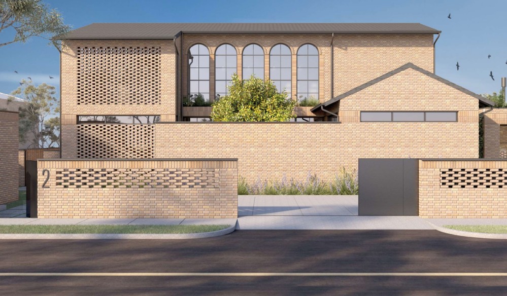
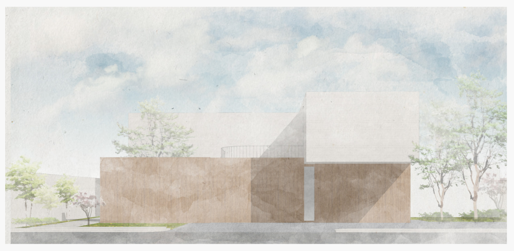
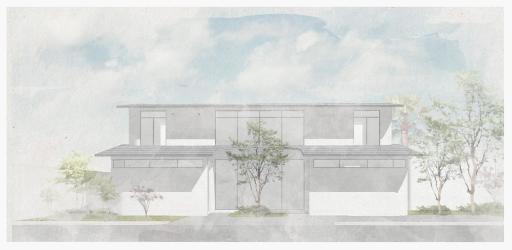
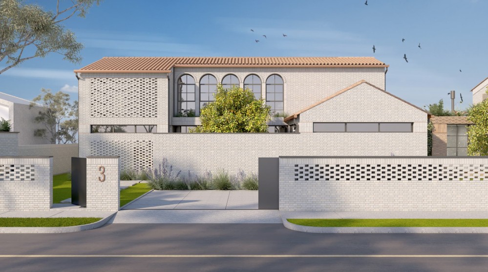
The front elevation
It’s impossible to work on something for a number of years and not have it change you. One of the gifts this project has given me is to help me become more comfortable operating from a place of feeling.
To design a house whose owners would feel they truly belong to, one must first learn how to even design from feeling, and with feeling…
Our design process doesn’t begin from a theoretical concept. Nor from a visual idea, sketch, or ‘parti’. Not even from practical requirements. Our design process begins with an honest introspection to identify what are the few elements that make you FEEL that you are home…
You become like a gardener cultivating a flower, where the ground is the site and the seed is your innermost feeling of home - Building Beauty
Once I embraced the idea that architecture is embodied feeling, it helped me unlearn an odd shyness I felt for gravitating towards traditional elements such as the pitched roof and the arched windows. The final form resonated most honestly with an innermost feeling of home, and I’m thankful to Studio Contra for diverting a bit from their usual contemporary style to deliver a home that felt more true to us, and which we believe provides a handsome view to the street.
The obligation of the building is to help the street; the obligation of the fireplace is to help the room; the obligation of the wall is to help the roof; the obligation of the building is to help the garden; and of the garden to help the street. - Christopher Alexander, The Process of Creating Life
Visual privacy matters a lot to my family, but we had to be careful to not present as actively hostile to the street. While the facade needed to be demure, we had to be careful not to tip all the way to projecting the energy of a closed-off bunker.
I believe we got the balance right.
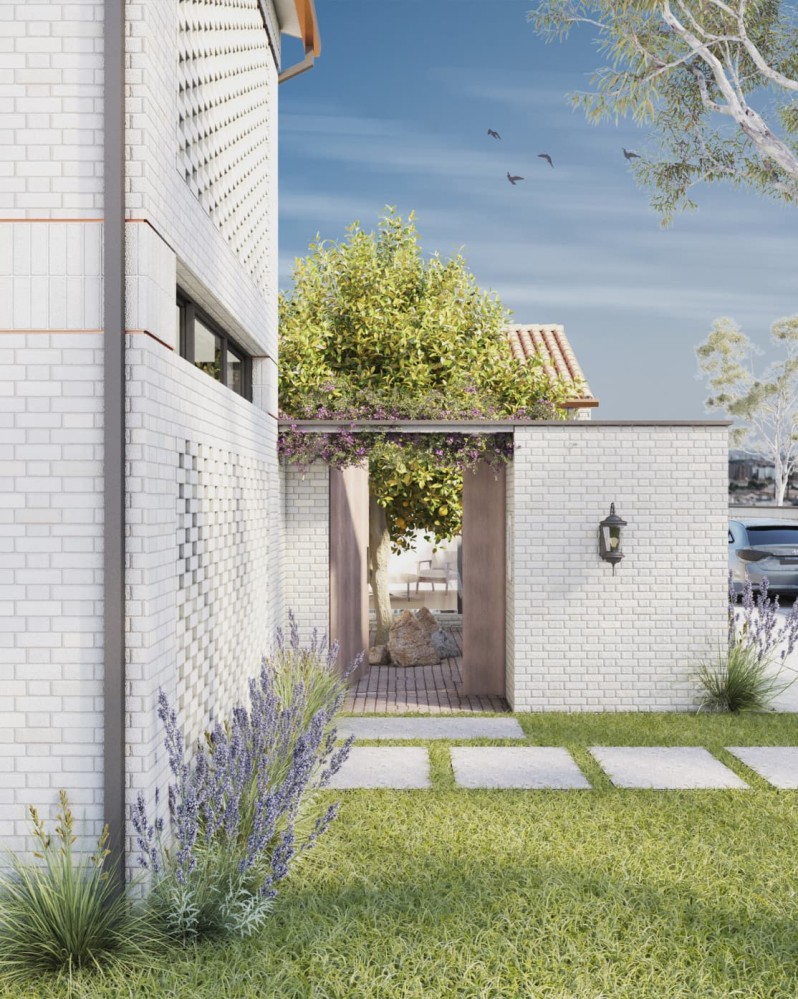
Even though the external gate opens onto a literal brick wall (I love the hidden entrance) we also create a lot of visual interest with the arched windows, the implied movement in the patterned brick, and the borrowed greenery.
The windows are also placed in such a way that at night, the mass doesn’t read as this oppressive hulking form. On the left, the hit-and-miss-style brickwork creates an almost lamplike volume. In the center, the arched windows come alive, and the horizontal windows at floorplate level help create an illusion, almost as if the upper level is floating.
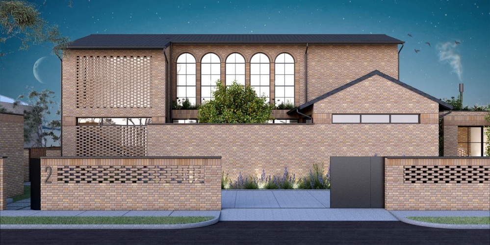
All together, it makes this load-bearing structure almost dissolve away into something softer and lighter.
Final note on the front elevation: I was surprised by how the detailing of the roof changed the atmosphere of the project.
We initially planned to use the traditional U or S-shaped roof tiles common to the Spanish references we were drawing from. But we’re currently considering going with flat tiles instead, both because they’re less expensive, and also because traditional Spanish clay tiles can be very heavy, and may require reinforcement to support their weight.
I don’t have a great image to show the before/after, but this switch had a surprisingly strong impact on the mood of the facade. Losing the waves and the visual movement in the Spanish tile roof had an oddly calming effect on the composition. Something about it seemed to echo moves you’d see in contemporary Japanese architecture.
But if I could wave a magic wand, and have any roof I wanted?
It would be the T-01 tile by the Oiya project.
Oiya is a project by three Japanese pottery companies to create novel building materials by harnessing the tile production techniques of Awaji Island in Japan’s Hyogo Prefecture. Together, they aim to raise the profile of “Awaji smoked roofing tiles,” and I’m completely smitten with their T-01 line.

Something about it feels like a confident, contemporary take on a traditional form, and I’m convinced that this roof paired with brickwork would produce something very lovely indeed. I hope to see that medley one day.
It’s worth checking out the Oiya Instragram account, which has several photos of their entire product line-up.
I hope that as someone walks down the sidewalk, running their fingers idly against the implied rhythm of the sun-warmed brickwork, they feel within them that this facade - this neighbour - provides a kind face to the street. A little reserved, maybe even shy. But still kind.
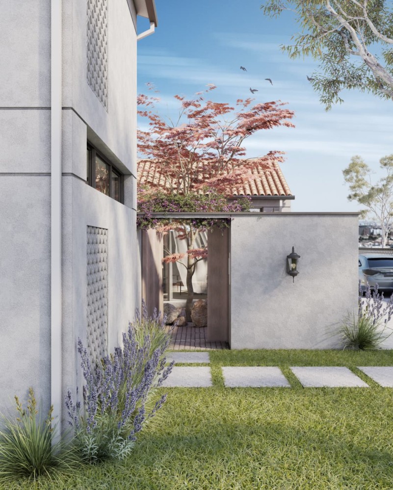
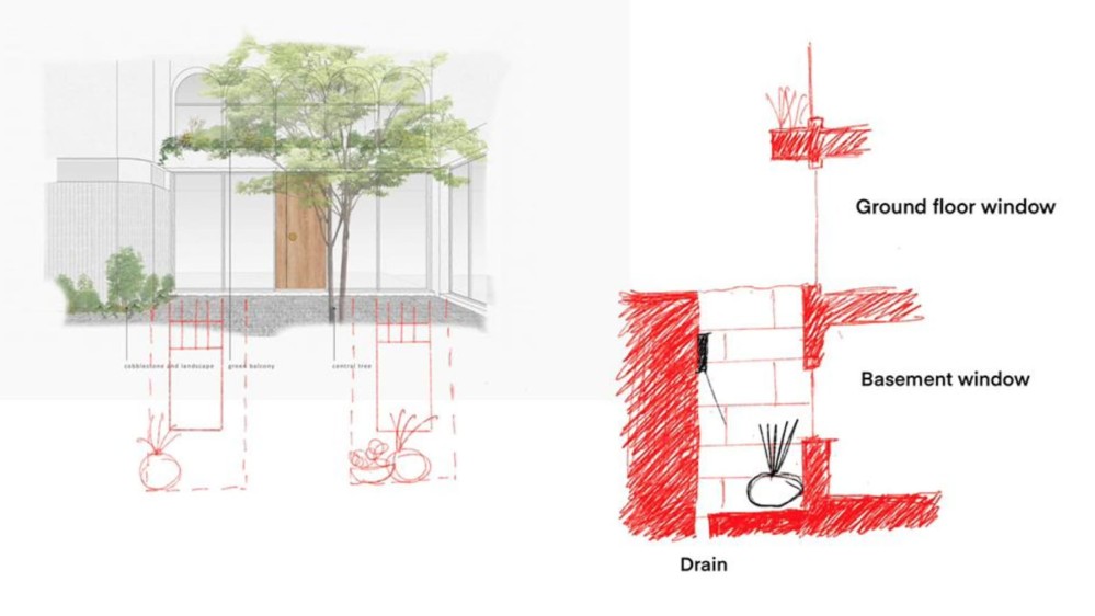
The courtyard
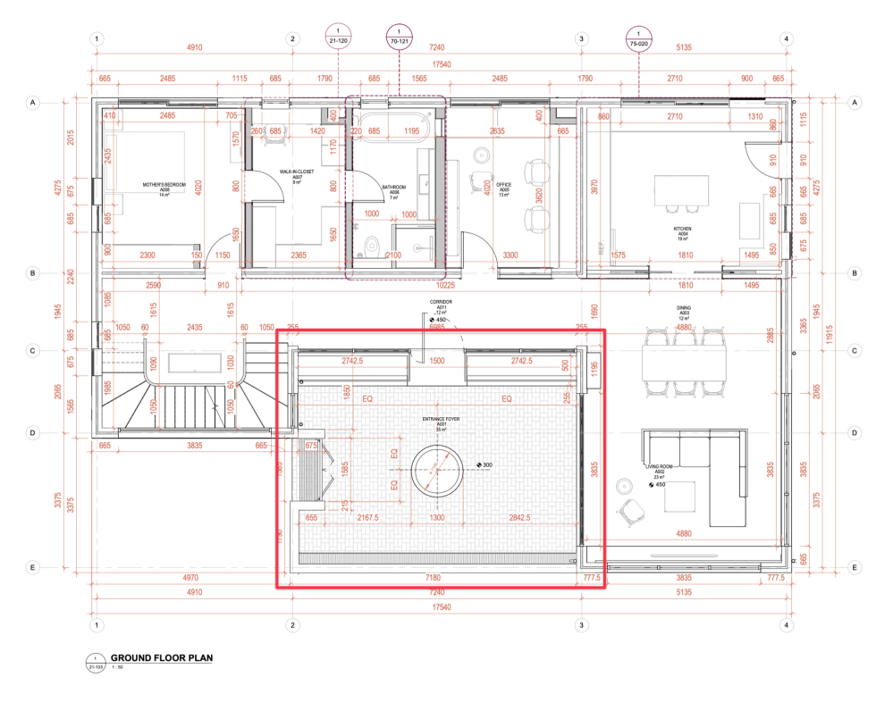
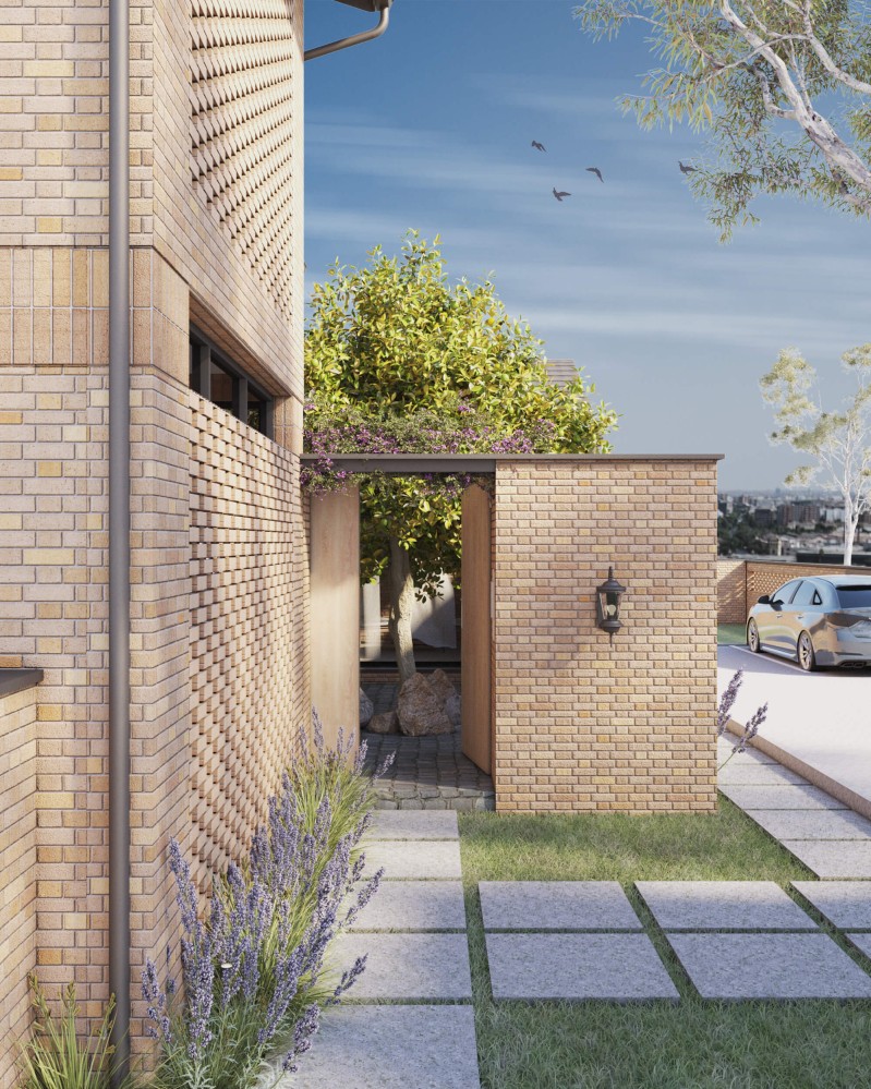
The courtyard is a tiny Eden removed from the stresses of the outside world, and we create a sense of transition into this pocket universe in three ways.
First, you enter through a narrow corridor. It’s a short walk (you can cover it in two strides) but that moment of compression, relative darkness, and then release into the bright open space, helps signal a tonal change in the quality of space.
Second, we have a small trellis above the entrance, creating a momentarily sense of enclosure above, which heightens the feeling of crossing some sort of threshold.
And then finally, there is a material change in the ground treatment, where the floor underfoot switches from pavers to cobblestones (or maybe terra cotta, not sure yet). All three things subconsciously signal that one has crossed a meaningful threshold into another space.
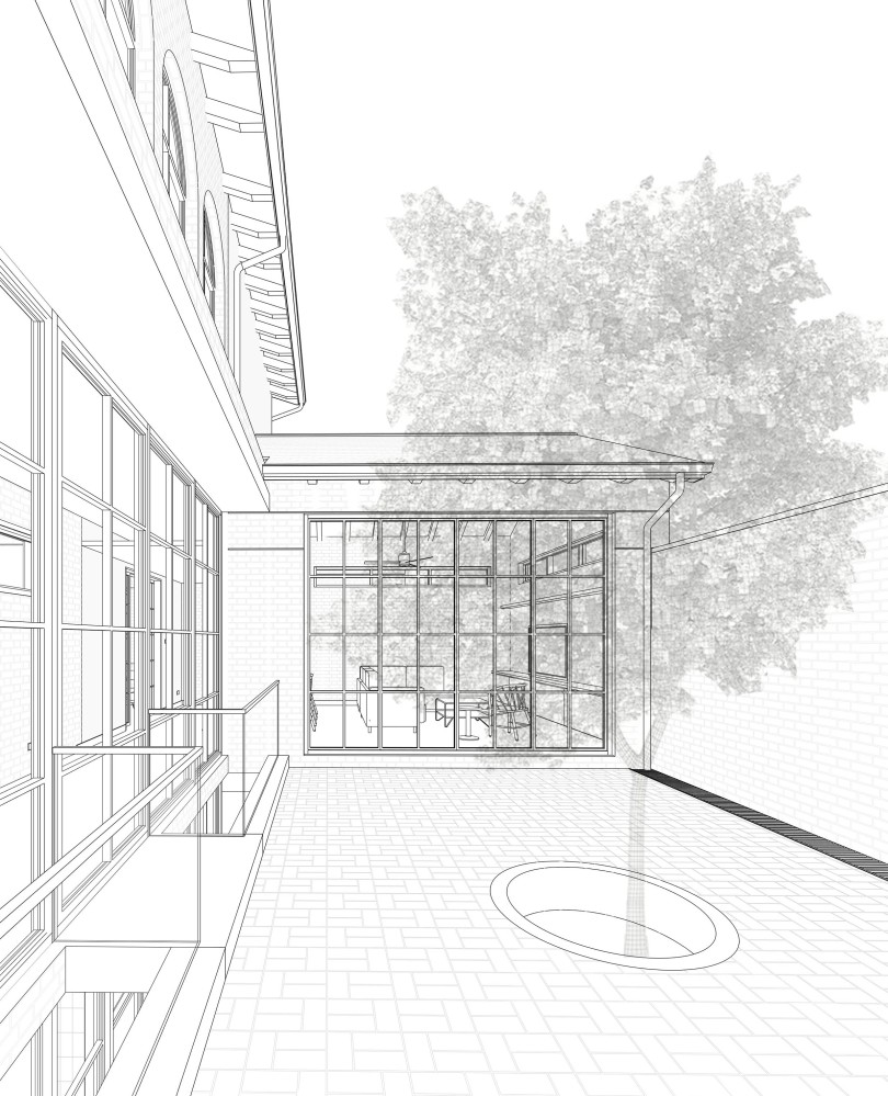
When you step into the courtyard, you’re enveloped on all sides, creating a strong sense of enclosure and shelter.
On your right-hand side there’s a 3 meter high wall that both provides visual privacy from the street as well as a sound barrier against the outside world. The ground slopes very slightly so that rainwater does not pool, but instead runs into a linear drain at the base of the wall.
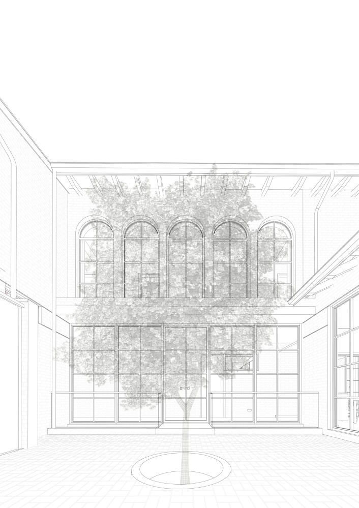
On your left is the full height of the building proper. The entire ground floor is a glass and black steel curtain wall, which helps the lower level dissolve away, and helps the masonry read as much lighter than expected.
In the center of the facade is the entrance door which is flanked on both sides by lightwells that bring light and air to the basement level. Above the entrance runs a green balcony which provides both a practical as well as aesthetic function: not only does it introduce more green into the courtyard space, but the ledge also protects against the elements, sheltering both the lightwell and someone at the entrance from harsh sun or rain.
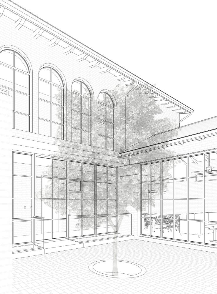
And then above the green balcony are the arched windows. The lines of the ground floor windows connect with those of the upper floor, creating the illusion of a grand, unbroken double-height volume.
We’re specifying the windows in steel instead of aluminium for a number of reasons. Steel is stronger than aluminium, which allows much of the wall to be made of steel windows with much more slender sightlines than are possible with aluminium. Steel windows are also more fire resistant than aluminium, and they’re very durable as well, which is important for a home which we hope to last for over 100 years.
Ahead of you is a tree in the center of the courtyard. We’re yet to finalise on the exact tree that will be planted here. I had initially specified a mango tree, but the problem with large fruit trees is that they have muscular root systems which can damage foundations, and over time their foliage might block out too much of the sun in the space. We’ll make a final decision on a tree whose root system ideally goes straight down as much as possible.
Depending on the kind of tree we go with, we might also consider a root barrier which a plastic material placed below-ground between a tree’s root system and a building. Why? It turns out that large trees can absorb a lot of moisture from the ground (about ~200 gallons a day!) which causes the soil under the tree to settle. As the soil shrinks and settles, the house’s foundation bends towards the tree, which can cause floors to become uneven, as well as other more dangerous structural issus.
This 3 min video is the best introduction I’ve found to the problems caused by trees under foundations and how they’re solved by root barriers.
If you would like to learn more, here is a short video showing a root barrier being installed, and this great 2 minute video covers some very common mistakes people make when installing root barriers.
To be honest, considering how damaging root systems can be to foundations, we might opt for an above-ground potted dwarf tree to spare ourselves the potential long-term headache of having a root system so close to the basement level of the house.
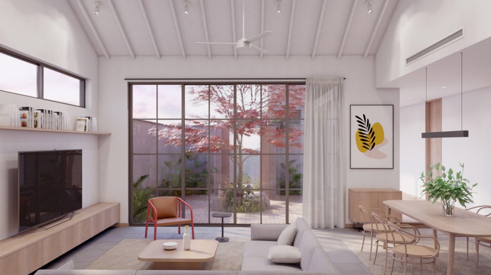
Beyond the tree is the living room, whose French doors are able to open up to connect indoor and outdoor space. The courtyard has a gentle slope that sends rainwater towards a drain running along the wall facing the street, but we also have a step up from the courtyard to the living room to prevent water from entering into the living room during heavy rains (we’ve accounted for slopes elsewhere to allow wheelchair access into the house).
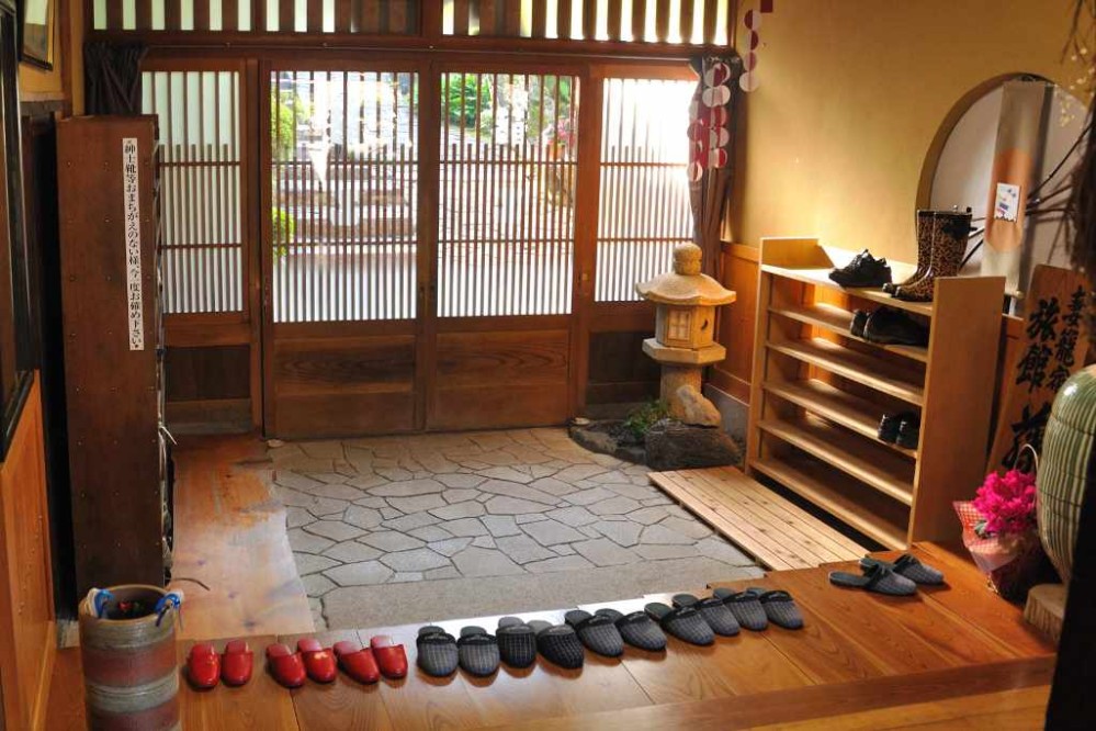
I love this step up moment because, while I don’t think the reference was intended, it is reminiscent of the genkan found in traditional Japanese architecture. From what I understand, many Japanese homes will have an entrance foyer where shoes must be removed, and a step up to the raised floor of the living area.
The courtyard home is likely humanity’s oldest building typology. Whether it’s the Chinese siheyuan, the Spanish patio, the Japanese tsubo-niwa, the Roman domus, or the traditional courtyard houses of the Muslim world, humans across different times and climates have always gravitated to this form for various reasons.
Closer to home, there are several examples of this housing typology across the continent. Studio NYALI is doing some research around exploring courtyard houses across Africa.
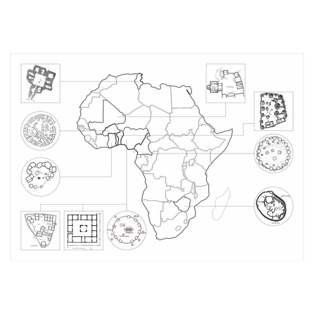
And of course, the compound house is a common typology in Ghana. The 2011 UN-HABITAT Ghana Housing Profile estimates that about 55% of urban Ghanaians live in compound houses.
While I’m not certain that Studio Contra intentionally set out to reference the traditional Ghanaian compound house, I must admit that it feels oddly comforting to know that our home is designed in the same spatial configuration humans have been reaching for over centuries, whenever they wanted to create a sense of enclosure and home.
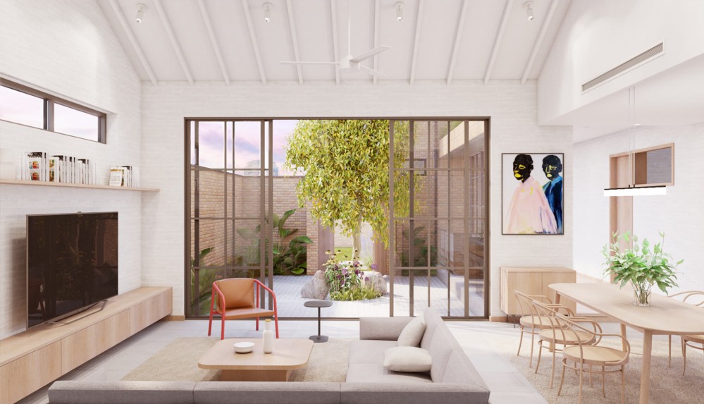
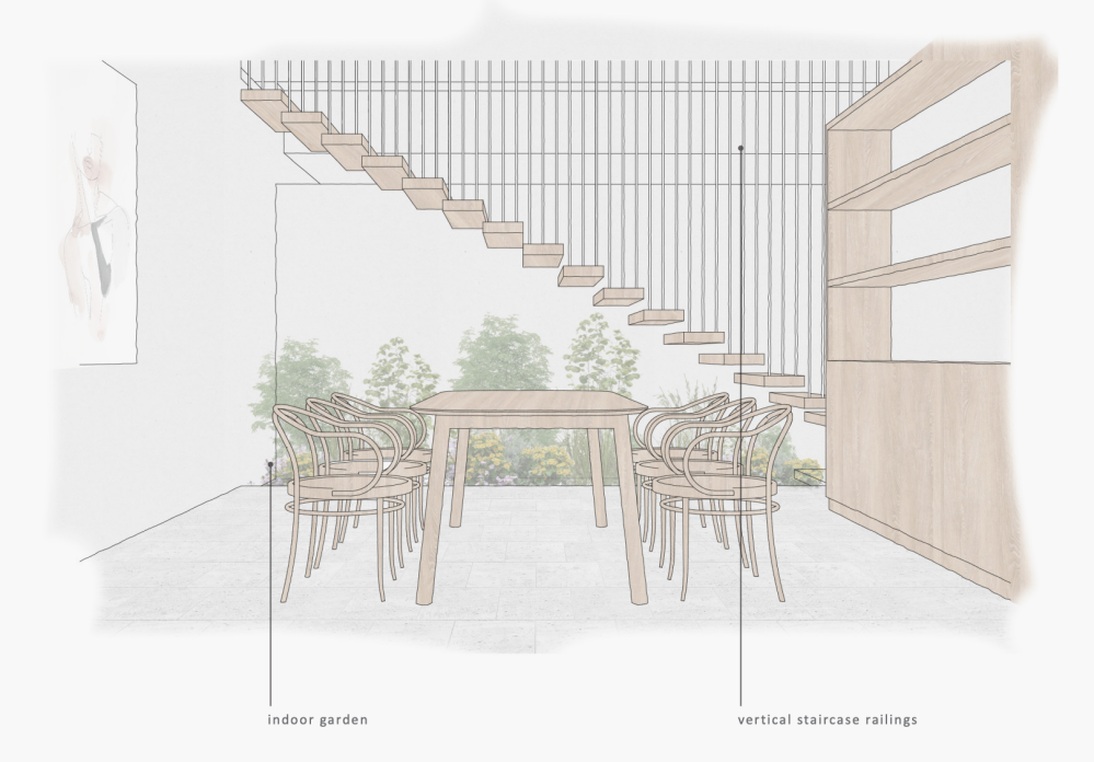
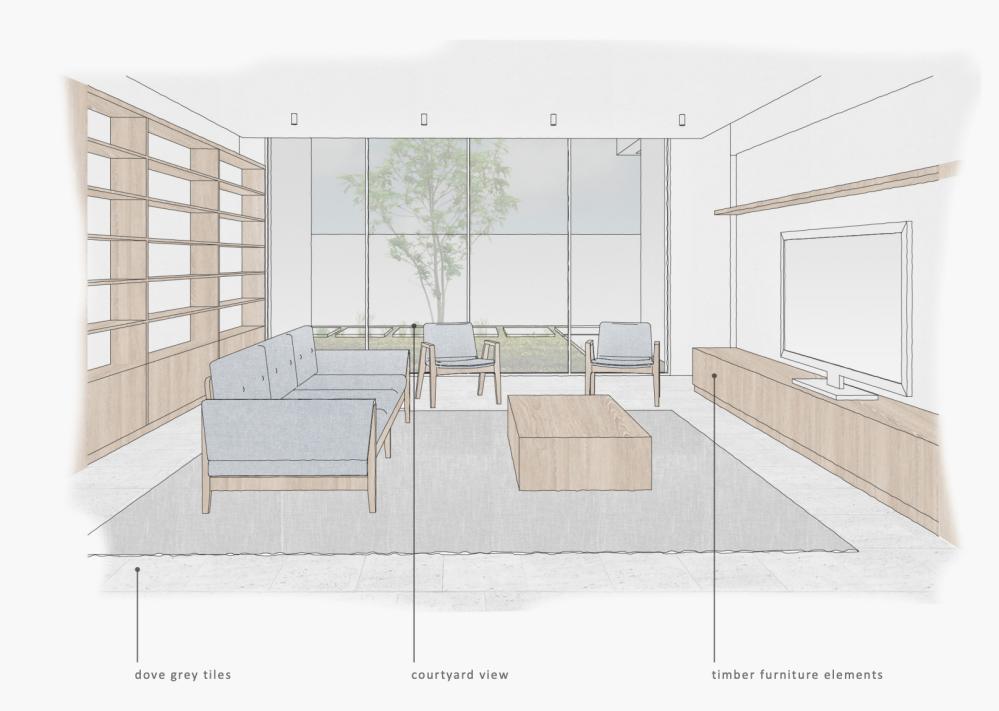
The living room
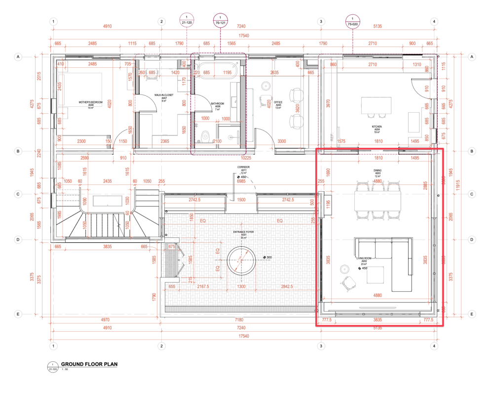
One step up from the courtyard, you enter the living room, with its generous 4.7 meter high ceiling. The living room doors open up to the courtyard, and the central tree helps block the view of the neighbour into the heart of the living space. The wall of glass on the right-hand side also helps make the courtyard feel much wider than it actually is.
Clerestorys ensure that the room gets light from three sides, while providing ample wall space for putting up artwork and my brother Alfred’s professional photography.
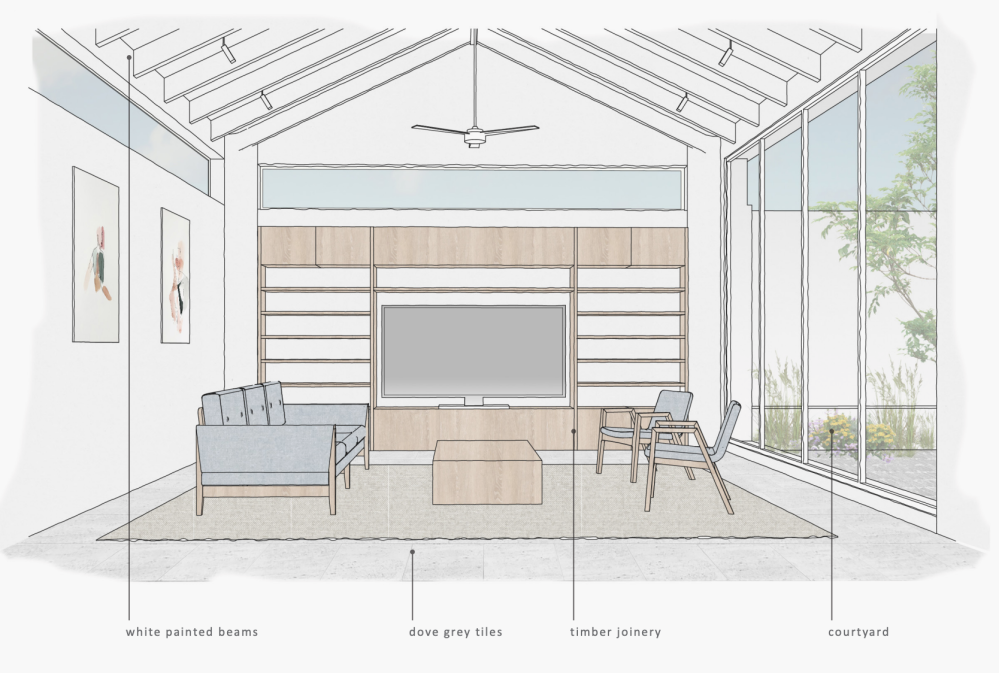
The living area also opens into the kitchen, providing a large continuous internal social space for entertaining. Like with all interior spaces of the house, we intend the interior design to be bright and warm. Whitewashed walls will meet dove grey tiles and timber skirting.
The kitchen
As is probably clear by now, this home is a deeply personal to me, but the kitchen maybe more so than any other room. There were no windows in the kitchen of the home I grew up in (fumes would flow into the corridor which led outside). A few years ago, the gas cylinder exploded in that kitchen. Happily, my mother wasn’t at home, and the fire was quickly put out, but the images of the aftermath haunt me, and that incident was a strong motivation for making progress on the house.
All of which is to say, the kitchen has special meaning for me.
We’re yet to resolve many aspects of the kitchen program, but here are the broad details. Pocket doors allow the kitchen to open up entirely into the living space, allowing us to close it off when we want to limit the smells coming into the living space or hide the mess.
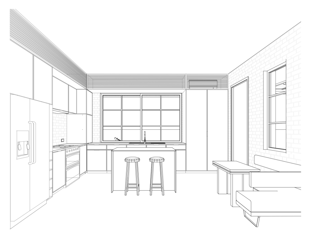
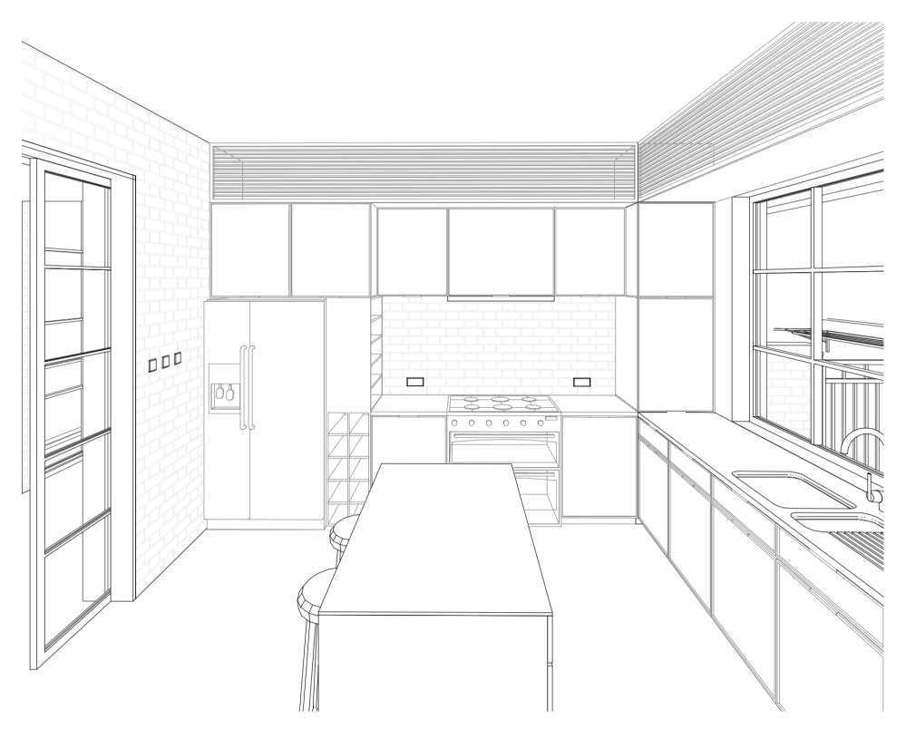
The entire left wall is heavily built out, including cabinetry, the cooking alcove (borrowed this idea from kitchen-centric interior designer Jean Stoffer) which will feature an induction cooktop, and “appliance garage” where home appliances like toasters, kettles, etc will be neatly stored.
The middle wall has large windows that let in a lot of light, as well as a small pantry and cabinet storage.
The right wall contains a breakfast nook where members of the family might huddle in the morning over tea, or a cozy late dinner. And the kitchen island provides needed counter space as well as more storage in its base.
I would like to say a little about why we’re going with an induction cooktop over the traditional gas cooktop. I had never heard about induction stoves until a friend in Accra got one for his apartment, and even then, I assumed that an induction stove was the same as an electric stove, but I later learned that electric and induction stoves are two completely different things.
Here are some of the reasons why we’re going induction.
- A big reason we’re moving away from gas stoves is because of how unsafe they are on several levels. I’m not even only talking about the problems with an open flame and the risk of explosion like what happened to us. In addition to that, there is a growing body of evidence that suggests that gas stoves produce unsafe levels of indoor air pollution that can cause all kinds of respiratory issues.
- The way induction stoves work, no energy is lost wastefully heating the surrounding air of the cooking area. As a result, the kitchen is much cooler when cooking, temperature-wise compared to a gas stove. In a climate like ours where it’s already very hot, a cool, comfortable kitchen is very welcome.
- And then last, but definitely not least, induction stoves cook absurdly quickly. In test after test, induction stoves take almost less than half the time to get a pan to the same level as gas stoves. This is because the hyper-efficiency of induction stoves means that over 90% of the energy is channeled into heating the pan, compared to gas where the majority of the energy is wasted literally heating the surrounding air. Here’s an example of a speed test.
So induction stoves are a lot faster, a lot safer, don’t generate indoor air pollution, and result in a more comfortable cooking experience. Honestly, I suspect that this is one of those things where in a few years we’ll look back and be amazed at how normalised it was to cook with gas stoves, like how we look back and are shocked that it used to be normal to smoke on planes. If you can afford to, I strongly encourage you to consider switching to induction. Here is a great 4 min video summarising why to switch to induction if it’s an option for you.
The study
COVID-19 put me in an introspective mood on, amongst other things, the nature of / value of / virtue of / future of / morality of work. It’s a conversation I’m still having with myself, as we go into the third year of the pandemic. What do we gain, and what do we lose, when work gets closer to the home?
What does it mean that works becomes simultaneously more removed (loss of the serendipity of the water cooler) but also more intimate (hearing your colleague’s newborn in the background)? As we continue to negotiate the implications of this shift, I suspect our homes will begin to mutate in response. In New rooms for the new normal, Matt Webb muses
Maybe the future of the “front room” is to be a mixed public/private space, a bit like the shopfronts or workshops of old – a space which is made to run a small artisan business: massage, haircuts, I.T. support, neighbourhood parcel drop-off… a counter, a big welcoming window to the street, a secure internal door to the rest of the house. How would architecture respond if the ground floor of a duplex, or the front half of a home was assumed to be semi-permeable interface to the outside world like this?
Dan Hill also has an excellent essay on the “blurring of home, work, office, classroom, studio, and shop”:
Most homes are not designed for work, such is the thoroughness with which modernity separated out form around disparate functions. The lazy phrase that “my office is wherever my cellphone is” was never more clearly false. It is awkward to work in this way. Despite years of a half-hearted interest in this area, there has been little true engagement with the idea of home-work not as a binary opposition, but a richly diverse continuum of spaces, fixtures, technologies, and modes.
…There is no doubt an increased pressure on a space not designed for families and friends working from home, or living together almost 24/7. This pressure is both physical and spatial, as well as psychological, emotional, social. The toll on many, in terms of mental health and wellbeing, will be crushing over time. For those with existing mental health issues, it will be particularly dangerous… By far the majority of dwellings we live in have not been designed for this.
Personally, I’m still early in my thinking on how a home should respond to this new reality, but what we’ve done in the meantime is to create two types of work areas - a buttoned-up study/office, and a less formal workshop in the secondary building.
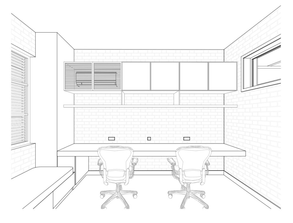
The study is optimised to provide a nice background while doing Zoom calls, and to be well-appointed place to receive guests and business partners.
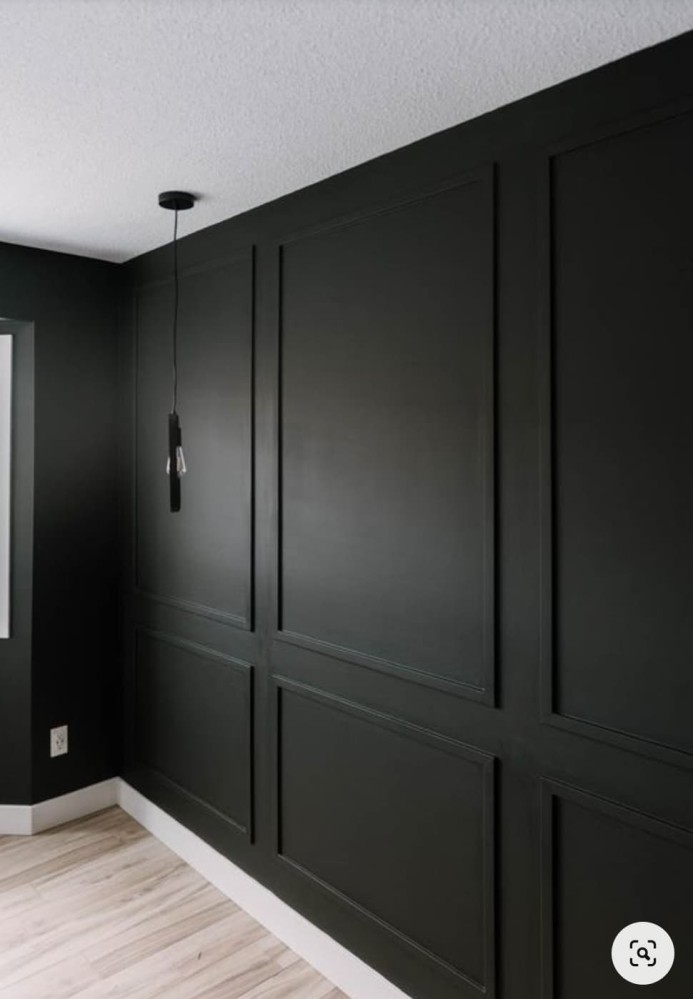
We’re yet to conclude on the interior design of this space, but I have a strong instinct to do rich dark green wall paneling - the type of thing you expect to see in smoky personal libraries with the strong scent of whiskey and leather upholstery 😄

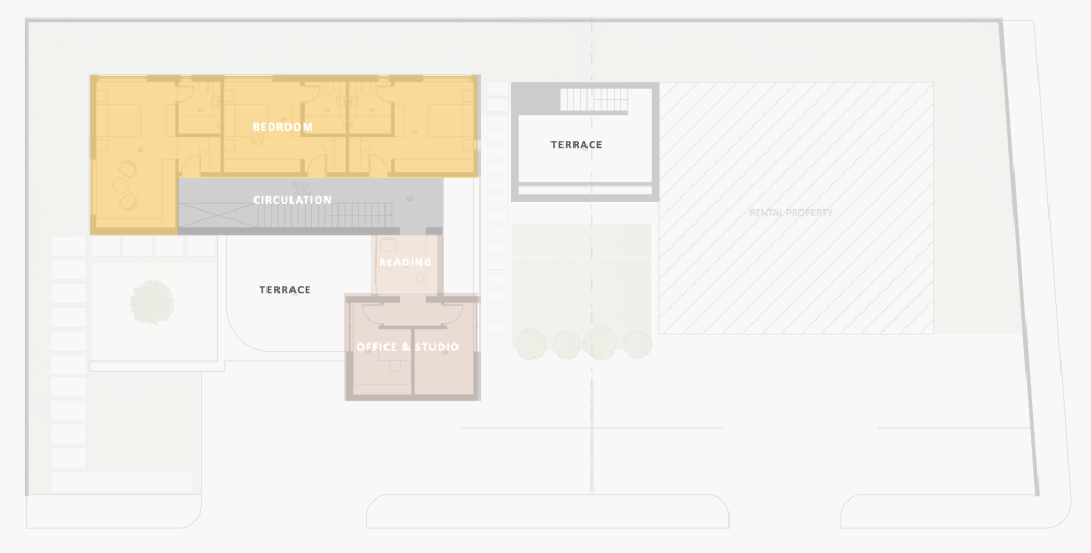
The studio
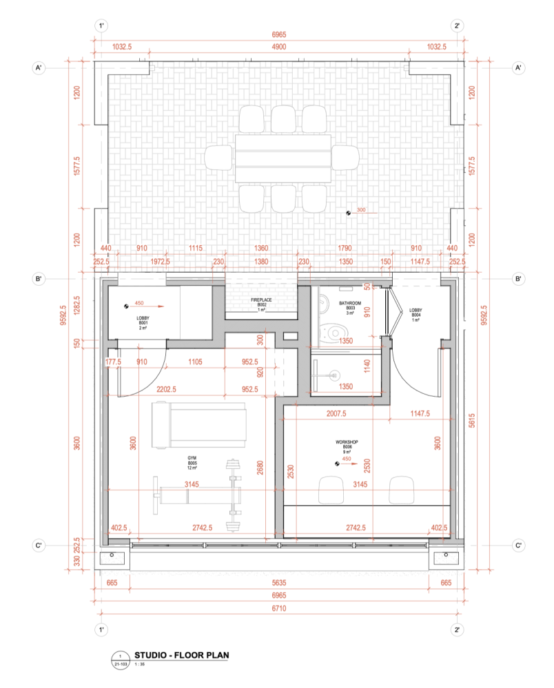
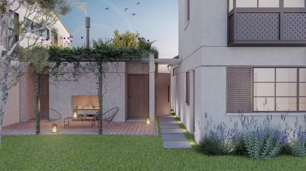
The studio is the collective name for the secondary building next to the main house. It houses an outdoor dining area, a small gym, and a workshop area for creative pursuits.
I’m fascinated by photos of the workspaces of creatives, and I believe it’s important to have this type of flex space where you can get messy without a care, and where you can lay out your work all around you.
One special thing we’re doing in this space is vaulted brick ceilings. I don’t have renders, but these photos give a very rough sense of what those kinds of spaces feel like.
It’s a small detail that adds character and personality to this cozy pavilion.
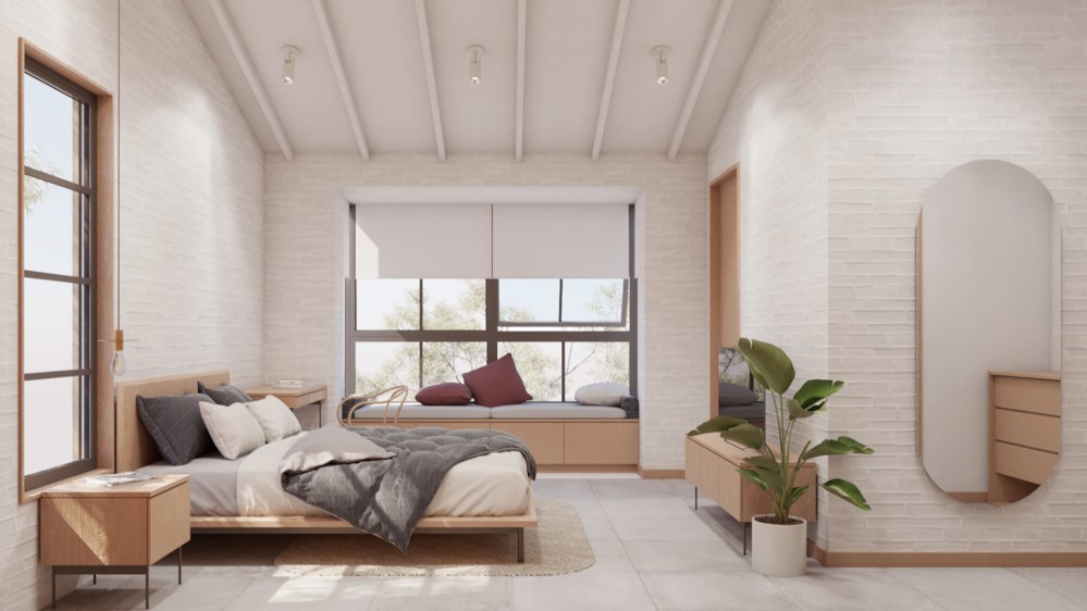
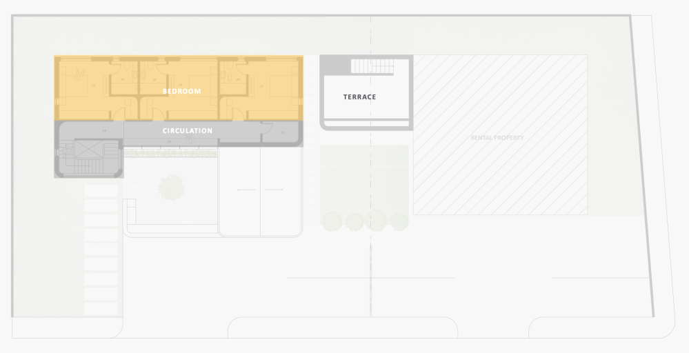
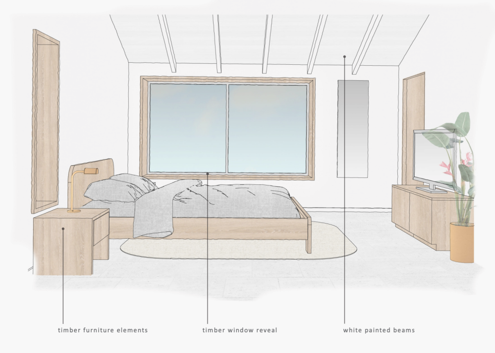
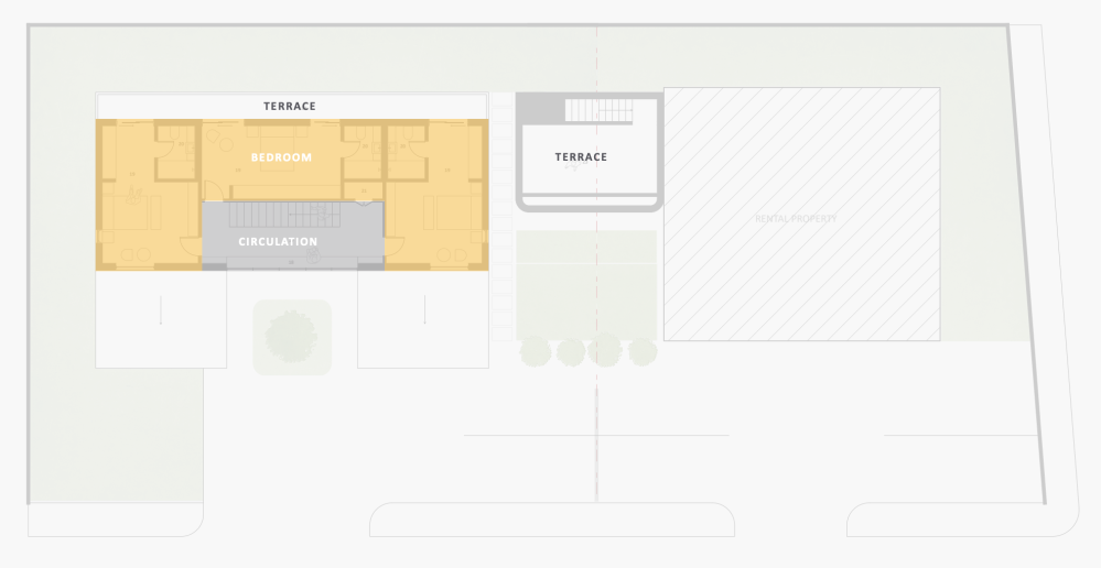
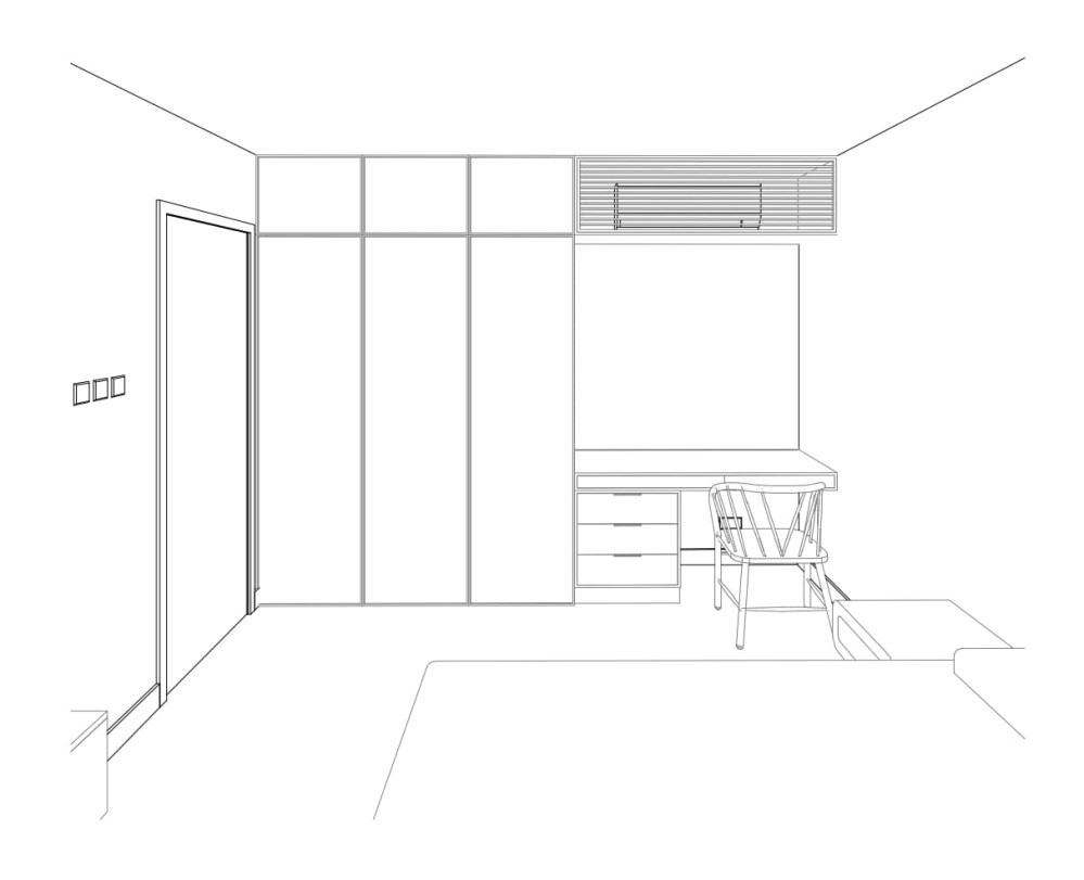
The bedrooms and bathrooms
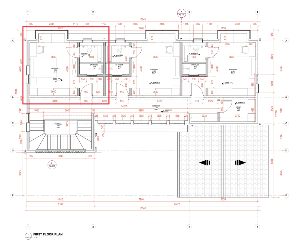
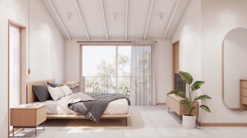
The upper floor bedrooms went through a number of iterations, eventually resulting in their most distinctive feature: a nook that cantilevers slightly over the ground floor.
I got the idea for the nooks while researching the courtyard typology in different cultures. While reading about traditional courtyard houses in the Middle East, I learned about the mashrabiya (also known as the shanashil).
E. Mahmoud Zein Al Abidin, in an essay titled “The courtyard houses of Syria” from the book Courtyard Housing: Past, Present and Future describes it as “a wooden balcony located on the outer façade of the house. It provides a cool screened space for women, allowing them to view public spaces without being seen. It is usually supported by two cantilevered wooden beams, which are anchored in the external wall.”
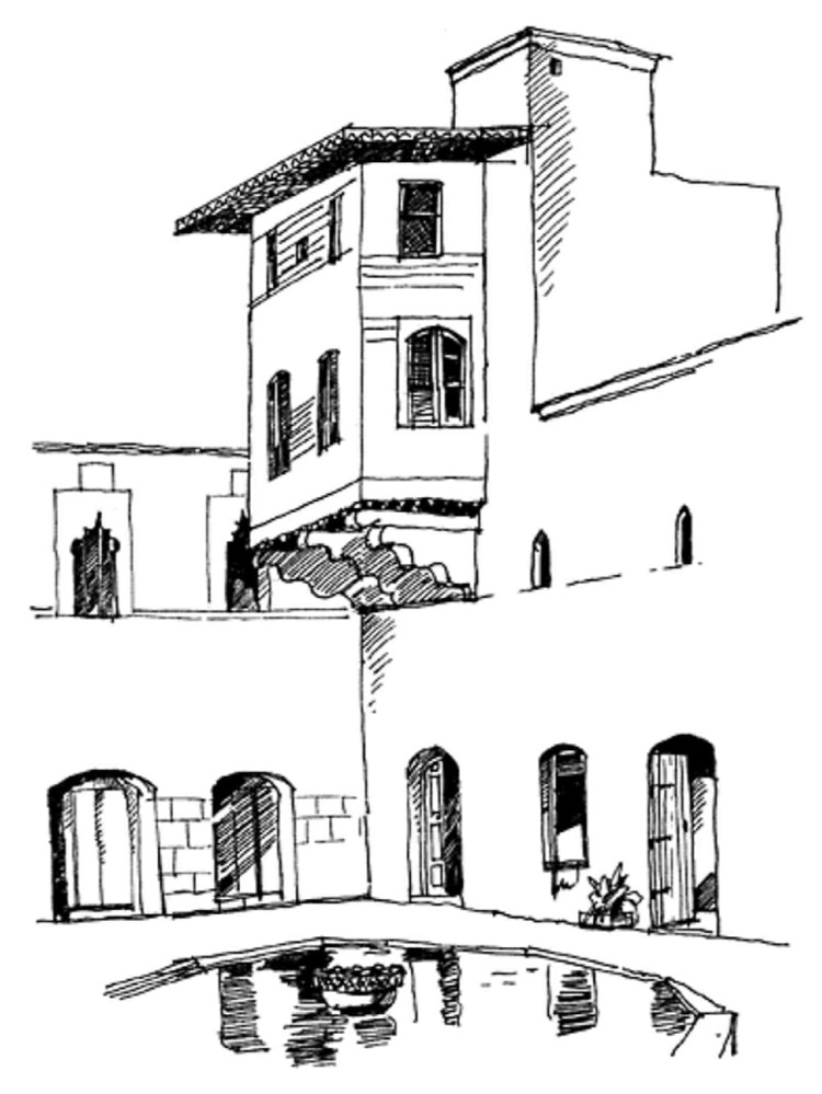
I enjoy how this form provides a soft edge to the room. For now, that space will be occupied by a comfy day-bed, but in the spirit of maximum adaptability, we construct it as loose furniture so that if we want to in future, we can easily turn that area into other uses, such as a more generous work bench, exercise area, or some other use.
We were also able to repurpose the negative space created by the nook projections to create a tiny balcony garden to bring some greenery closer to the bedrooms.
There are a handful of things I have in mind for the bathrooms.
I was initially drawn to skinny, vertical tiles because of how they draw the eye upwards and help create a sense of height.
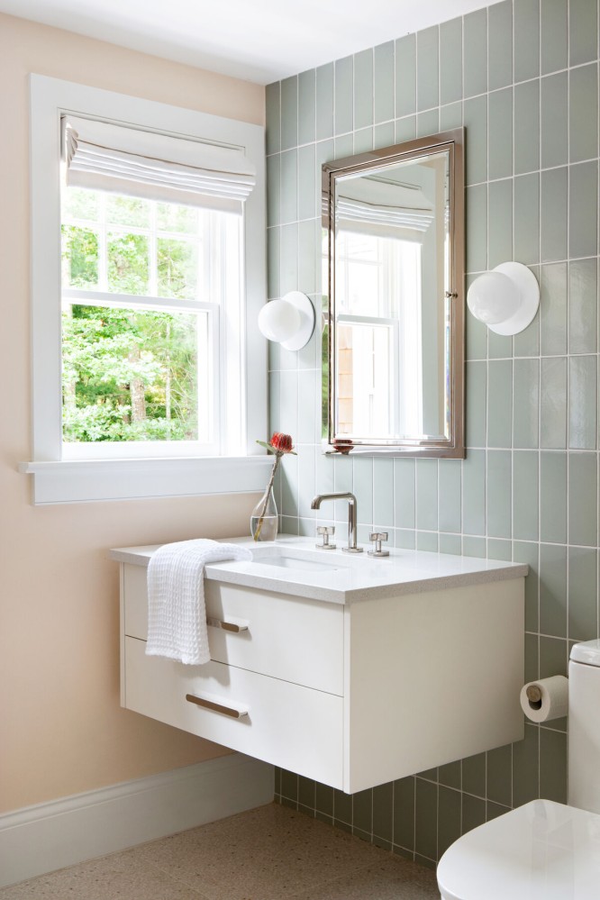
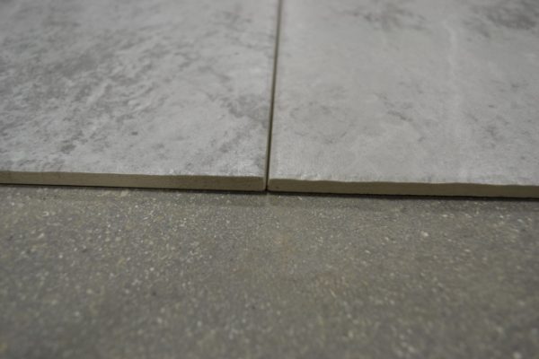
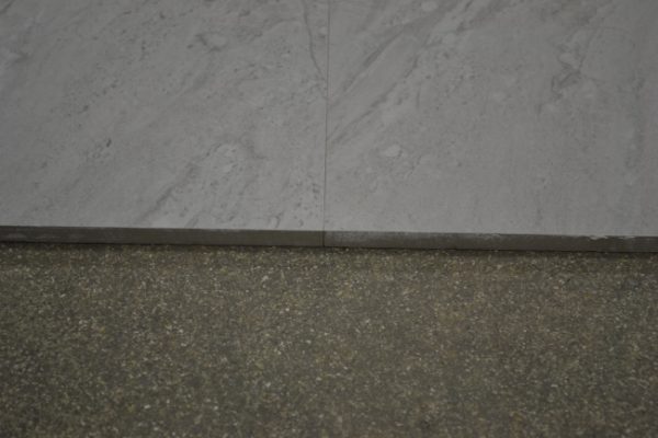
But I’ve since changed my mind on this. Instead, I intend for the tiles to be as large as possible, in order to have as few grout lines as possible. This is because grout can be difficult to clean and can trap bacteria if you’re not meticulous. The fewer grout lines, the better.
Another trick that homebuilders use is to use a colour of grout that matches the colour of the tile as much as possible. Unless the design intent is explicitly to create a high contrast look, harmonising the grout colour with the tile colour makes the grout almost invisible, which creates the illusion of a seamless look.
Yet another way to minimise grout lines is to use rectified tiles. A rectified tile is a tile where “the edges have been ground or sawed after firing so that the overall size of the tile is more precise or exact” (definition from this great resource). This extremely straight edge produces an acutely thin grout line when rectified tiles are laid next to each other, making the wall or floor look almost as if they’re one unbroken piece of tile, which gives a more premium look.
Finally, with sustainability in mind, we’re considering solar water heaters, as well as low-flow fixtures, which are faucets, toilets and shower heads designed to operate satisfactorily while reducing water waste (and utility bills) by reducing water flow rate. Here’s some more info on low-flow fixtures.
The basement
We didn’t go into the project planning to do a basement. But after the geotechnical survey report came back and we realised that the water table was lower than we had thought, we realised it was an option open to us.
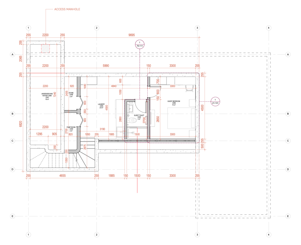
The reasons we ultimately decided to do it include:
- The previous plan didn’t allow us to have a dedicated guest bedroom, and Appolonia City’s developmental controls limit the maximum height of the building to two storeys, so we couldn’t build upwards. We were initially going to turn the studio workshop into a flex space that could be converted into a guest bedroom when necessary, but going below ground allowed us to have a bedroom that was always ready to accept family and guests
- We were digging down anyway to create the water tank to store treated rainwater, so we figured we might as well activate the space to allow more space for storage, a better laundry space, and an out-of-the way place for mechanical equipment
- Finally, I genuinely believe that if the soil condition allows for it, and you’re in a position to do so, it is the sustainable-minded thing to do to maximise the use of land by making use of below-ground space. I belive that moves that help us build more densely are a net good because it frees up land for other uses
Introducing the basement increased the cost and complexity of the project. Much of that complexity came from figuring out clever ways to handle the grey water from the laundry room and bathroom, the solid waste from the basement toilet, the collection, processing, and storage of rainwater (and ensuring that the underground water tank is as watertight as possible), and of course holding back the soil that’s pushing against the walls.
We even thought long and hard about whether it was worth it to have the laundry and guest bathroom in the basement at all, considering that it increased the complexity of the mechanical and engineering works, but I ultimately decided to do the harder thing because, in line with the principle of being super adaptable, I believe it’s important to have full water access on all three floors. This gives us maximum flexibility in future to change the functions of spaces as desired. For example, if we wanted to rent out the basement level as a tiny studio, having waterworks there would make it relatively trivial to install a small kitchen.
But this is one of those moments where investing in a good team pays off. For example, here is the logic that our M&E team went through regarding the question: how should we handle solid waste from the basement toilet?
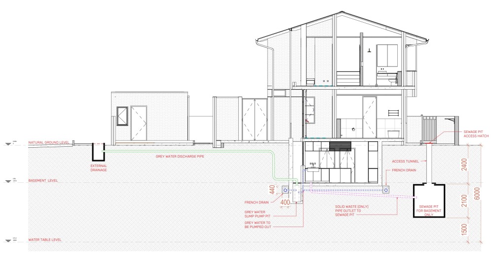
Everywhere else in the house, we’re using on-site biodigesters to handle toilet waste. Couldn’t we simply use a biodigester for the basement toilet as well?
Well, usually, with the biodigester, the solid matter is separated from the liquid, and the liquid soaks away, but there are two issues with doing this at basement depth. Firstly, this would introduce water near the basement, and we’re trying to reduce the amount of water near the basement as much as possible. Secondly, at that depth, there is a lot less oxygen, resulting in anaerobic reactions that will cause strong smell. We could technically introduce a sump pump to pump the water away from the biodigester, but this would introduce yet another mechanical system, with all the potential issues that come with it. We would need to treat the water before it can be discharged into the central gutter system, which is even more added complexity. Weighing all that, the best call is for a septic tank system for the basement toilet.
I had initially been trying to avoid the use of the septic tank as much as possible, because I was worried about how the waste would be disposed once it was drained, but after asking around, I’ve learned that there are actually facilities in Accra where the waste is properly disposed off, and turned into biogas and a flammable product that can be used in place of charcoal (which reduces the amount of deforestation caused by producing firewood).
I know this was a very long digression, but those are the kinds of considerations we have to make due to the desire to have the basement.
(As an aside, I hadn’t heard about biodigesters before this project, but they’re super cool. Basically, they’re better than septic tanks in several ways - require smaller land area, don’t require trucks to come drain them, don’t smell, and rely on organic microbes to break down waste. If you’re curious, there is a YouTube channel from a Ghanaian biodigester installer with lots of content. Here is a video about the pros/cons of biodigesters vs. septic tanks, how to construct a biodigester, and how to maintain a biodigester.)
Regarding how we handle light and ventilation, this is the scribble I sent Studio Contra describing an idea for how we might do this, which they resolved into the much better plan you see. The idea is for a lightwell in the courtyard which brings light and air down to the basement level.
Finally (and this is a very tiny thing) but I really like how, on some level, having the laundry room and guest bathroom off the courtyard to some extent echoes the traditional Ghanaian compound house typology.
Artwork
My brother, Alfred does incredible professional photography, and I’m really looking forward to us being able to put up large scale prints of his work around the house.

But I’ve also been keeping tabs on a number of other African visual artists from whom I’m considering procuring some work one day. Here are some of them (in order of images below: Julius Agbaje, Chidinma Nnoli, Joshua Oheneba-Takyi, Adanna).


I also intend to check out Juniper Print Shop, a site where you can purchase high quality art as digital downloads, which you print on your own, in a way that benefits the original artist.
Landscape (and the secret garden)
For flowers, we have three broad themes. First, we’ll be looking for flowers that are either white or purple. Many internal walls will be whitewashed, and white flowers contrasting against the multi-brown brick walls would be a nice way to continue the colour theme outside.
And I also think the moody contrast of purple against the backdrop of brown brick will look really good.
Secondly, we’ll be looking for strongly fragrant flowers to colour spaces with their scent. This was a useful resource on different types of fragrant flowers, but we’ll need to work with a local expert to understand the types of fragrant flowers that do best in our climate.
And finally, we’ll look for plants that are natural mosquito repellants. Here is a useful list of plants that are natural insect repellants.
Beyond the areas immediately around the house, though, we’ll be putting special thought into an area we’re calling The Secret Garden.
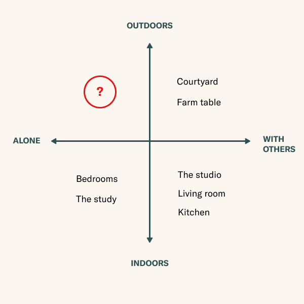
This grid was one of the tools I used when considering the programme of the project, and it helped me realise that we were missing a space where it was easy for someone to be outdoors, alone. That opportunity for retreat and solitude matters a lot to me, and The Secret Garden helps produce this.
I have so much to share on this, but I think that’s best saved for its own post. For now, I strongly recommend this video interview with Leslie Bennett, founder of Pine House Edible Gardens. Watching this video was transformative for me and helped elevate my thinking into what landscape design could be, and the ways in which physical landscape is intertwined with cultural landscape.
In addition to founding Pine House Edible Gardens, Bennett also founded Black Sanctuary Gardens, a community around creating garden spaces that nourish Black women. In her interview, Bennett gently points out how surprising it is to encounter an image of a Black woman, in a garden, at rest.
A Black woman.
In a garden.
At rest.
It’s a very simple idea, but given that much of this project is a celebration of my mother, it has animated my thinking about The Secret Garden.
Lots to figure out here, but this is what I have so far:
The secret garden will be sunken. I love the strong sense of enclosure and safety, and the dense moods and smoky flavours of sunken gardens.
The secret garden will be edible. An edible garden is a garden that not only looks good, but produces fruits, herbs, vegetables, tubers, edible flowers, and other foods that can be eaten. It should celebrate abundance and should be a joyful harvest of flavours.
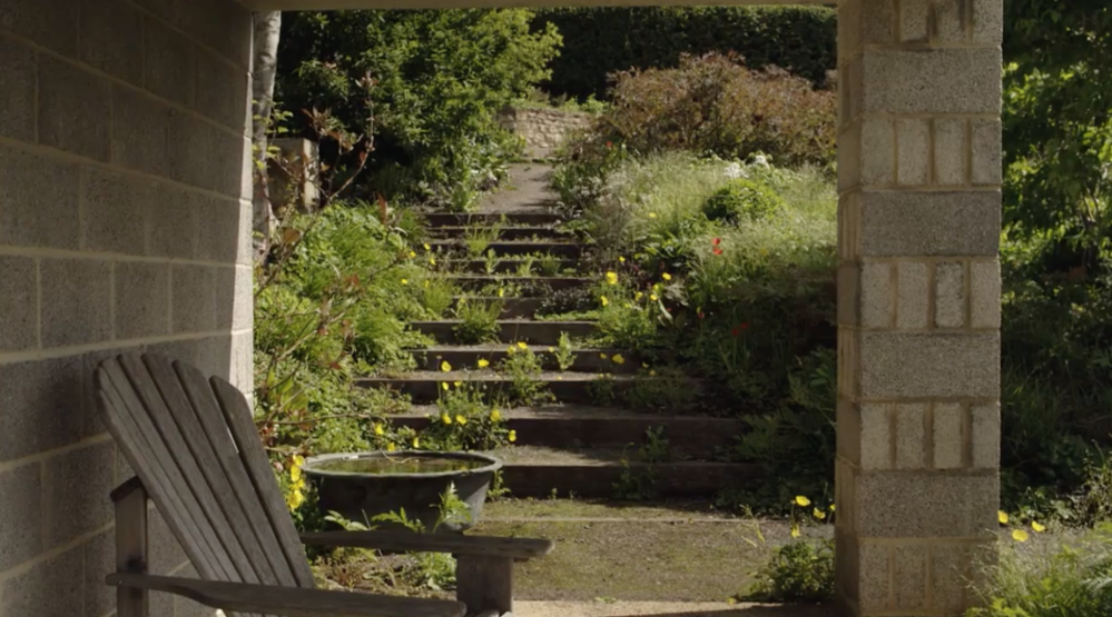
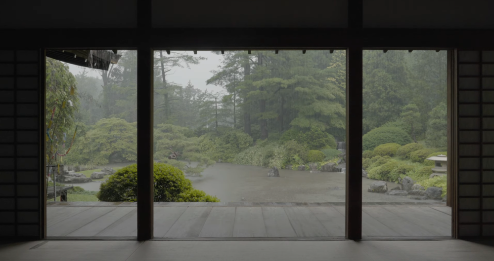
Lastly, the sunken garden will have strong Japanese influences. Japanese garden design is a highly sophisticated art, and there is lots to learn from their principles.
07. Sensory design
Since each sense contributes a slightly different perception of the world, the more senses involved in a particular experience, the fuller, the rounder, the experience becomes. If sight allows for a three-dimensional world, then each other sense contributes at least one, if not more, additional dimensions. The most vivid, most powerful experiences are those involving all of the senses at once. - Lisa Heschong, Thermal Delight in Architecture
It matters a lot to me that the experience of our home is memorable, and I believe an important way to do this is to tune spaces in such a way that they leverage the full spectrum of human senses.
This matters, not out of an egotistical desire to impress, but because I believe that the body experiences these decisions as care.
As designers shape and specify objects and surfaces in the built environment, they make a statement about care and thoughtfulness by the form and texture they create. The door handle shaped to the hand and rubbed smooth to the touch, the banister curved to the direction of movement, the seat molded to the form of the body—all of these are a direct tactile communication of care from the maker to the user.
It says you are welcome here or you are not. It says that the maker has thought about you, has planned for this moment of your arrival, or that you are just one of many who pass through here and the building cannot be bothered to give attention to such a common and inconsequential event. It is a small, subtle greeting card that we all subconsciously read and remember. - Barbara Erwine, Creating Sensory Spaces
Candidly, this is the area of the design where I have the least certainty. I have ideas and theories, but until we put them in practice, we won’t know how well they work to tinge the mood of spaces.
Our somatic senses describe a range of different experiences, including our sense of touch (how things feel against the skin) and our sense of our own body in space, and in relation to other objects. The most significant design decision we’ve made to tune somatic space, of course, is the decision to build in brick. Brick walls have a warmth and welcoming human scale to them. Unlike pristine plaster white concrete walls, brick walls invite the intimacy of a human hand.
Another way we shape somatic space, of course, is with the strong sense of enclosure in the courtyard. Predictably, the dense masonry envelope blocks out the world and focuses attention inwards.
And yet another way we shape somatic space is with the walkway into the house proper. There’s a special moment here when you realise that the entrance is actually a short drawbridge spanning over the lightwell beneath. This is a small hunch, but I suspect this will create a tiny moment of vertigo, which will in turn add a delicious thrill to the moment of entry.
Of all the senses, the sense of smell is definitely the one I care most about. This is because smell is the sense most closely associated with memory, on a biological level.
Just one whiff of a scent that resides in our olfactory history has the power to excite our earliest memories and transport us to places halfway around the world. Avery Gilbert, a smell scientist and author of the book What the Nose Knows, explains the immediacy of this connection. For “every other sense,” he says, “the information has to take a detour through the thalamus to reach the cerebral cortex. And smell has a privileged fast lane, right to the cortex.” Via this shortcut, smell travels to two centers in the brain that are essential for generating memories and emotion: the amygdala and the hippocampus. As Gilbert puts it, “right away, even just by the sheer wiring diagram of smell, we’re talking about emotion and memory.” - Barbara Erwine, Creating Sensory Spaces
I care deeply that our home is a canvas for deep, lasting memories, and the science of memory says the sense of smell is a powerful way to leave an indelible mark on someone.
Smells detonate softly in our memory like poignant land mines, hidden under the weedy mass of many years and experiences. Hit a tripwire of smell, and memories explode all at once. A complex vision leaps out of the undergrowth. - Diane Ackerman. A Natural History of the Senses
There are a number of ways I hope to shape olfactory space, and tune space to make it more memorable.
The primary way is with fragrant plants both indoors and in the outdoor areas. In Ghana, a popular plant for this is the “Queen of the night,” a white flower that blooms only at night and gives off a sweet, pleasant, calming smell. I hope to find several such flowers with different fragrances and plant them them in various areas where people congregate, and by so doing, “colour” spaces with a unique blend of olfactory “notes.” If we’re lucky, we’ll be able find plants that both give off a strong perfume, while also being natural insect repellents.
Another layer of aromatics might involve Japanese tatami mats, likely in the bedrooms. Made from rush grass and rice straw, tatami mats are known to give off a pleasant grassy, herbal scent. They’re also believed to purify the room by absorbing carbon dioxide and to help regulate room temperature by absorbing humidity, especially the humidity that the human body gives off when sleeping on top of it.
Yet another way might be to hang eucalyptus leaves in the showers. I know, sounds strange. Shower steam activates the oils in the leaves, and not only does it smell really nice, but there are apparently proven health benefits including stress reduction, pain relief, and relief from respiratory issues.
I’m fascinated by the several ways that aromatics were used to tune space in the past. For example, apparently untreated cedarwood or sandalwood would be favoured in building because of how they would scent a space. My favourite story is that builders of mosques would mix musk and rosewater into the building mortar, so that when the sun struck the building it would heat it up and release the scent. This story comes from Diane Ackerman’s A Natural History of the Senses and its possible that it is apocryphal, but what a beautiful, evocative idea. It’s really inspiring how seriously we used to design for all the senses, and I’d like bring more of that multisensory experience into our space.
Candidly, tuning auditory space is the one I’m least certain about. There are several ways to tune space with sound (for example, muffling the sound of running water helps create a spatial illusion that makes space feel larger than it actually is) but I personally don’t have an instinctive sense for this.
I’m hopeful that the green balconies overlooking the courtyard and beside the bedroom nooks invite birds, and birdsong. While on site of the property I hear lots of birds, so I’m hopeful we can get them to continue to feel welcome after construction is over.
Another idea is to put up windchimes which will ring softly in the wind.
I still need to think more about how to shape sound, but what is certain is that buildings, in a very real way, are large instruments. They produce sounds like the slam of doors, the clack of feet on tile, the sigh of the AC unit, or the whistle of wind through a corridor. As an instrument, it can be tuned.
08. Bibliography
I’m thankful to the authors of several books for sharing their insights which helped structure my thinking on this project. If you’re embarking on your own house journey, here are the books I highly recommend, listed in recommended reading order.
- The Architecture of Happiness by Alain de Botton: This book will teach you how to diagnose why a spatial design does or does not work. If you’re curious to know more, I wrote a comprehensive reading note about this book. You can buy this book on Amazon.
- A Pattern Language: Towns, Buildings, Construction by Christopher Alexander, Sara Ishikawa, and Murray Silverstein (with Max Jacobson, Ingrid Fiksdahl-King, and Shlomo Angel): This book will teach you patterns that show up again and again in well-loved spaces. These “rules of thumb” will make it easier to make good design decisions. I share more about why this book is great in this reading note. You can buy this book on Amazon.
- How Buildings Learn: What Happens After They’re Built by Stewart Brand: This book will teach you how certain buildings come to last for a long time. Here is my reading note from this book. You can buy this book on Amazon.
- Creating Sensory Spaces: The Architecture of the Invisible by Barbara Erwine: This book will teach tiy how to shape sensory experiences to make spaces feel more special. You can buy this book on Amazon.
- Landmarks by Robert Macfarlane: This is not a book about architecture, but I found it transformative. It will help you understand why it matters to be a better steward of land, wherever you’re planted. Here are my reading notes on this book. You can buy this book on Amazon.
- The Beautiful Edible Garden by Leslie Bennett and Stefani Bittner: I’m early in my education on landscape design, but this book has been very revealing. I also strongly recommend this video interview with between the New York Botanical Garden and Leslie Bennett - without exaggeration, this video blew my mind and completely transformed my understanding of landscape design. You can buy this book on Amazon.
The books above were invaluable for shaping my thinking, and I recommend them strongly.
I read Courtyard Housing: Past, Present and Future to learn more about the courtyard house typology. It’s an anthology of several essays on the courtyard house across different cultures, but with a special focus on the middle East and North Africa. To be honest, I’m sorry to say that I’m unable to give a strong recommendation for this book. While some of the essays were decent, the quality was very variable, the language was very academic (the assumed audience was clearly other academics), and there were production errors in the Kindle version (eg. entire paragraphs duplicated). To be fair, it did provide me a useful overview of the scholarship regarding the courtyard house in the Muslim world, but I think it could have done with some more editing.
Here are other books which I haven’t finished yet, but which I suspect might have been very influential on me during the design process.
- Genius of Place: The Life of Frederick Law Olmsted - great biography of Frederick Law Olmsted, one of the leading lights in American landscape architecture. Amongst other great projects, he helped designed New York’s Central Park. Of interest because it goes deep into design decisions to create evocative spaces.
- A Living Tradition: Architecture of the Bahamas - a “pattern book” of architectural details of buildings in the Bahamas, covering things like “the proportion of a window, the slope of a roof, or the design of a garden wall.” Of interest because the climatic similarities between Ghana and the Bahamas might make this instructive.
- Sub-Sahara Africa: Architectural Guide - this encyclopaedic seven volume set is arguably “the first comprehensive overview of architecture south of the Sahara.” 850 buildings, 5000 images, 350 authors from Africa and around the world. Of interest because it’ll be a goldmine of reference and historical precedent info.
- Francis Kéré: Radically Simple - monograph of projects by Burkinabè architect Francis Kéré. I just really enjoy the design of his forms, and I suspect they would be really useful to someone seeking reference inspiration for design that appears both contemporary but also deeply rooted in a place.
And finally, here are some books on theory, which I haven’t yet finished, but which are already proving formative for my continuing education on spatial design. Fair warning that these are very esoteric. They won’t tell you how to build or design your house. But if you’re curious about the philosophy of why some spaces feel better than others, they might be of interest.
- Space and Place: The Perspective of Experience - “A study of the ways in which people feel and think about space, how they form attachments to home, neighborhood, and nation, and how feelings about space and place are affected by the sense of time.” I was drawn to this book by a reference in another book where author Yi-Fu Tuan describes a place as “a field of care.” Really enjoying it so far.
- Atmospheric Architectures: The Aesthetics of Felt Spaces - the first English translations of several essays by German philosopher Gernot Böhme, who takes seriously the idea of atmosphere in built environments. This is a very dense work and I am completely lost, but pleasantly so.
- The Nature of Order: An Essay on the Art of Building and the Nature of the Universe - “Here is acclaimed architect Christopher Alexander’s four-volume masterwork: the result of 27 years of research and a lifetime of profoundly original thinking.” I resonate very strongly with Alexander’s felt sense of not only the nature of built spaces, but matter itself. Cannot wait to dive into this. Learn more about this amazing series.
09. Team
I’m thankful for the tireless support of several craftspeople on this project.
Many special thanks especially to Studio Contra, who have been invaluable from the very beginning. It’s hard to overstate how essential they’ve been. They brought a level of passion and attention to detail to solving problems that turned what could have been an acutely stressful project into a delight and my family will be forever thankful.
They’re selective with their projects out of necessity (so that they can give each one their full attention), but if you’re looking for an intellectual partner who can take your requirements and deliver a truly world-class, elegant, timeless spatial solution with depth, your architect search is not complete until you’ve spoken with this team.
I’m not getting paid anything for this. It’s just really important to me that we elevate the quality of care-minded architecture in Ghana, and this team gets it. They have my full-throated endorsement.
- Architect: Studio Contra
- General Contractor: Yawson & Lombardi
- Brick Sub-contractor: Green Sun Villas
- Structural Engineering Consultant: Yawson & Lombardi
- M&E Consultant: Probare
- Geotechnical Engineer: Geoconsultants
- Landscape Design: TBD
- Joinery Sub-contractor: TBD
- Electrical Sub-contractor: TBD
- Plumbing Sub-contractor: TBD
- Windows & Doors Sub-contractor: TBD
- AC Sub-contractor: TBD
10. Beauty as embodied care
In my reading note for How Buildings Learn, I wrote the following:
The most important idea in How Buildings Learn is that age plus adaptability is how buildings come to be loved.
But my favourite idea in the book is this: “Well-made buildings are fractal—equally intelligent at every level of detail.”
It is the idea that beautiful buildings are beautiful at every scale: they’re beautiful in elevation, in plan, in section. From cornice to door knob, there is evidence of a loving attention to detail.
I have come to believe that beauty is embodied care. That wherever attention accretes and care pools, regardless of how fine or modest the canvas, the focus of that concentrated loving intent cannot help but produce the quality of beauty.
We have a long way yet to go with this project. I’m sure there will be many more surprises and changes, and I’ll continue to document what we learn (I actually removed several chapters from this essay - will split them into their own stories).
But my sincere hope is that when all is said and done, my family feels, with their entire bodies, that I have loved them impossibly, deeply, with an intensity that feels like it has existed across lifetimes. I hope they feel in every decision, embodied care.
We hope to move in in time for Christmas 2022. Wish us luck. ✌🏿❤️
Do you have any questions, recommendations, or advice? Feel free to reach out on Twitter or via email at equartey at gmail. You can also subscribe via email and RSS to get updates on this project.
Thanks to Kachi and Abdulrahman for helping review this essay.
(If you enjoy my writing and want to support my personal research projects, the best way is to buy me a book!)
-
Family Home
-
Family Home
-
Family Home